Tag Archives: notebook

Review: Cognitive Surplus “The Hypothesis” Hardcover Notebook

Cognitive surplus designated this a notebook but it functions quite well as a journal.

The nitty gritty:

  • 7×9 inches
  • Hardcover, with a waterproof coating
  • 192 pages of 80 gsm paper
  • Pale gray ruling, graph on the left, lines on right; available in different ruling online
  • Fountain pen friendly paper, with medium or smaller nibs
  • Designed in Portland, OR made in China
  • Lengthy gray ribbon page marker.
  • $18.95 at Bob Slate in Cambridge MA, and in their online shop

I picked up the Crystallization cover because it has geometric shapes on a dark teal background. They have many other cover options in many other colors in their online shop. I particularly like the Planetary Motion, Neurons, Models of the Universe, and Brain Anatomy. The designers at CS have a great sense of color and design. They mix old-timey scientific drawings with text and color in a way that I find particularly interesting.

The cover is smooth and not quite slippery in hand. It has a satin finish that has gotten burnished with use and shows a few spots of shine as I’ve pulled it in and out of my bag. I’ve been a bit… rough, with it and it’s showing the consequences. The burnishing is barely noticable.

Inside I found the signatures of the book to be securely stitched and glued. I did not find any glue creep or loose stitching in my book. The block is cut cleanly and square. It is fitted into the cover well. The whole thing opens flat on desk or in hand. The covers are stiff and solid, allowing the book to be used for writing in hand. It even folds over onto itself well. Surprisingly well considering that the binding utilizes a piece of card across the spine, a practice which I find usually interferes. IN this case it is done well enough that it doesn’t interfere at all.

The paper is decently smooth with most of my finer nibbed pens. I only noticed feathering with ink that has general issues with bleed through, the majority of my inks were well behaved and looked great. Inks that sheen exhibited a great deal of sheen. Glittery inks glittered. I did not note any ink spread. Nib size is true on this paper. All other inks performed well on this paper- grl, rollerball, and ballpoint were all fabulous.

The paper also has excellent tooth for pencils. It’s at a great amount for even softer darker pencils. I found that my soft dark pencils held a point quite well. My harder pencils also performed well on this paper. They put down a decent amount of lead to the page and smudging is minimal. Pencil felt superb to me on this paper.

Overall, I love the designs on the covers and the paper is great. The size works well for notes or journaling. It’s just a smidge smaller than a composition notebook so fits in most backpacks and messenger bags with ease. the cover is sturdy and allows for writing in hand. At $18.95 these aren’t cheap, but they are a solid choice for a journaling splurge or gifting to your favorite stationery fan.

No affiliate links today. I bought this book with my own cash money and no one influenced my review. But hey if Cognitive Surplus wanted to hit me up with review copies of their other books I’d be down to review the rest of their line. They have POCKET NOTEBOOKS with their colorfully printed covers!!!

Back-to-School Sale Composition Book Round Up

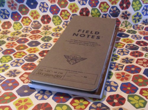
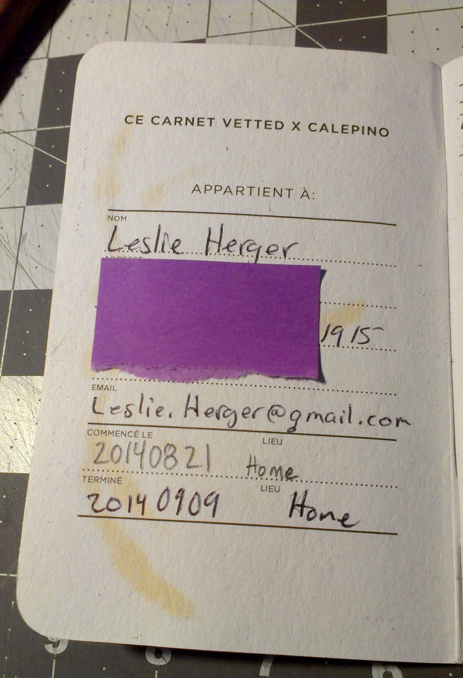
This is a very image heavy post!
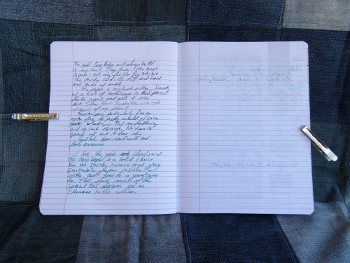
I decided to head to back to school sales and pick up a few composition notebooks to update my old best of Composition Notebook review. I go through a lot of them writing my drafts, so I have room in my budget to spend the money to buy during the sales, because for the most part comp books are around 50 cents at Back To School Sale time. All are college ruled. Unless otherwise stated these are all the typical size for comp books:9.75X7.5 inches or 247x190mm.

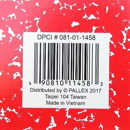
Entry 1: Generic Made in Taiwan 51 cents (Target)

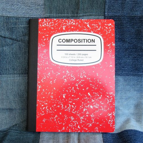
Target’s entry has thin flimsy card covers graced with a marble pattern that has bled together so much as to have little white space. It has a black textured paper tape spine. Beneath the tape it is stitched. It does have a nice oval shaped Composition label on the front cover that looks absolutely generic. I kinda love it.

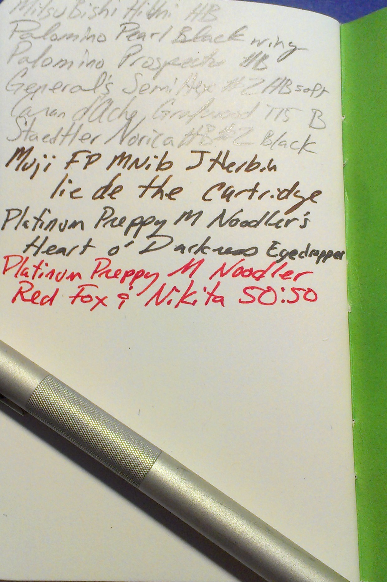
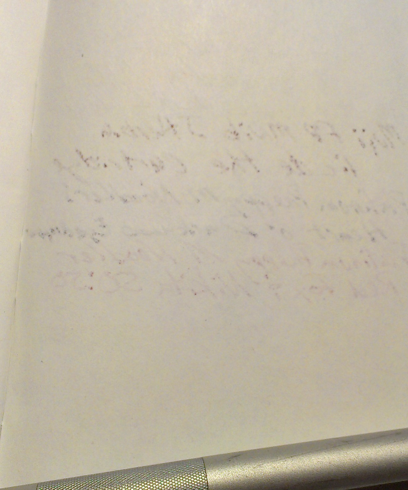
Inside are 100 sheets or 200 pages of thin smooth paper. In my testing I found it worked well with pencil, rollerball, ballpoint, and gel ink. Fountain pens bled through but didn’t feather until I started to use wet nibs paired with inks that tend to feather. With fine and extra fine pens it did okay. With any darker colored ink the verso of the page won’t be usable as the show through is intense.

What sets this comp book apart from the pack is the smooth paper. It is smooth yet toothy enough that pencils were superb on its surface. Point retention is phenomenal even with soft dark pencils like the Glimo Super Black. Smudging was minimal.

Entry 2: Staple’s Made in Brazil 50 cents

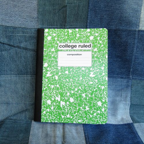
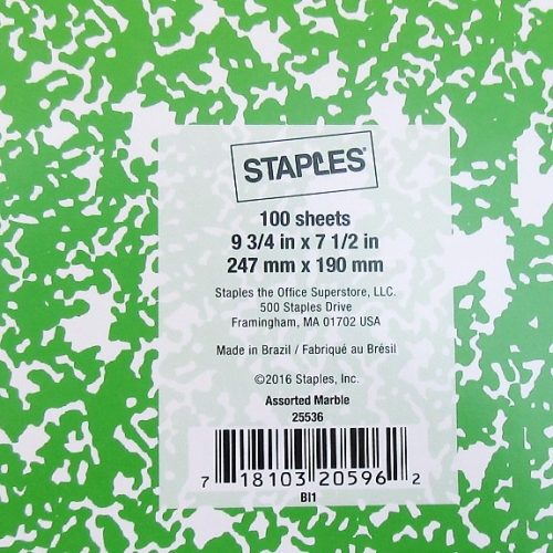
The latest iteration of the venerable favorite has thin flimsy card covers. A definite downgrade over past years. The marbling is splotchy and evenly distributed between white and whatever color cover you purchase. It isn’t very marble-y. The label area is rectangular and rounded over. Rather boring. The spine has a black textured paper tape over it.

Inside are 100 sheets/200 pages of thin bright white paper with a dark purple-blue ruling. The ruling is far too dark and never receded into the background.Even with thick black ink it stands out. Gross.

Testing proved that this toothy paper did well with the usual round up of pencils, rollerball, ballpoint and gel inks. It was shite with any fountain pen. Even the thinnest and stingiest of nibs feathered and bleed with the best behaved of ink. Wet thick nibs soaked through to the page beneath. The verso of the page is unusable with any liquid or hybrid ink. Even some of my gel inks tended to show through. What a  mess.

What an abysmal fall from grace.

Entry 3: The Mead Poly Cover Made in Vietnam $1 (Target)

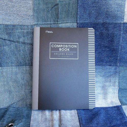
I’ve had very bad luck when it comes to Mead comp books in the past. This year’s is far different than the past iterations. There are 70 college ruled sheets, though they are also available in wide rule. The poly cover is thin and rather floppy. The tape is gray textured poly. The cover has lines printed on the fore edge but no other design. The typical label area lacks anywhere to write your name or other information. This is a sad oversight.

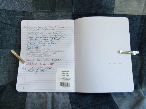
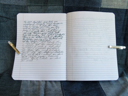
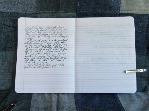
Inside the 70 college ruled sheets feature very thin pale blue lines that recede into the background of every ink. I’m in love! The paper is thin and crisp. It’s not slick feeling but it performs remarkably well with every pen and ink combination I’ve used. My wet pens and inks glide over the surface and feel wonderful. Better yet, there is no bleeding, feather or soak through. No, I even get sheen on this lovely paper. There is show through, but that is to be expected from paper this thin and crisp.

I find it shocking that I have a Mead contender for best Comp Book of 2017!

Entry 4: Mead Card Cover Made in Vietnam 79 cents (Target)

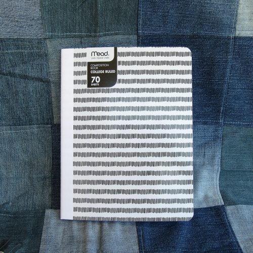
Repeat everything I said about the Mead Poly cover here. No Feathering, bleed through, or feathering. Loads of lovely sheen, even from my EF pens.

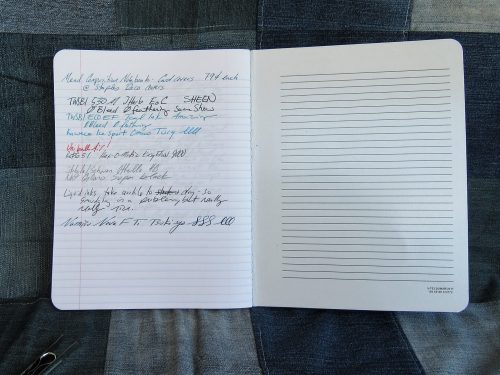
The covers are decently sturdy card, and at least at the Target where I purchased my sample they had 2 patterns- one for wide and narrow lines. The patterns consist of stripes made of vertical lines roughly the height of the lines inside the book. Clever. They were offered in a rainbow of colors with textured paper tape over the spine. Sadly this also lacks the classic front cover label area.

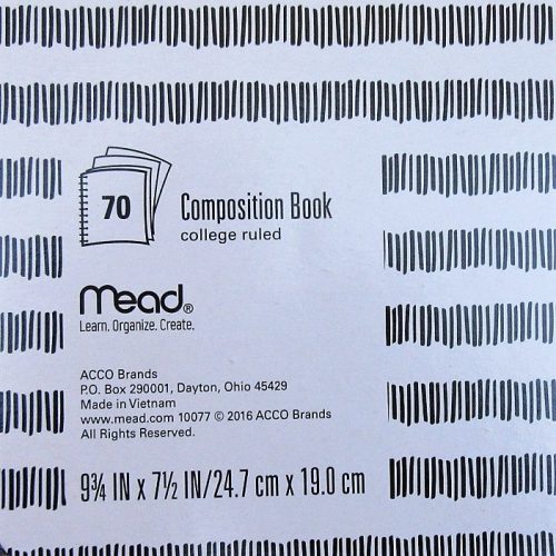
The big downside of this paper is that because it doesn’t absorb liquid ink, it takes quite awhile for that ink to dry, resulting in smudging.
Not only do I have 1 but I have 2 contenders for best comp book from Mead. Shocking.

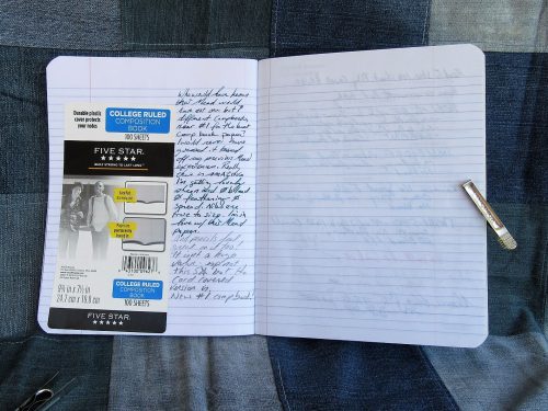
Entry 5: Mead Five Star Poly Cover Made in Vietnam  $2.99 (Target)

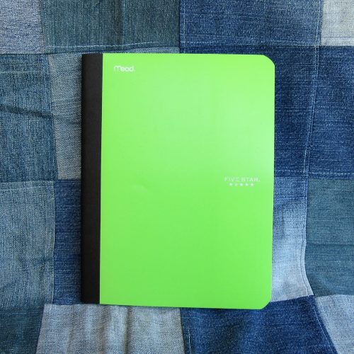
In another shocker, repeat all the good stuff from the last two Mead entries and it applies here. The paper is great. There are 100 college ruled pages in the 5Star. It features a classic textured black paper tape along the spine. Mead skips the classic front cover label area.

These poly covers are among the toughest of the poly covers. Though they are still floppy, they are less floppy than others. The interior of the cover is also lined with white poly so that the contents aren’t on display. Further, it features some of the classic composition notebook interior goods- class schedule and conversions.

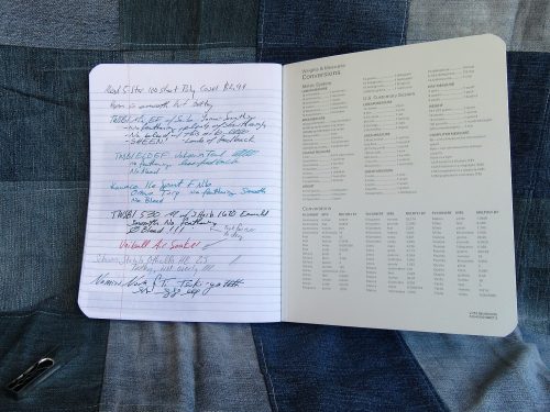
Comparing this to the other Mead offerings, this is not a great value. The paper is wonderful and the poly cover sturdy but not enough (to me) to justify the increased cost  over the other poly cover.

Entry 6: Up & Up Card Cover Made in Mexico 5 for $4/80 cents per book (Target)

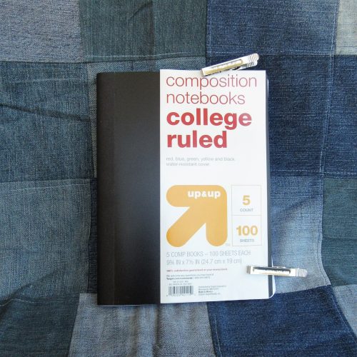
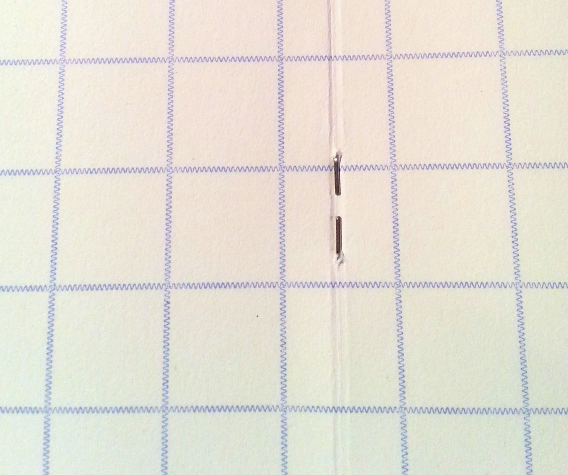
It is tempting to return these and cash in on the Target 100% satisfaction guarantee. Yes they are that bad. The poly cover is thin, flimsy and floppy. The paper taped spine features glue squeezed out of it’s edges. Unlike most of the comp books written about thus far which have stitches at roughly 10mm, the Up &Up is stitched at 15mm.

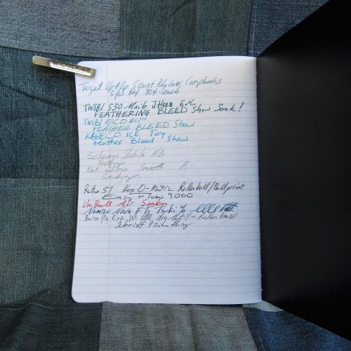
The paper is bright white with pale blue ruling. The positives end there. Every fountain pen I used feathered and bled, even dry extra fine nibs using dry well behaved inks. Blotter paper is less absorbent. The only thing that works okay on this paper are ballpoints and pencils. Even pencil doesn’t feel that great on the paper. It lacks tooth to get a decent line and what graphite does get onto the paper is pale and smudgy.

This goes on my do not buy list.

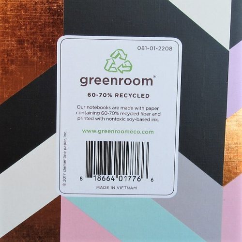
Entry 7: Greenroom Decorative Card Cover Made in Vietnam $2.50 (Target)

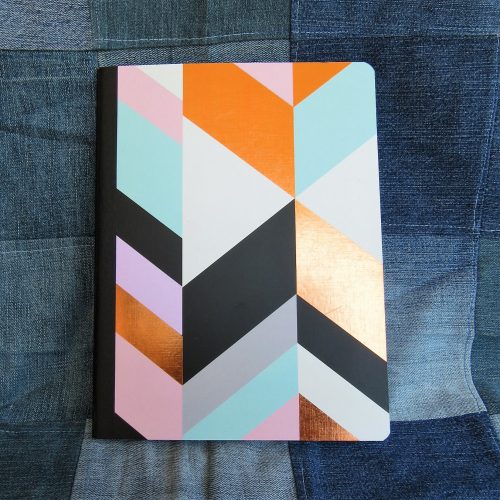
Here is another comp book with only 70 pages. The paper is cream colored with brown ruling. The lines are actually tiny dots. I really adore this ruling and wish that I had better things to say about the actual paper. This paper feathers and bleeds with every fountain pen used. Gel ink also feathers and bleeds. Unlike our last entry, pencil feels good on this paper. Rollerball and ball point are also quite nice, so there are a few more options for use than the Up &Up.

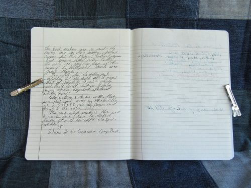
The very pretty card cover is very thin, very flimsy and as floppy as the poly entries. It will not survive carting around in a book bag for long. A spill will spell the end of this comp book. The textured paper tape is well applied and looks good with the lovely printing of the cover.

Entry 8: Yoobi Card Cover Made in Vietnam $2.29 (Target)

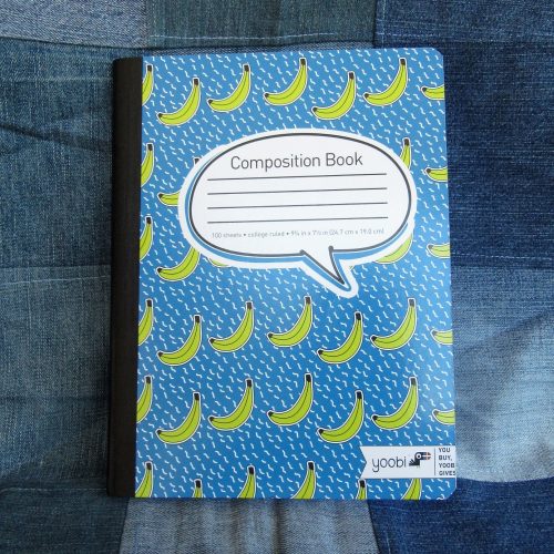
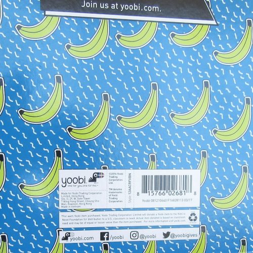
The Yoobi comp book is a venerable contender and little has changed since the last time I purchased one- the covers are sturdy and thick, printed with one color or a fun pattern. The textured black paper tape is well applied. The front cover features a large block where you can label your notebook with your name and other info.

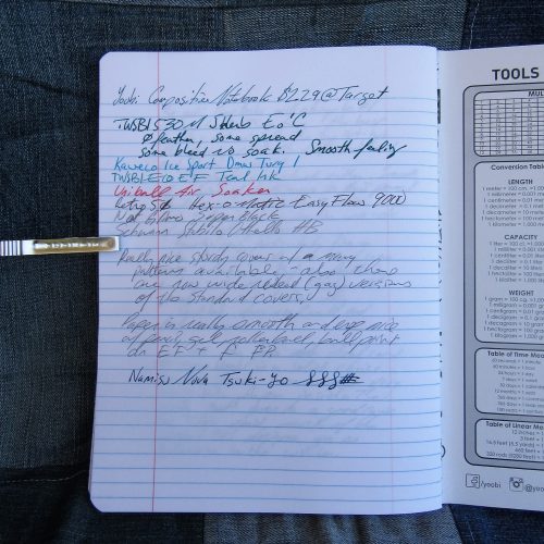
Inside are 100 college ruled sheets. The ruling in this year’s is pale and thin. I like it. The paper is smooth but not too smooth. It’s toothy enough for pencil but not so toothy that it eats up your graphite. Fountain pens fair less well than in the Mead notebooks but fine and extra fine do really well.

Though the Yoobi books aren’t the greatest value at full price, they are a great cause. Plus they go on clearance often enough that you can usually snag some decent deals in the middle of the winter.

Which is the winner here?That really depends on your final use of these notebooks. If you are a fountain pen user you can’t go wrong with the Mead card covered available at target for 79 cents. The paper is phenomenal for everything tested for this review. I was able to see sheen even with my finest fountain pens. Nothing bled or feathered. The per page price was 1.13 cents a sheet. While this isn’t the cheapest, it’s squarely in the middle of the road. If you are planning on using pencils or ball points (looking at you Bic Cristal lovers and folks who put the Fisher Space refill in friggin’ everything) you really can’t go wrong with the Staples 50 cent composition notebooks. At 0.5 cents per page these represent the cheapest of the cheap. Sadly they no longer fair well with fountain pens or liquid inks. Finally if you want a solid writing experience, fun covers, and a good cause, the Yoobi books are a good choice.

There are two here I’d avoid at all costs. Sadly the pretty Greenroom notebooks are just far too expensive at 3.5 cents per sheet to have paper that performs so poorly. Though the Target Up &Up brand is on the low end of cost at 0.8 cents per sheet the performance of the paper is abysmal and the shoddy stitching will likely give out before the poly covers have a  chance to break down.

This series of mini reviews reaffirmed something I’ve know for a long time; I hate poly covers. They are floppy, you can’t write in hand or even in your lap. The plastic won’t break down for ages. The brighter the poly cover the more likely you are to be able to see through to your contents. They add unnecessary cost to a product that should be inexpensive. Here let’s put it into “print:” poly covers are garbage. Continue reading

Review: Field Notes Byline Summer Colors Edition


I don’t usually review the new Field Notes (FN) color editions as they come out, but Bylines is so different I think it really deserves a once over.

First, I’ve been digging Reporter Notebooks for the last 6 months and began to get interested in them about a year ago. Why? I don’t know. Universe synergy? Collective consciousness*. Clearly something is in the air, because reporter notebooks are booming. Field Notes and Write both came out with one at the SAME FRICKIN’ time. Whoa. Crazy cool.IMG_0107

Anyway. The Byline has been hailed as “reinventing” the reporter notebook among many other things that fans of Field Notes are wont to say. Don’t get me wrong, I love me some Aaron Draplin design, but this is not reinvention. It is a fabulous interpretation of the reporter notebook, but reinvention? Well, if you count using floppy barely functional covers as radical. But then Tops, Portage, and Mead have been doing that since the 90s. So radical, what a  departure. Please, cool your hyperbolic jets, field nuts.daringfireballhyperbole.bmp

But the covered spiral binding? That’s surely radical. Err, yeah, you haven’t seen many annual reports for midsized companies** have you? The covered spiral binding is routinely used by print companies to dress up a company’s annual report. It’s relatively inexpensive yet looks great. It stands up well to being tossed around and shipped.IMG_0113

He made it narrower! By a quarter inch. There are also half as many pages as in a regular reporter’s notebook. Yes the paper in the FNB is twice as good and I’m able to use both sides. There is a pocket! Is that really your trump card? *shakes head* The pocket makes the last few pages lumpy and bumpy and hard to write on. It also gives some weight and thickness.IMG_0108

Here’s the thing, I LOVE this edition. I love reporter’s notebooks. The long narrow form factor is great for making outlines for stories, podcasts, videos, and other things that need outlines. It’s one of the reasons I love the Write Notes Ledger and I want to love all notebooks that are tall, open at top, and narrow. If you like this form factor it’s going to work for you. If not, well, my address is…
IMG_0112 IMG_0115One of the best aspects of his new design is the paper. It’s heavy, quality, and great with all manners of ink. This is a notebook for the fountain pen users of Field Notes, granted it’s not the right form factor, but you can’t get everything you want.IMG_0111

Continue reading

Review: Shinola Small Notebook Paperback, Ruled

During my last visit to Artist & Craftsman I purchased a few Shinola notebooks on a whim. The small paperback notebooks are available in a variety of colors and are displayed in a neat spinning display made of dark stained wood and plexiglass. For the paperback books I snagged the orange color but they also have a nice pink, tan, navy, teal and black. They were out of the teal or I’d have gotten that*. Orange is a great color for a notebook because it can easily be found in a bag and in among crap laid out on a desk.Shinola Papercover

The notebooks are covered in a stiff cardstock that is sturdy, and the one I’m using has survived some seriously rough use. Yes, it has achieved and nice wabi sabi worn in look, which will offend some of new “brand new look” purists but, I love me the worn in look, and this is starting to get a good patina. The cover also has some nice embossing and debossing details. The name plate has a nice rounded rectangle embossed around it as well as a series of double lines at the top and bottom, which I think it could do without, but look okay. There is an embossing around the edges of the front cover. The back cover is adorned with simply, “Shinola Detroit.”Shinola Papercover

I’ve made my way through 3/4ths of the book and the spine is surviving well. The spine is not stitched rather it is perfect bound with embedded cords. While this is a sturdy sort of perfect binding, it won’t last forever. Eventually the rubbery glue they have used on the spine will give out, it might take 10 or 20 years, so if you use these for notes you want for posterity, because you know your thoughts are really THAT important, these might not be for you. So yes, perfect binding is generally the devil’s tool, but this is a good one, and has survived my rough use thus far. Also, for even more of a party foul, it won’t ever lay flat, nope don’t bother I tried. A final weirdness, these measure 5.5Hx3.75 inches, so you have to wedge them into your covers and they do NOT fit into a Fodderstack XL, again don’t bother I TRIED.Shinola Papercover

The paper is a delightful cream color with light grey lines. I love the color of the paper and the lines. the paper is smooth and lacks any sort of toothines that I like for graphite. I find the pages are prone to smudging when I use my usual B or 2B pencils on them. this is a great paper for HB or even *GASP* Wopex! Oh yes, this paper is DELIGHTFUL for the odd wopex pencil you have in your kit.Shinola Papercover

Anyway, you can ge a 2-pack of these 72 page lined notebooks for about $6.75 at Artist & Craftsman in Saugus, MA or you can go to the Shinola website, or a number of other sites.Shinola Papercover Shinola Papercover

Details:

  • Paperbacked
  • Perfect bound, NOT stitched
  • 72 lined cream colored pages
  • 60lb/90gsm acid free
  • 5.5×3.75 inches

Continue reading

Review: The Mt. Tom Six by Four by Bob Slate

In complete opposite to the last notebook review I did, I’m ecstatic over this one, even though it has a spiral binding, and I’ve written about how much I despise spiral bindings. The Mt. Tom is a 6×4 inch 80 sheet notebook sold by Bob Slate Stationer in Cambridge, MA. The spiral binding is bright silver and tough. The paper is bright white with dusky blue college ruling. The cover is raw tan card and is stiff enough that you can write in hand.MT TOMThe paper is very nice. It responds well to juicy fountain pens and scratchy pencils and smooth Palomino Blackwings. I was quite surprised at how nice the paper responded to everything I threw at it. The construction is solid. the spirals, though the notebook lives at the bottom of my backpack, are hardly squished or bent. The stiff cover allows me to take notes on the go and is delightful for scratching out ideas on the train. The printing on the book is in red, much like their line of notebooks branded for Harvard, but is a little more subtle.MT TOM MT TOMThe price is right too, at $1.95 this notebook is not only a quality winner, but a value.MT TOM MT TOMAs for the spiral binding, I wish they would produce a composition notebook with this paper inside. It would allow for any tool to be used on it’s pages with success. I also tested out another of their notebooks, which I’ll write about later, but no where on their shelves did I see a Bob Slate composition notebook. If half as good as these, I’d buy a dozen. I suffer the spiral binding, though I loathe them, because sometimes you need a notebook where pages can be torn asunder and passed to another. To do and grocery  lists must be jotted down and fulfilled. You can’t just tear out a page of a Field Notes without destroying it’s structural integrity, rather, you keep something like this for those occasions.

Review: Tattersall Pocket Notebook

I picked up a 2-pack of OrangeArt’s pocket sized tattersall letterpress printed notebooks at Black Ink in Harvard Square awhile back. The 2-pack was $8.50, so pretty pricey.TattersallEach notebook has a cover and pages that are letter press printed with a  tattersall pattern. Basically zigzag lines in a large grid pattern. The covers are printed in 2 colors while the interior is a nice shade of gray. The interior paper is nice, toothy enough for pencils and smooth enough for fountain pens. Fountain pens perform reasonably well on this paper, with a little show through and hardly any bleed through but for where I rested my pen a second too long. I used 3 inks in my testing, Pelikan Edelstein Tanzanite, J. Herbin Lie de The, and Noodler’s Heart of Darkness.  All were in medium or fine nibbed pens that run wet. I had no feathering or widening of the lines. With the finest of pens the paper made them feel scratchy, but not bad enough to stop me from writing. Pencils performed admirably on this paper. I was able to use my soft dark Palomino Blackwing (“original”) as well as my harder lighter Mirado Black Warrior to good effect. The paper was toothy enough to pull off a decent amount of graphite but not so toothy it felt like I was writing on a cheese grater. Pretty much just right.TattersallTattersall TattersallThe book is held together with 2 standard staples. This works reasonably well. I did not subject this to a stress test as this book was my at-home journal and even there lived in a leather cover. The cover is letterpress printed in 2 colors on white. The cover paper is not much heavier than the interior pages and feels flimsy. It is the worst part of the whole book. While pretty, this cover simply isn’t going to hold up to much abuse or pulling in and out of a back pocket. This is a paper cover that necessitates a case for any use out and about.TattersallThe 40 pages take fountain pen and pencil well. This notebook has 8 less pages than other pocket notebooks that are cheaper. The ruling is also  odd. It is a gray version of the exterior printing but without the cool letterpress imprint*.  The ruling is super wide, about double the width of a Word notebook and most other ruling. It measures in at 13mm. Super wide. i was able to fit 2 lines of writing into one line. I find this annoying. the ruling is also thick about .5mm. even though it’s gray it shows up under all my writing and remains very noticeable. They are available without the ruling. If I were to buy these again I’d look for them with blank pages.Tattersall TattersallOverall these are very pretty pocket notebooks and wonderful if you use a case/cover for your books. If you use fountain pens you will be pleased with the interior paper, and likewise for pencil. They are higher priced than Field Notes or Word notebooks, but boast letterpress printed covers and interior pages. Worth it if you like letter pressed items and want something a little different from the standard fare.

Here you can see the Tattersall on top of a Field Notes Red Blooded, it's a tad smaller than the Field Notes.

Here you can see the Tattersall on top of a Field Notes Red Blooded, it’s a tad smaller than the Field Notes.

Continue reading

Review: Furrow Books Pocket Size Notebook

I signed onto the Kickstarter campaign for Furrow Books roughly 6 or so months ago.  I pledged for one of the founding member pocket sized notebooks. Its price was fair to help support the campaign.FurrowThe pocket sized notebooks are 3.5×5.5 inches in size and contain 48 pages. The pages are held to the cover by 3 silver staples. This is all pretty standard in the pocket sized notebook arena. The front cover is unadorned and is a nice dark shade of green. The back cover has some information about the company and the book. Because this was a limited edition of 1500, it sports a hand numbered 0044/1500. At the bottom of the back cover is the furrow books logo. The cover is made of stiff sturdy card. I really dig the logo free front cover.FurrowFurrowInside the covers are colored the original Kickstarter green* and they are blank. They don’t have a place to put your information but this is easily enough to be scrawling in with ink. The pages are blank. Furrow books schtick is that their pages are blank, but that they have a card with lines that you can stick behind them and use as a guide. The pages are just thin enough that you can see this guide well enough to, uh, guide your writing. In practice this works pretty well. I found shoving the card behind every page a tad annoying** but for specific reason which will likely not annoy anyone else (read the footnote for more info on this.) Using the notebook in my cover meant that the elastic pushed the card out of place. Outside the cover it worked pretty well.  I really liked the fact that once I was done there were no lines visible on my page and yet my writing was perfectly straight. Like lines? That’s covered. Like grids? That’s covered. The card is double sided to accommodate what you prefer.FurrowFurrow FurrowFurrowWhile using a pencil I found that my card got a little graphite transfer. This wasn’t an issue in use just a thing to make note of. It wouldn’t happen with fountain pens.FurrowAs someone who interchangeably uses fountain pens, pencils and cheap roller balls it’s important that I know what kind of utensil will work on my paper. I found that pencils worked the best on this paper, in fact they worked so well I found myself using little else. I did test out the Field Notes clic pen to good effect. I tested out a few of my fountain pen stash and the results were ok. I had a lot of show through  and a touch of bleed through. YMMV. I really liked it with pencil, and I would put it on par with some of my other favorite notebooks with pencils. Furrow FurrowOverall this is a pretty nice notebook with great paper that is made well here in the US. The aesthetics are significantly different than Field Notes and approach a classy simplicity in the choice of cover materials and treatments.  These notebooks would look good in an office, board meeting, or a meeting with nerdy professors. The branding is subtle and adult, sophisticated. Again,, comparing them to Field Notes, they lack the fun factor, but make up for it by being an adult notebook.

While I was a Kickstarter Supporter, I suggest that people keep an eye out for these notebooks and support them. MAde in the USA, quality construction (when compared to other notebooks of similar build) and a nice look. How can you go wrong?

Continue reading

Review: Calepino Notebook

Calepino notebooks are the french equivalent of Field Notes. Their limited editions pair with a designer to create their covers, pencils, and matching pens. They have 4 ruling options- lines, grid, dot grid, and plain. Their regular editions feature a color that denotes the kind of grid inside, red, green blue and silver. The typical cover features bands of color with the name of the company and notebook’s info.calepino calepino calepino

I lucked out and snagged a Vetted X Calepino notebook via a swap a few weeks ago. This featured a white cover with some printing on it in black. Inside it was loaded up with white dot grid paper.  The inside of the cover was printed with the usual “fill in your important info” style lines and such. Of course it was in French but my rudimentary High School French tells me that it is pretty much like Word or Field Notes style info. the inside back cover relays info about Calepino and the history of the company as well as a ruler.calepino calepino

The cover is tough cardstock and survive my uses, which you can see via the picture means that it’s used as a coaster for my coffee cup in the AM. I found the cover to be very absorbent. the area for info took pencil and BIC clic roller ball well. It also survived, though the white looked very dirty at the end of my week’s of use. This is the danger with white notebooks. Filth.

The dot grid was done with a nice gray ink. It was good to know where I was writing but sinks into the background after words are added. Perfect in my book. the paper itself is thick and crinkly, it feels nice, smooth but not glassy enough texture you can see it but isn’t overwhelming. The paper took fountain pens reasonably well with some show through but nothing bad.calepino

This paper worked wonders with pencils, but not good soft dark pencils like my Palmino Pearl. Oh no using a Pearl on this paper was like writing with soft cheese on a cheese grater. Rather this paper was a dream with harder pencils like my General’s Semi-Hex which I generally refer to as the “general’s Semi-Yuck” due to it’s gritty scratchy performance*. Writing with a Neon Ticonderoga was heavenly. Lumgraph HB? Let us not go there. The Caran d’Ache Grafwood B performed like a B should instead of an H. This paper took all the good points of writing with a B or Palomino and threw them out the window, allowing  me, NO BEGGING me to use my less expensive pencils to fill it’s pages. This notebook was cheap pencil HEAVEN. I’m sad it’s gone, where will I use my crappy General’s Semi-Hex?calepino calepino

From what I understand of the website and what is printed in the book, this paper is exactly the same as their regular dot grid paper, so you can get the regular edition, with more printing on the cover, to fill in with your not-so-nice pencils. **

The price of these is the same as Field Notes, Calepino offers a exchange rate (or thereabouts) discount for non- EU buyers. Which is pretty awesome. These little notebooks are definitely on my radar for yet another notebook to buy and keep in my rotation.

Continue reading

Reflection: Adaptability of the Traveler’s Notebook System

For the last several years I’ve been carrying some variation of a homemade Traveler’s Notebook system. I have gotten my system to perfection for me- one of my simple slim two pocket inserts, a BanditApple Carnet (BAC) peewee, and a Field Notes (FN). This system allowed me to jot down important information on a catch all page in the FN or if I needed more room to take up a whole page in the FN. The BAC allowed me to sketch on the train. The pocket hold receipts, stamps, and odds and ends. This worked perfectly for me for several years. It got me through my last hellish year at the old job and through my first year of GradSchool. But today I realized that it was a little inappropriate for me to carry my journal with me to my internship. It also didn’t work for my needs as an art therapist. It was simply put- too bulky and cumbersome.tale of travelersA couple of weeks ago I bought some Post it “Study” Grid notes and cut them down to fit onto the back cover of my planner- housed in a custom made Davis Leather Works simple notebook cover. This cover is traveler’s notebook style, but holds only a BAC peewee sized planner and a simple slim 2-pocket insert. The gridded post it notes saved my bacon as I was running around the senior center, jotting down  notes about supplies the program has, things the director needs, things my supervisor would like to see, what kind of art people like, and other assorted quick notes. While my planner worked well for the day, it’s not a long term solution.

I think that a pocket notebook like a moleskine would be too formal for the setting, and if I lost it would house far too much important information*. I’d like to stick to some sort of Field Notes or Word sized note book, something pocket sized between 48 and 64 pages. Ruling not important. But I’d like to be able to combine it with a pocket system that I can keep post its and index cards in. So basically, I’m looking to make a cover like my planner cover, that holds a pocket notebook and a pocket with a handful of notecards and a few post its cut to size. It has to fit into the back pocket of my khakis.

It feels a little strange to me that the system that I currently use isn’t appropriate for a new setting. I simply assumed it would be good for all settings, since it’s been “there for me” through so much and for so long.  It’s strange to think that I’m so attached to my notebook system that I feel a little lost (and admittedly sad) that I won’t have it with  me. Instead what I’ll have with me will be a new version of the system, something adapted to work with my new profession. Something slimmer and a little more sleek.

Continue reading

New Field Notes Covers

I’ve been working on some prototypes of recycled sign vinyl covers for Field Notes. I’ve made a number of prototypes and have listed a few of them are for sale on my etsy shop. I’ve priced them below what the final design will sell. While they are perfectly serviceable there are little things that I want to change to make the covers better. However, you can get these for a good price. Mostly because they don’t make me perfectly happy. I’ve got some that hold 1 notebook, others that hold 3 and one that holds 4.

I’ve been toting around one that holds three for the last few weeks. The vinyl is a perfect for making a  cover for these notebooks, it’s sturdy and survives abuse. They are perfect for a vegetarian or vegan. Also the covers are recycled, so are ecologically minded.

Vinyl Notebook Covers Vinyl Notebook Covers Vinyl Notebook Covers Vinyl Notebook Covers Vinyl Notebook Covers Vinyl Notebook Covers Vinyl Notebook Covers