Tag Archives: watercolor

Thinking: 100 Days Projects

There are a lot, and I do mean a lot of projects that people sign up to do online, from 30 Days of something to NaNoWriMo to 100 Days Projects. I have trouble completing any month-long projects that I sign up for let alone 100 Days projects. Yet here I am at 33 days into a 100 days project. I’ll surely have more pointers at the end of the project but let me share what I’ve learned so far.

Break the rules– The rules of 100 Day project state that you work on something every day for 100 days. I can’t do that and know I can’t. It’s not possible for me to work my DayJob and then come home and do something every night. I work late on Wednesdays and I know that I cannot work on my project on that day. So I double up on a day when I work late.

Don’t beat myself up. Because I know that I’m not going to be able to work on the 100 Days stuff on Wednesday night, I also allow myself to not work on 100 Days stuff when I’m stressed out or very tired. Because I’ve built in some flexibility I don’t beat myself up for taking off a needed night.

Accountability– Despite building flexibility in, I need to hold myself accountable for catching up on days when I can. This means that often times I’m doing double duty on Saturday and Sunday. I do 2 items on those days. Or try to. Go back to not beating myself up.

Thus far I’m very much enjoying the 100 Days Project. I’m learning a lot about watercolors- how the various colors respond in use and with one another on a variety of papers. I’m learning which of the colors granulates, how they merge with one another on the page as well as when mixed in a pan. Anyway, the 100 Days projects are a great way to learn about a material in depth, and it’s worth the effort. Just remember to be flexible and not to beat yourself up when you need to skip days, then catch up when you have time.

Portrait Process

I thought I’d show you some of the process of creating the images of the presidential wannabes.

I start by looking through google and assessing the kinds of pictures they have available. I don’t use just one as a reference, sometimes an image will wash out the nose, or the lips. Quite often all of the images made the candidate look pink, really really pink. Occasionally they’d be orange or gold. I think it depends on the photographer, but man, many of them should get their blood pressure checked, because their faces are RED.  After I find 3 or 4 images to reference, I start with a sketch, it’s basic. I was using a “iron blue” (AKA payne’s gray) Derwent Inktense. However, my local stores only carry Inktense in tins, and I have no interest in having a tin of them. I like them for under drawings for watercolors because after I add water and they dry, they stay put. However, they aren’t light-fast, or all the colors aren’t. So I don’t want to rely on them because I don’t want to use them in anything but my journal. I have moved to other brands of watercolor pencils and I’m debating which I like best.processprocessAfter the under drawing us finished, I hit it with water, blending the color out and into the proper tone.process processAfter this I start to layer on the actual colors. I and working with a bright and dark palette of not true to life shades. I start with pale pinks and yellows, brushing these on in broad strokes. I’m using a #10 synthetic brush. I then layer on medium shades, and finally the fully saturated dark colors. I’m a huge fan of mineral violet and indigo. Such amazing colors. process

Portraits of “Presidential” Candidates

In an effort to learn more about politics and be balanced, I decided to read about each of the declared candidates for president. That wasn’t making things stick, so I decided to make art for each of the declared  candidates for US President. It turns out there are many of them. I could end up making little paintings about them all summer if I wanted to. I don’t but I’ve decided to highlight a few of them and fill a journal. Here are a few without my color commentary.

IMG_20150723_214208 repuglican repuglican repuglican repuglican IMG_20150727_112355 IMG_20150727_112355 IMG_20150727_112355 repuglicanHere are a few close ups of what the paint looks like after it dries. I’m working very wet into wet and in the humidity the paint takes forever to dry. I’m also working with a #10 and #20 brush on a hand-book travelogue series sketchbook. Which I’ll have to do a full review on soon enough.

granulation granulation

Review: Sennelier Aqua-Mini 8 Half Pan Set

The 8 color half pan travel watercolor set from Sennelier is a fantastic deal on on great watercolors. Getting 8 half pans for less than $20 is a steal, so this set is well worth the asking price, with a few caveats and work you’ll have to do to make the set useable.

The colors included are fantastic and useful for just about any urban sketching adventure. Unlike less well planned sets, this one includes the ever useful Payne’s Grey rather than black. The other colors are: primary yellow, French vermillion, cinereous blue, French ultramarine, pthalo green light, sap green, burnt umber. These colors have their limits. Obviously there is no cool or true red, so there is no mixing a decent purple, but overall it is a very useful set of colors.

First the big issue is that the tin and insert that the colors are packed in is not quite useless but really not great. The insert is made of flimsy white plastic that I cannot imagine would stand up to much use. It’s not bad, and it might last the life of the pans, it’s just not all that useful. Using the colors in it means the plastic moves around quite a bit. Annoying.
sennelier mini
To fix this issue I moved my half pans from the flimsy insert to Schminke empty half pans**. Useful.

The tin the set is housed in also has a few issues. First the lid has that cute little viewing window, which makes the lid, normally used to mix paints on, useless for that task. You could go about painting it or cutting a piece of Yupo to fit*. But that is way more work than it is worth and it won’t sit flat for mixing, so color ends up under the Yupo. . The next issue is that the tin is about ¼ inch deeper than most mint tins. This makes fitting a brush in a little more work.

I abandoned the tin and placed my pans of color into a new tin. I’m using a Thayer’s lozenge tin- it’s square, fits my hand well, and is just deep enough to hold the pans well. I use a little ball of plastic tack to hold each pan in place. It works well, and allows me to pick and chose what colors I’d like to include in my tin for that outing.

Sennelier watercolors are a great choice for someone looking for good watercolors that wet easily. Some people dislike them and others love them. I’m a fan of them for their good colors, relative affordability, frequent sales, and amazing rewetting; simply touching a wet brush to the pan results in a decent load of color.

For roughly $18, getting 8 half pans is a steal.

Oh, it comes with a tiny little joke of a brush. It holds a point well but it would really only be useful for working on something smaller than an ATC or ACEO. The handle is far too short to be useful. If you can figure out a useful way of extending it, let me know in the comments.

Continue reading

Review: Sargent Watercolor Crayons

I'm a huge fan of watercolor crayons I've tried a number of brands but keep coming back to Caran D'Ache. Why? They are creamy, loaded with pigment, and move with water excellently. They are however pretty pricey at just over $1 a crayon that can add up. When I saw the Sargent Watercolor Crayons I wanted a pack immediately. I couldn't decide between the 8 or the 12 pack. Eventually I went with the 8 pack. They were reasonably priced at $6.67* at Artist & Craftsman.
IMAG1211
IMAG1211They are in a cardboard matchbox sliding box. No fancy tin here. You'll haveto excuse the paint that I got on the box, I had to use them to review them, and that included doing some of my usual watercolor crayon techniques.

The crayons themselves at first are a little stiff, I think the outer layer of crayon has dried out a tad. Once I used them for a few minutes and wore off the outer layer these crayons perform really well. I was really really surprised at how well they performed for inexpensive watercolor crayons. After the initial dried layer the crayons goes onto the page smoothly and looks like any crayon. The color is nice and deep so long as you put enough crayon on the page. The darkness of color can be controlled by how much crayon you lay down on the page. Color lightly- get light color; color heavily and get dark color.
IMAG1214These really surprised me in how well they lifted and moved around with water and a brush. They really needed very little water and brushing to move around well and blend with one another. Really really impressed with their ability to move once wet. Unlike the Staedtler watercolor crayons these moved while wet like Caran D'Ache.
IMAG1210I'm very impressed with this realtive newcomer to the watercolor crayon market. They perform really well for any art journaling need and are signifcantly less expensive than  the Caran D'Ache. Are these archival and lightfast? Probably not. I've not yet tested them. But like any student watercolor it's not likely. They do match the Sargent Watercolor magic liquid watercolors. So color-wise they match, allowing easy mixing across materials.

While I didn't purchase the 12-pack with a "free" brush I did look at the brush, flopping around loose in the cardboard box… It didn't look like it was a very high quality brush, but it would be useful for washes. It certainly looked like whatever point may have been on the brush was long gone. I don't know why manufacturers that include a "free" brush in a box of something haven't learned to put a small dab of rubbery glue to hold the brush in place to prevent damage. Common sense might cost the manufacturer some money.

A new addition to my review will be looking at the material's potential for use in my future art therapy practice, I'll keep it at the bottom of my reviews so people who aren't interested can ignore it, and those who are can find it easily. These watercolor crayons could be used with children or adults with success. They work as well as the "big" brand but at a much lower cost. Meaning, they can be purchased in a plentiful quantity that the client will never feel they are running out of materials and lending a sense of freedom to their use. If giving a client a new box is important, that can be done because the cost of these crayons is low. The crayons are non-toxic. There is, of course, the typical concern that one might have when giving "children's" supplies to adults.

Continue reading

Watercolor Basic Tools

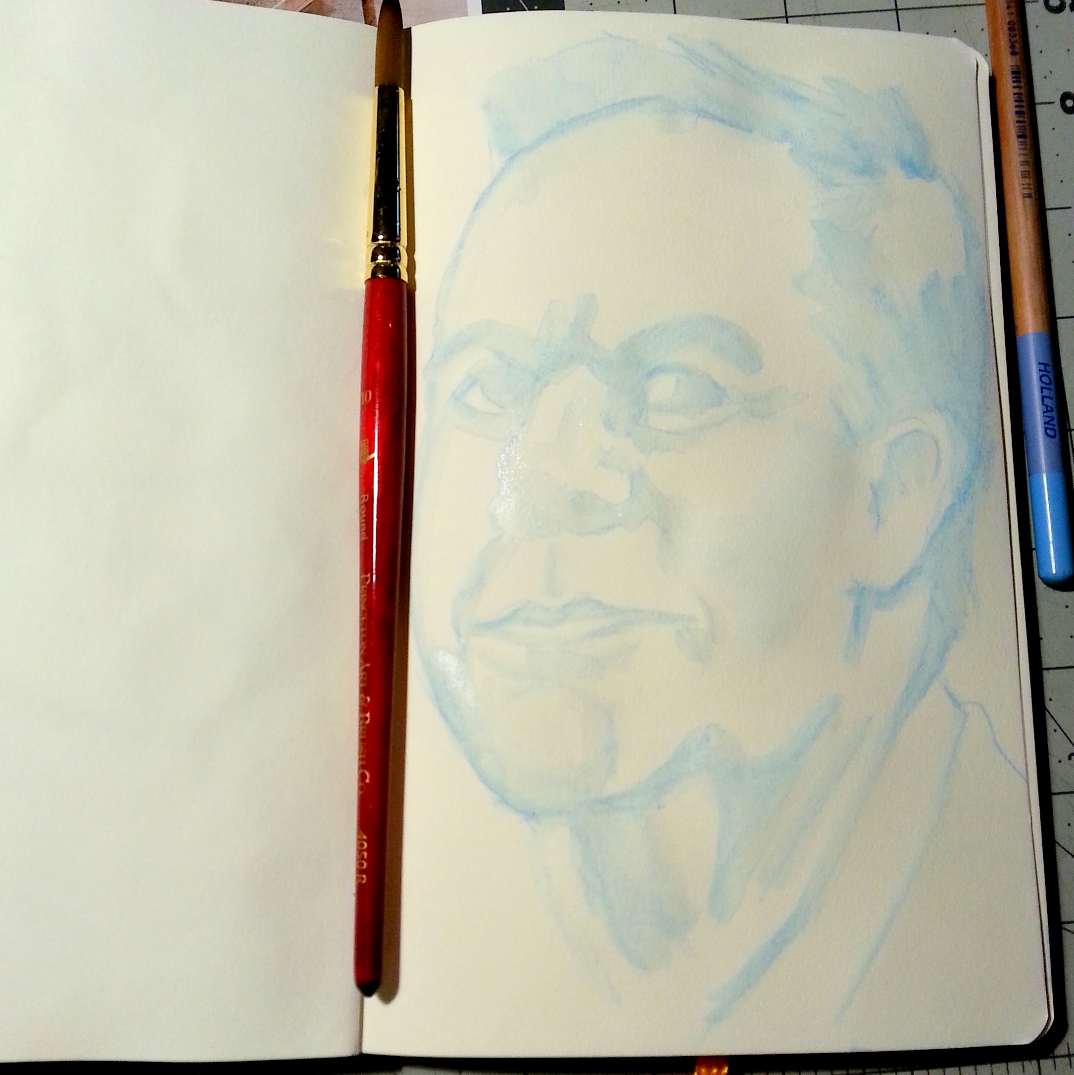
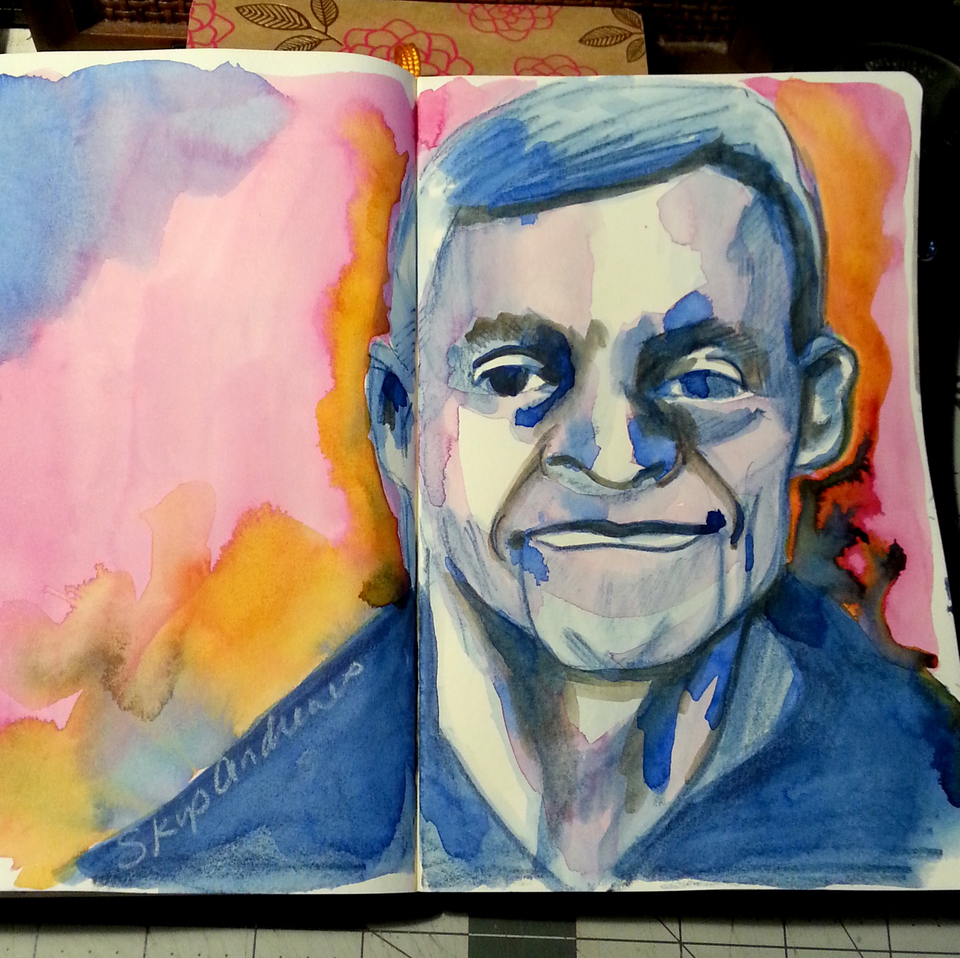
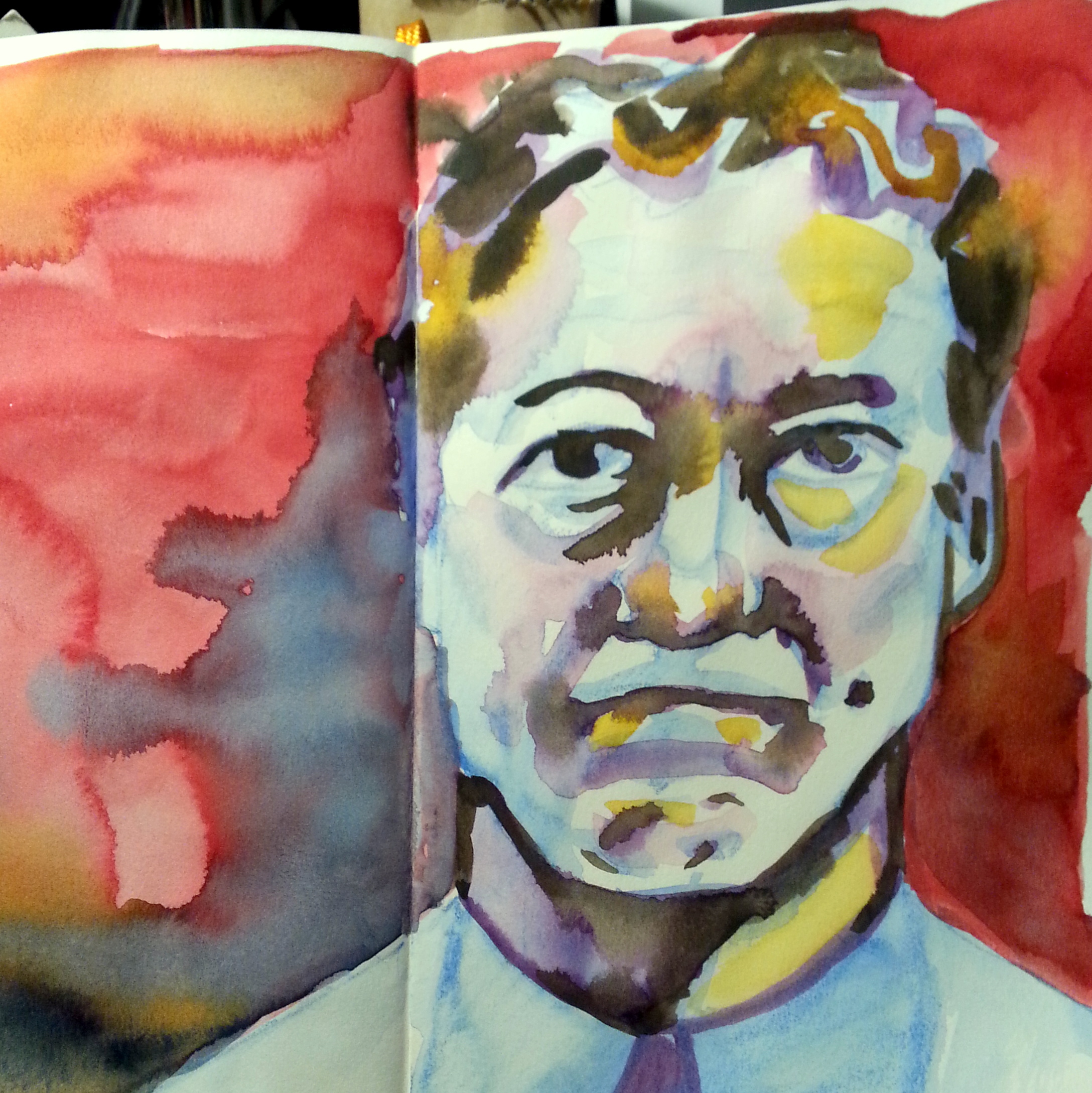
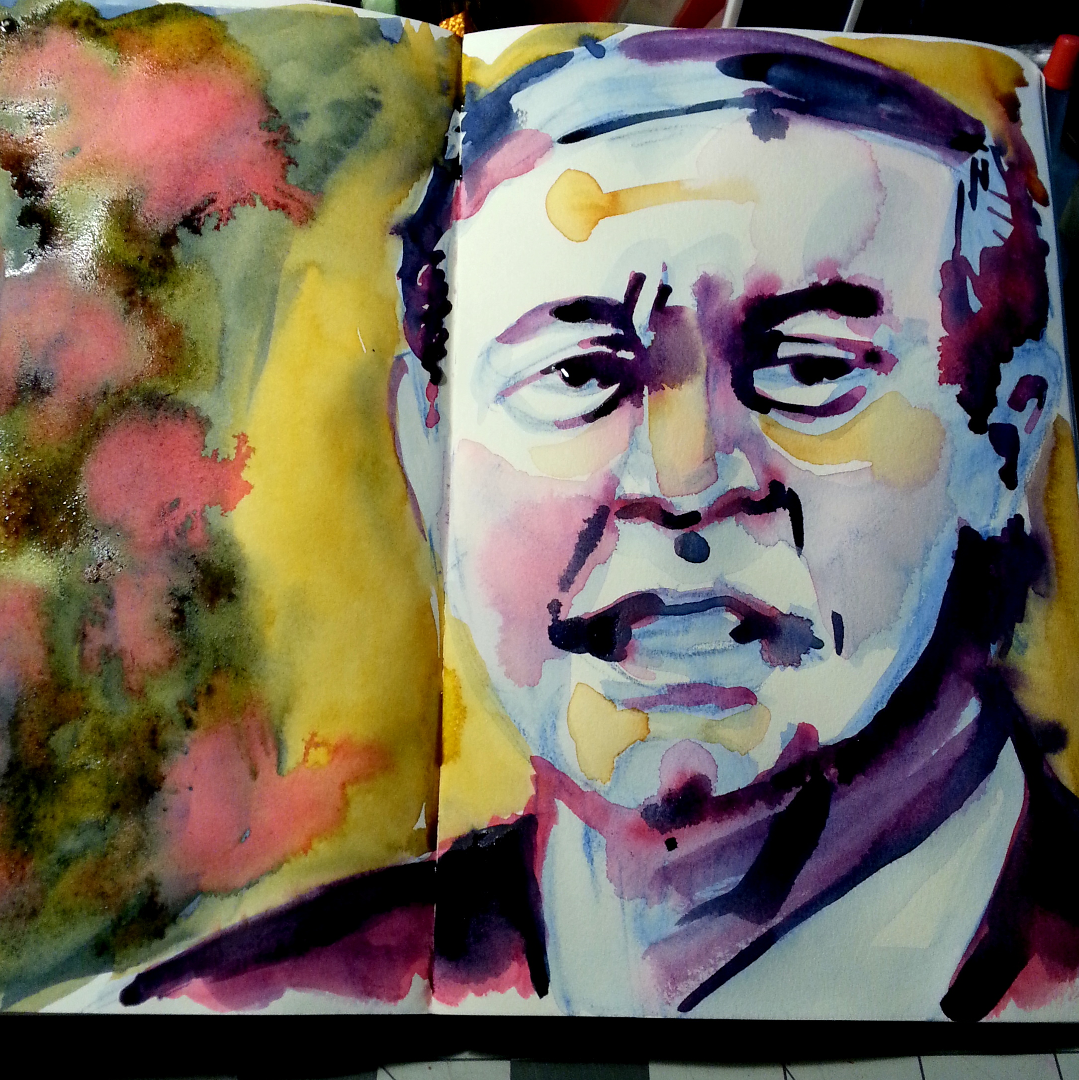
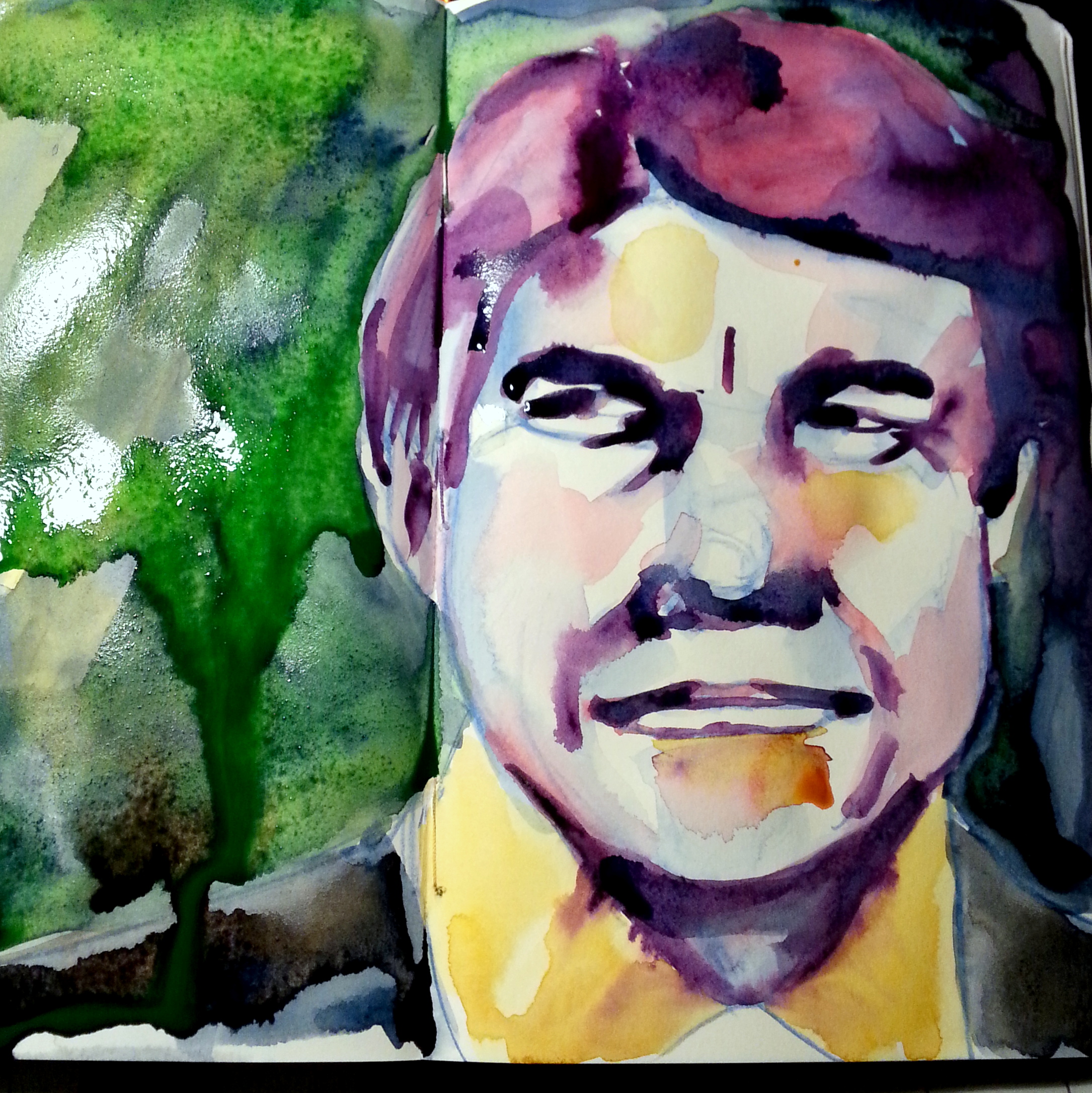
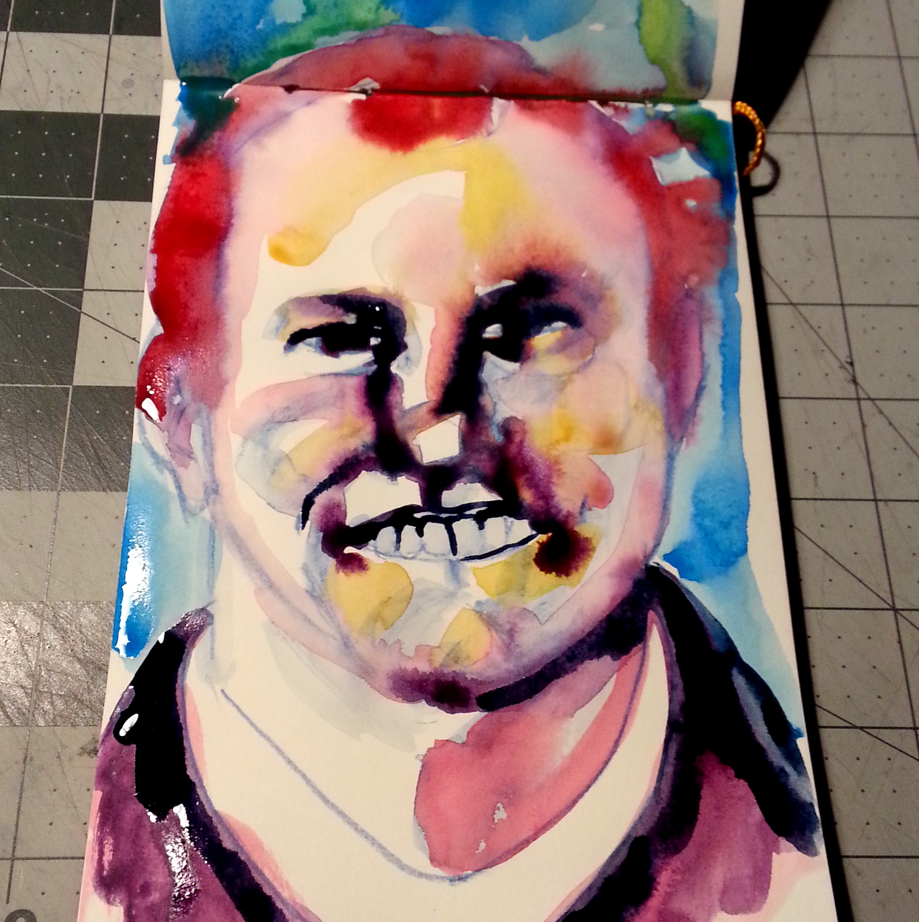
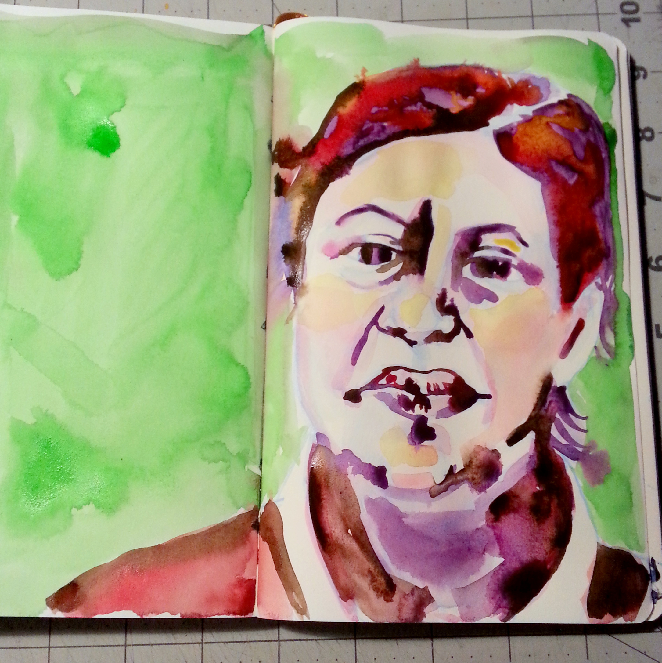
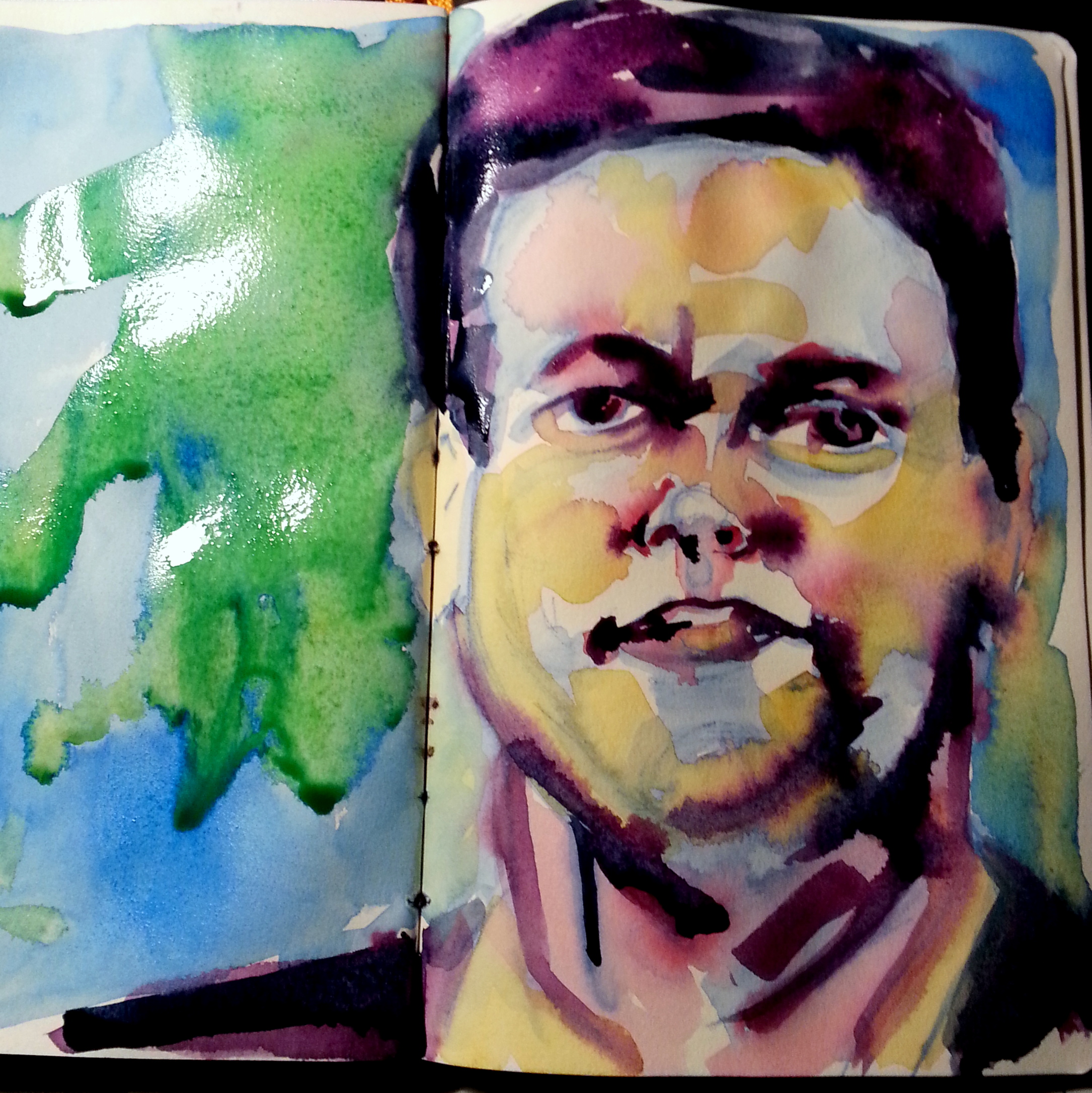
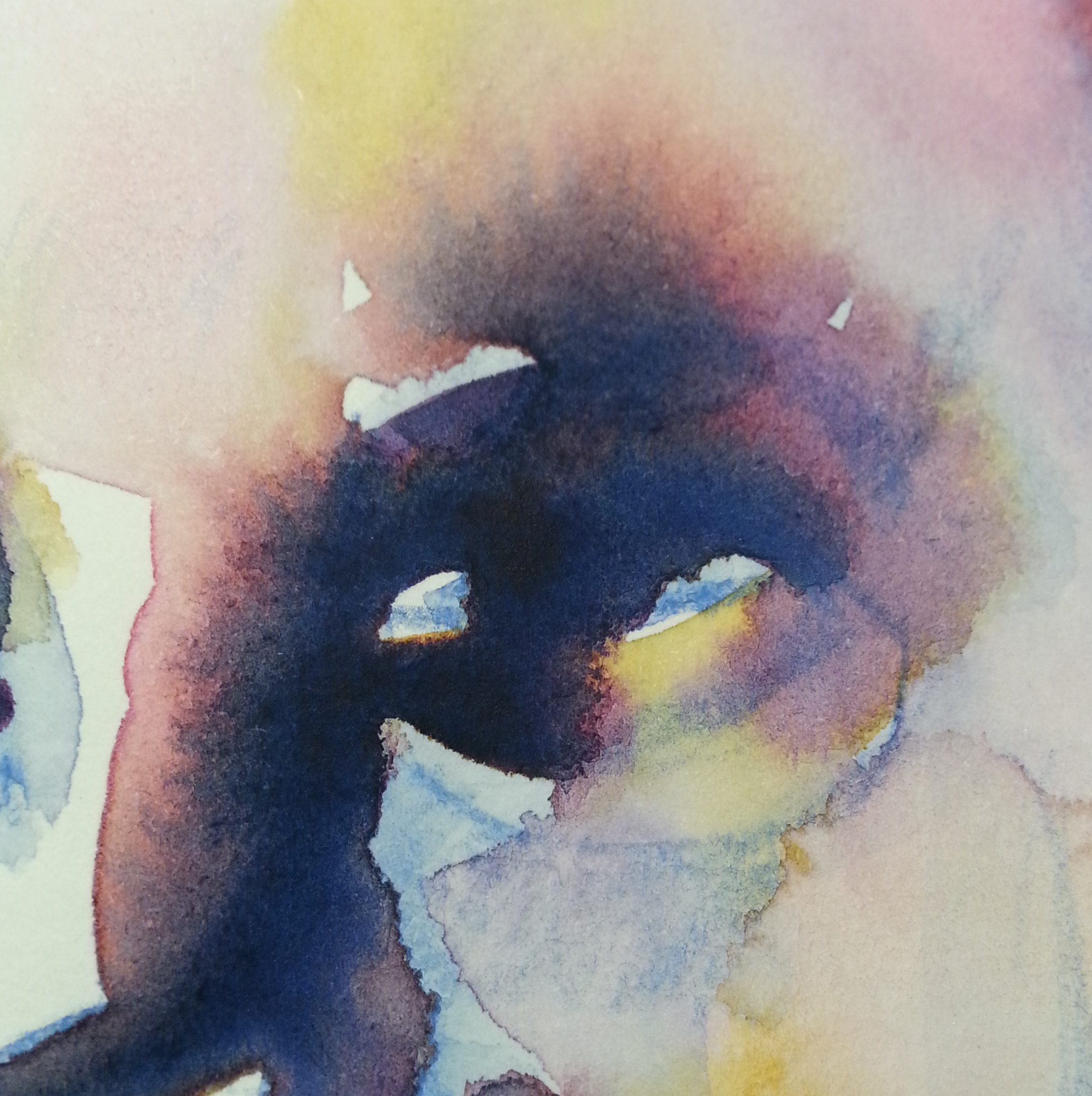
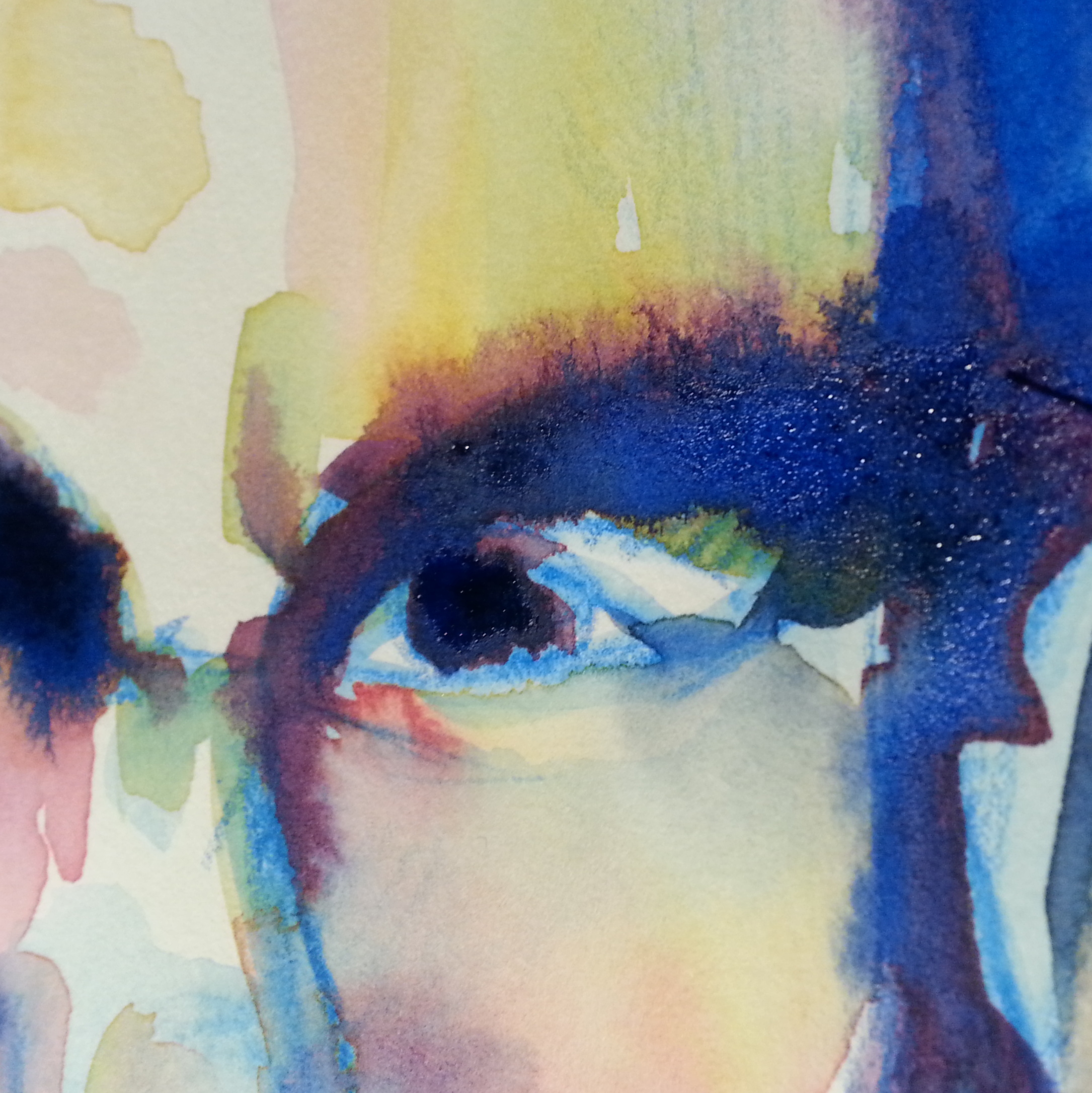
I was recently asked to do a brief “intro to watercolors post.” So here it is.

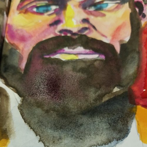
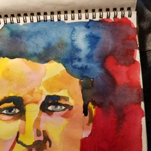
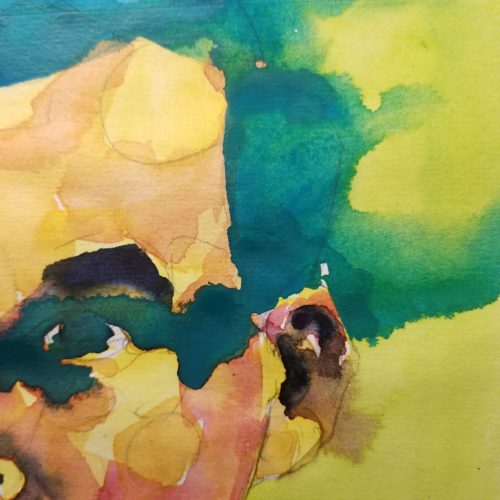
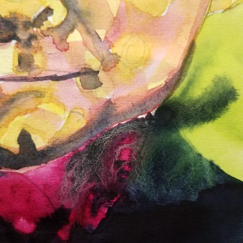
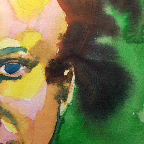
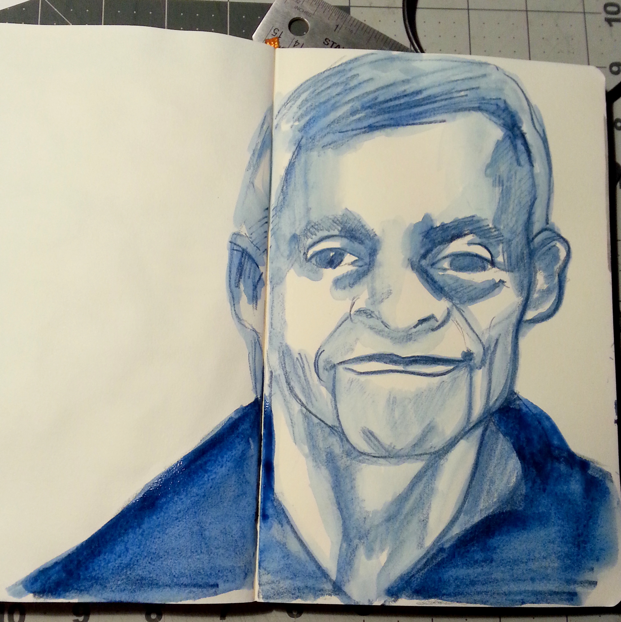
Watercolors have a variety of ways of being used, from larges washes and free wet into wet application to tightly rendered pencil drawings filled in with layers of colors. I work somewhere in between. I enjoy making a mess and creating carefully rendered illustrations of things I see. Here are some basic tools I’d sugesst with a budget in mind:

P6024333
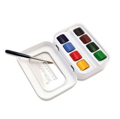
First the colors themselves. I’d suggest starting off with a Windsor and Newton Cotman Sketcher's Pocket Box Set. It has 12 colors all of which are usable in a variety of settings. The box itself is sturdy and completely usable. The brush it comes with is, well, crap. This is the best of the small pocket sketch sets by W&N. It generally runs about $20. They are carried in most places like AC Moore and Michael’s.

If you are the crafty type I’d suggest making a recycled mint tin watercolor tin and picking up a student set of tubed watercolors. This will be more expensive but half the fun is making the tin and sourcing materials for it. Van Gogh student watercolors are inexpensive and work very well.

I like to buy most of my watercolors locally. I really like to walk into a place and look at the displays. This also lets me use my discount coupons best. I keep a running list in my planner of colors I’m running out of, this lets me walk into a store and walk out without buying more than I intend. This also has let me buy some REALLY expensive Winsor & Newton colors at half price! Although I am prone to buying tubes of every brand’s version of indigo and sepia.

Brushes are important. Using shitty brushes doesn’t  help your experience with painting, it merely serves to frustrate you. I have several sizes that I like: #12 round, #8 round, #6 round, #4 liner, 1/2in flat, 1/2in mop. I find myself reaching for the #12 and #8 round the most followed closely by the 1/2in flat. You want to look for watercolor brushes that are springy and hold a point. How can you tell this in the store? Take a small pot of water with you, swish the brush around until it’s soft and saturated with water and flick the water off the tip. Look at the tip, is it holding a nice sharp point? Yes! You have a winner! No? Put it back and try again. If they will not let you do this, or you feel uncomfortable trying it in stores, buy the brush and try it at home, return it if necessary. Start with one round- maybe a #8 or #6 depending on the size you plan on working. If large, buy larger and if small, smaller.

My favorite budget friendly brand is Princeton with the red handles. I have several of these that I reach for again and again. These are not the cheapest brushes available, but I have used them again and again since college with good success. Cared for properly they will last you many years. I have one I bought in college that I still use, we won’t talk about it’s age. These range in price from $5.99 to $12.99 each. These are available all over the place. These are a great coupon buy.

If you are looking for a still cheaper brush check out the Loew & Cornell Soft Touch line. These are dirt cheap but remarkably nice brushes. I bought them on a whim expecting them to suck and they were shockingly nice. I bought these in #10 round and a 1/2in flat. I find myself reaching for them again and again. Their #10 is the size of a Princeton #8. These are awesome cheap brushes. They run $3.99 for most sizes. The only place I’ve found these is at Joanne’s.

As for waterbrushes I’m a fan of the Koi brand. Which you can get at Jetpens. I have not liked the niji and the pentel I’ve tried.

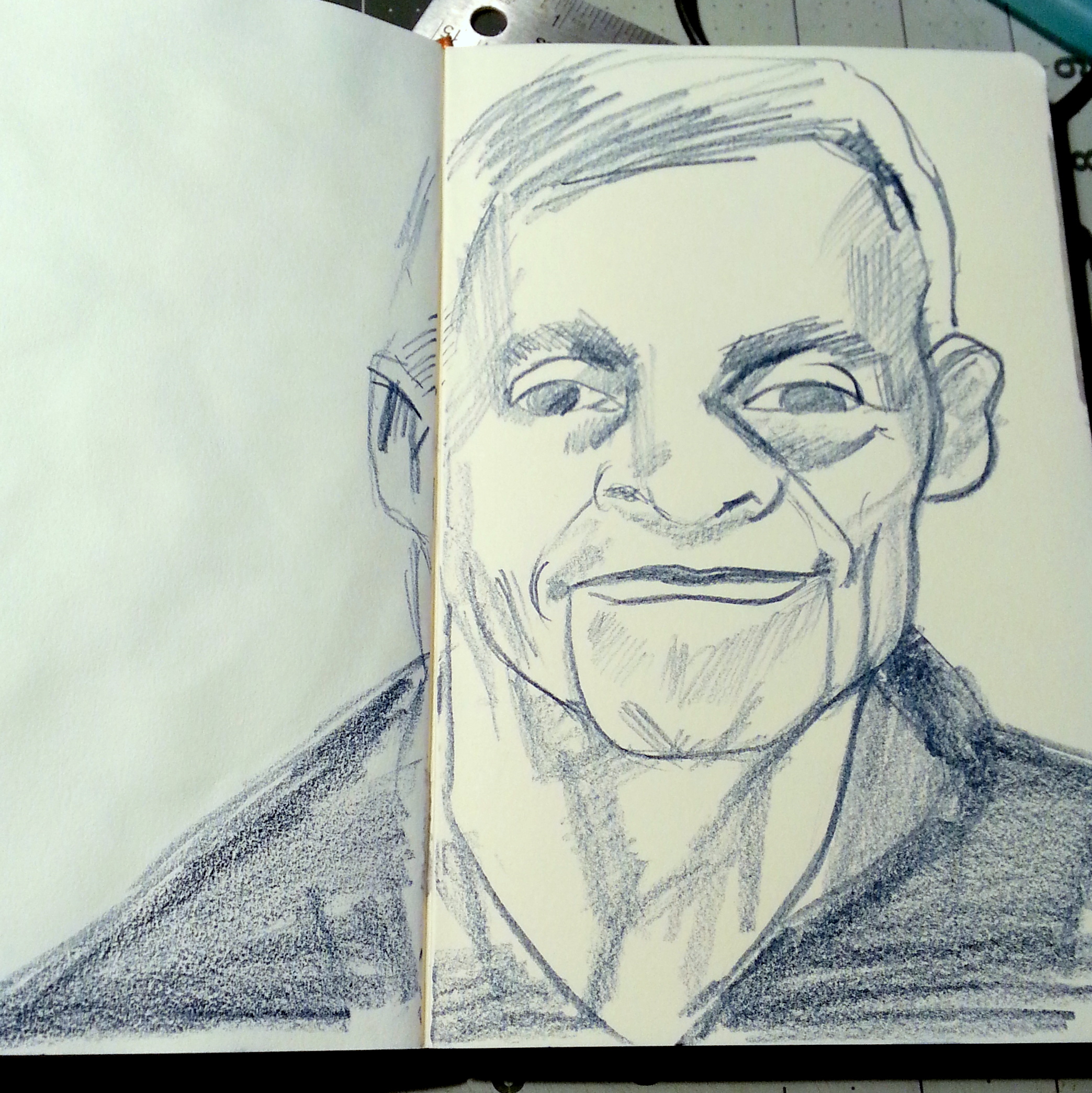
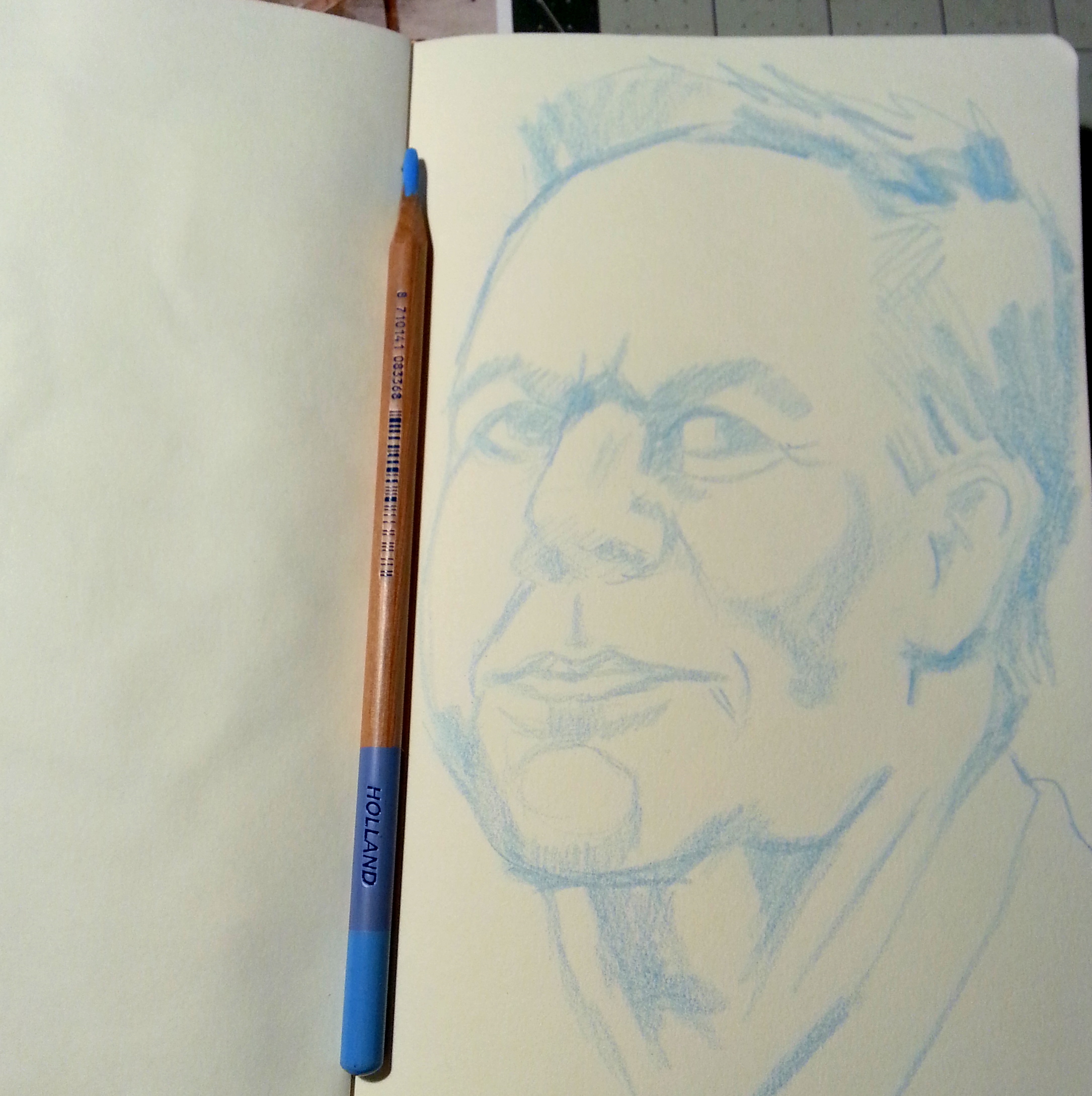
Many watercolor pieces start out with a sketch. I like mechanical pencils for starting a watercolor painting. There are a lot of brands available, but I’ve been particularly in love with the Uniball Kuru Toga which you can get at Jetpens. I prefer it with a B lead. You can really use any pencil, but a good one is a joy to use.

As for paper. This is greatly a matter of preference. I’m a fan of cheap paper. I said it, I like cheap paper. I also don’t mind working in a regular sketchbook with watercolors, the cockles, wrinkles and curls don’t bug me at all. I do note that for most people, they hate this. Watercolors make even heavier papers curl. It is a fact of life and with watercolor you are going to have to deal with it or buy really really expensive paper. I strongly believe that buying paper that is too expensive encourages people to be stiff with their art. Buy cheap student grade paper to get used to using watercolors. Buy better paper later when you feel more comfortable with the materials. Fill a sketchbook before moving onto the next one. Test each color on every paper, they will respond differently.

A really nice paper for beginers and students is the Canson XL line. It is 2 sided, one side is smooth and the other is cold pressed. Compared to other watercolor papers it can’t be beat in terms of easy use, size and price. It also folds well incase you want to bind your own watercolor sketchbook. Their bristol pads also do well with watercolor.

A sketch paper that is slightly harder to find is the Clairfontaine Graft it Sketch pad. This sketchpad is simply brilliant with pen and ink, pencil and does great with watercolor. It’s thin but is just wonderful. It’s also pretty inexpensive as far as sketch pads go, $5 for a 6×8 pad. I’ve been making pocket sized notebooks out of these for awhile now and they are just awesome.

Some basic sundry items you should look into getting: a spray bottle for moistening your pallet or one of these, an assortment of rags, some plastic cups to rinse your brush- one for dirty-ish water and one for clean and maybe something to store all your stuff in. Keep your brushes safe somewhere!

Some Observations: On Paper and Frisket

Iv'e been working on a variety of papers, settling on Canson's XL Watercolor paper, for a variety of reasons- it works well with the watercolors I'm using, it's cost is nice and it has a relatively smooth surface that my pens rather like. It's also got 2 sides, a right and a wrong, ot a front and a back; which ever way you prefer to call it, but I like the judgemental aspect of right and wrong… In this case. Any how.

One side has a little more tooth an grab to it than the other, this is the right side. The reverse side AKA WRONG is smoother. It also has less sizing… This affects a number of things- how ink and paint react with the surface. Less size means it's more absorbent.

This is good and bad.

It's bad when you use a mask. I applied a liquid frisket rather heavily to the surface of one of my paintings and the frisket grabbed to the paper so strongly it ripped when I removed it. Quite badly. It was crazy frustrating.

I went ahead with the mixed media piece anyway, knowing my paint would adhere the ripped pieces down and it would be okay, but I had to change my plans for color and other ideas for the image, and I know that the torn piece could come back to haunt me.

Additionally in my frisket/mask adventure I've found that the frisket REALLY doesn't like the spray inks. If the frisket is too thin the spray ink "leaks" through it. A total pain in the ass. So I've learned to put on one thin coat and then a heavier coat to seal it all up.

Weekly Round Up: Videos

This week's videos are late because I had an Art Adventure on a super warm winter day! Cappuccino, breakfast sandwiches, walking around the city of Salem, and of course sketching. (Also planning for a new secret project or two destined to hit awesomeness this coming summer.)

So here you go this week's videos:


Review: Some Thoughts on Watercolors

I’ve bought a bunch of different watercolors from Grumbacher Academy to Winsor & Newton. My favorite travel watercolor set is a Cotman 12 pan set. The colors wet easily and lay down nice saturated colors. It was a  great value to get 12 half pans of color for around $20.

IMG_2824
I’ve since focused on purchasing tubes of color to replenish emptied tubes and adding a few extras. I’ve tried to buy a few different brands. If you’ve got an AC Moore or Michael’s near you, getting a tube of Winsor & Newton Artist watercolors with a 40% off coupon is a pretty good deal.*

My usual rant with any art material is that you get more out of artist’s grade than student. Why? They tend to have more pure pigment and less filler and that means you get more color out of a 5ml artist grade tube versus a 15ml student grade tube.

I’ve purchased a few tubes of Holbein watercolors at Artist & Craftsman as they’ve been having a sale. The 15ml tubes are a little pricier than the usual 5ml tubes of Winsor & Newton colors that I buy but it’s also 3 times the amount. The colors are intense.

The first time I sprung for a tube of W&N artist grade watercolor I was shocked at how much more intense the color was than Cotman and Academy colors. I was also surprised at how easily my damp brush picked up a lot more color than with Cotman. The “rewetting” ability of W&N over their own Cotman student grade colors was surprising and delightful. Creating an intensely colored wash was much easier than with my cheaper colors.

Now that I’ve discovered Holbein I’m feeling the same way about them as I did about my W&N artist grade colors. I feel like I’m getting more bang for my buck out of these slightly more expensive tubes of really intense color. So far I’ve bought a tube of indigo, turquoise blue, and sepia. All 3 colors perform flawlessly and wonderfully on everything I’ve tried them on so far. The Holbein turquoise blue is a very different shade than the Cotman turquoise. Since I rather like the color of the Cotman turquoise I may end up buying a new tube of it, but I have to say that I’ve been quite spoiled with the Holbein paints.

That being said I also tried out a tube of Van Gogh watercolor. These are larger sized tubes of color that are considered student grade. The VG colors had something going for them- they rewet on a palette like nobody’s business. A swipe across a dried out blob of red oxide brought up a fully loaded brush of intense color. These tubes are moderately priced around $4 a tube and come in sets. I’ve not tried their pan colors but the tube color is very well behaved and an excellent value.

Ink mix0042

Continue reading