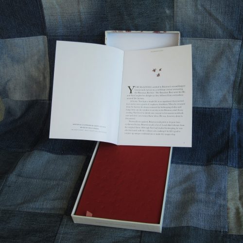
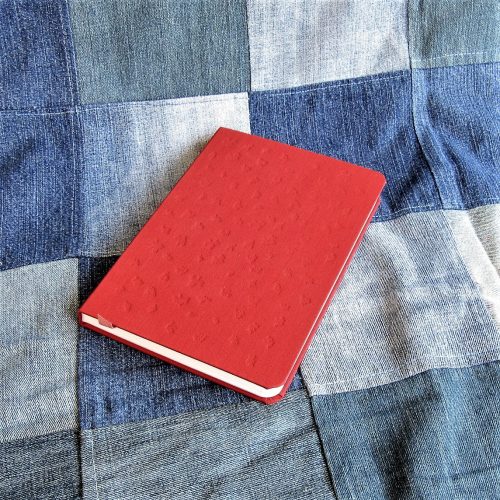
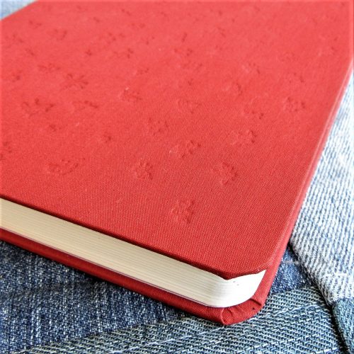
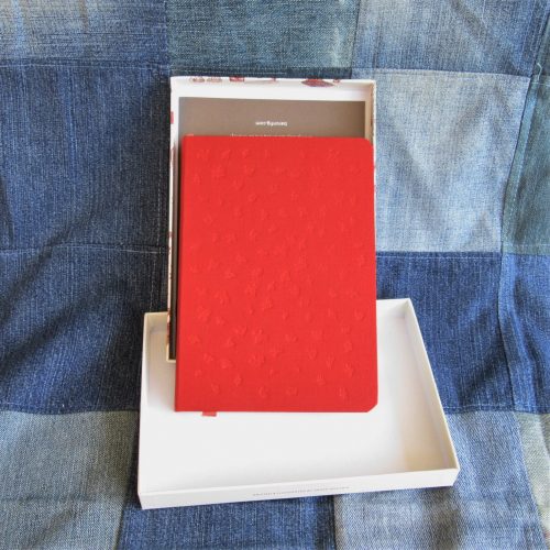
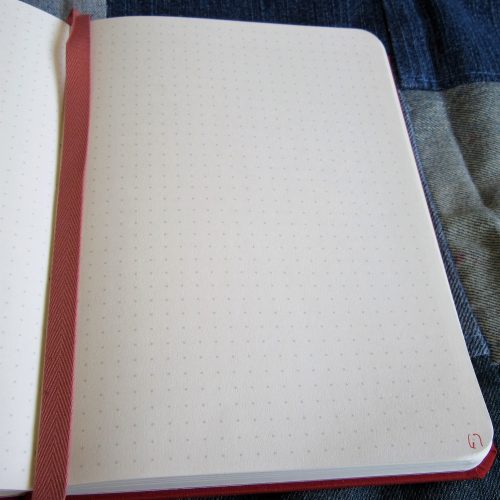
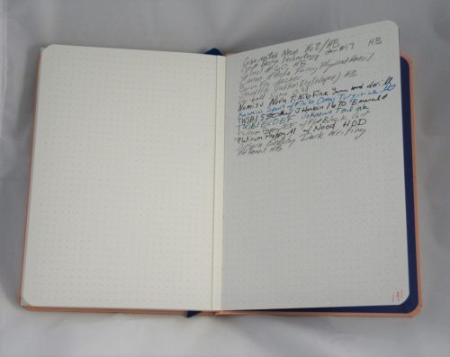
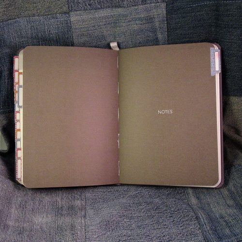
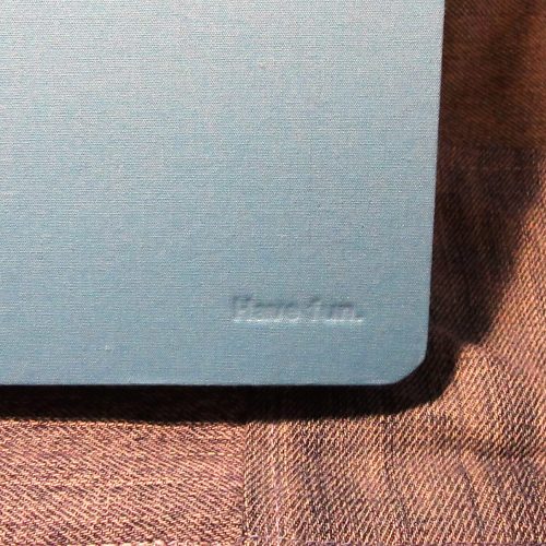
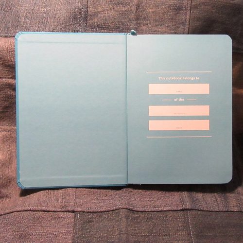
This planner begins with a Baron Fig Confidant base- a solidly built grey notebook. In this case medium, or flagship size, with a charcoal gray cover. Flagship size is 5.4×7.7 inches or 137x196mm with 192 pages of toothy but fountain pen friendly paper. The paper is off white. All ruling is light grey.
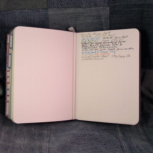
Inside the planner is where it differs from the Confidant. There are different sections, starting with a year overview, followed by month at-a-glance, then week + day view, and finally a notes section with dot grid ruling. As I’ve mentioned, the ruling is all light gray. For me, it is perfect- it disappears behind the inks and pencils I use most often, while being completely visible in regular light.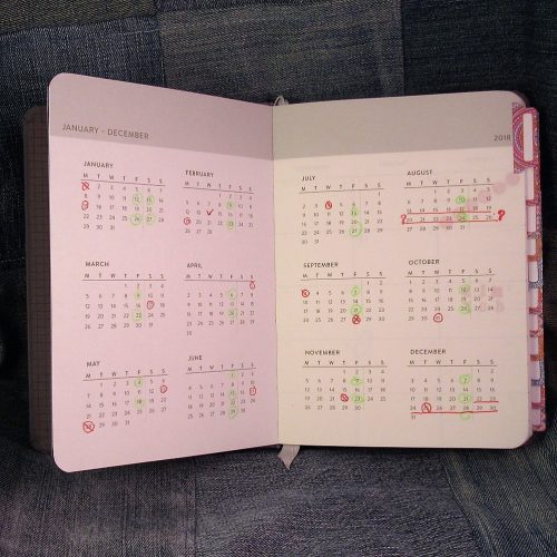
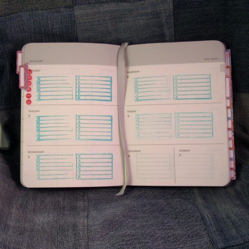
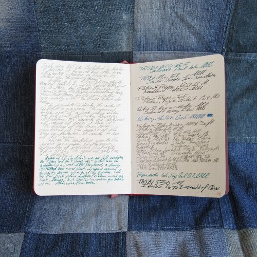
Depending on your use- the week + day view might be perfect. I’m in a profession where I need to schedule myself by the hour on the hour- so I needed to add in times to each day. I looked for self inking stampers but found none that would work for the available space. I picked up (and was gifted) a few number stamps as well as to do list stamps. Combined with an acrylic block I am able to stamp each week and day with 9am-7pm along with lines. This lets me schedule clients and easily see which times are open. In the past I didn’t need to have the hour marked out and this planner would have worked really well for me. I like the generous openings for each day with smaller spots for weekends.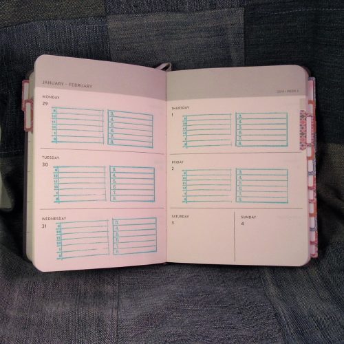
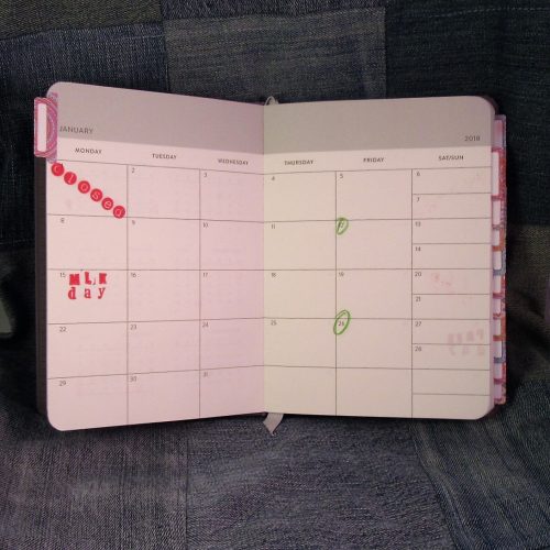
The month at-a-glance is useful for planning vacations, paydays, and other activities. I also found the year overview useful to track vacations and days off. In the monthly section I used rubber stamps to label holidays and days the office is closed. I then used these to easily find the same dates in the weekly planner section to also easily label those same dates. This way when it comes to scheduling, it’s easy as can be.
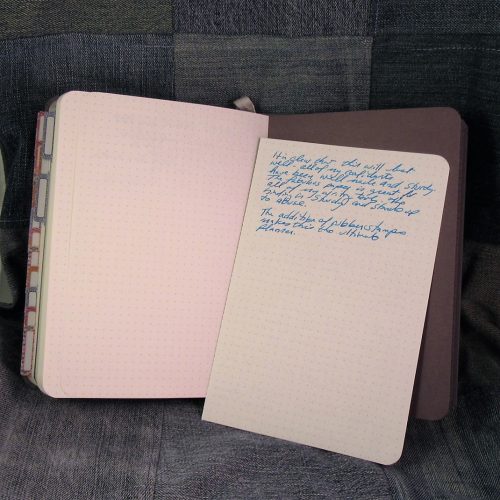
I had never used rubber stamps in a Confidant before, and there are some important things to be aware of. First if you are stamping something with a lot of “black” area and you are using a REALLY juicy wet stamp, it will soak through to the verso. It stops short of completely soaking through but it is visible. Because the paper is good for fountain pens, it does take a really long time for pigment in to dry. I used a blotter sheet while I was quickly working, and even after an hour, the in was still wet. Use of a heat gun to dry pigment ink is totally necessary. Stick to fast dry ink pads or keep your heat tool handy.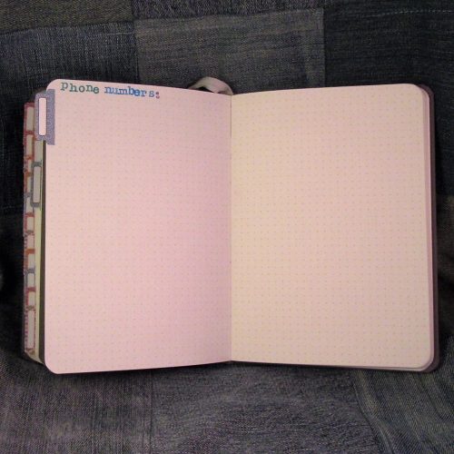
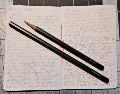
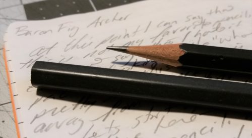
Because the paper is so good for ink, ink looks amazing on it’s creamy surface. I have been very pleasantly surprised by how nice the stamp inks look. I’ve used red, teal, indigo, and pale teal and it all looks wonderful. The cream paper does darken everything by a shade or two. But it looks great. The stamps are crisp and edges neat, except where I used too much pressure. I’m able to write names into the lines easy as pie, and the ink looks great. Pencil also fairs well enough. Once the stamps are set pencil erases off the page and the stamp is still strong and vibrant.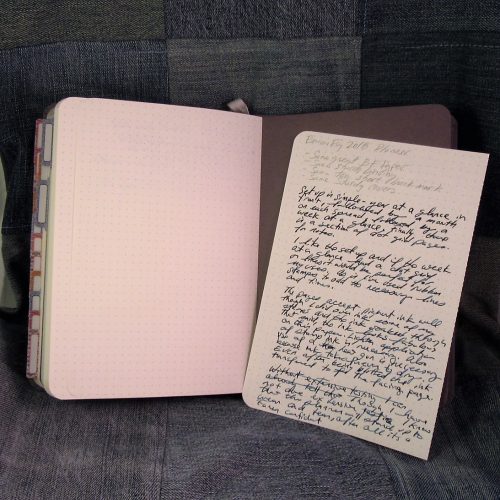
Overall, with just a first look at this, and basically setting up the planner for use next year I’ve found it to be pleasant and well built like any Confidant. A year in my bag will tell me how well the cover stands up to abuse and coffee, but based on my use of other Confidants I suspect it’ll fair just fine. As with any planner if it will work for you is really based off the week at-a-glance layout as the bulk of the planner. I suspect I’ll be using the Saturday and Sunday spots for to do lists as I keep my outside-of-work life separate from work.
You can find the planner here.
Continue reading →
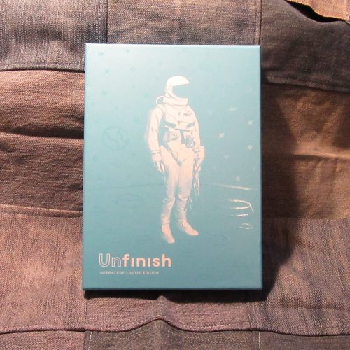
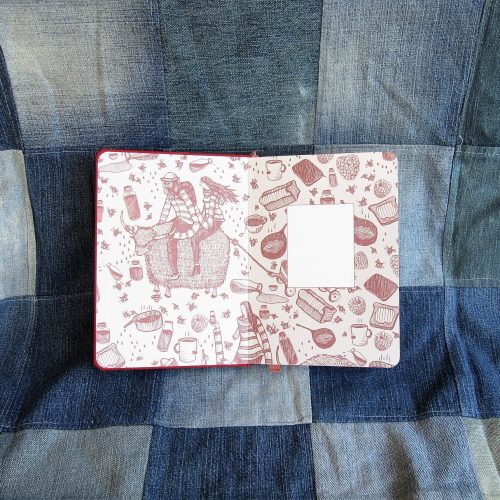
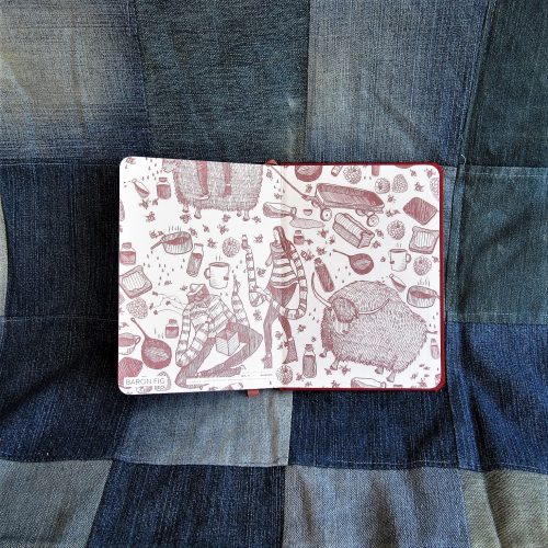
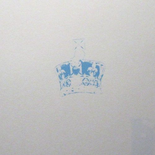
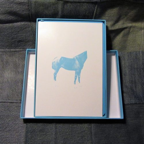 So in comes Unfinish, delightfully weird and a dash wacky all printed up in non-photo blue. No weirdo lines, just little images that aren’t finished. If you doodle this might be your dream journal. If you just want a Confidant you can write in, don’t fear, the printing is pale enough that it disappears behind your writing- whether you use blue or black ink or graphite. There are no lines just unfinished little images throughout the book. You need lines? Hit up The Well Appointed Desk for some printable line goodness.
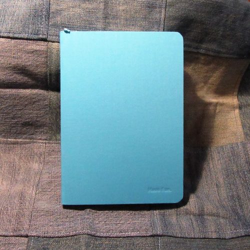
 I find the little images kinda cute and silly. If I wanted a journal to doodle in with a bit of a prompt, this would be a good choice. Some of the images remind me of Keri Smith’s “Wreck This Journal,” i’m not sure why, but they do. It also reminds me of Dada and Fluxus, and a bit of surrealism. Look up Hannah Hoch for more Dadaist goodness.
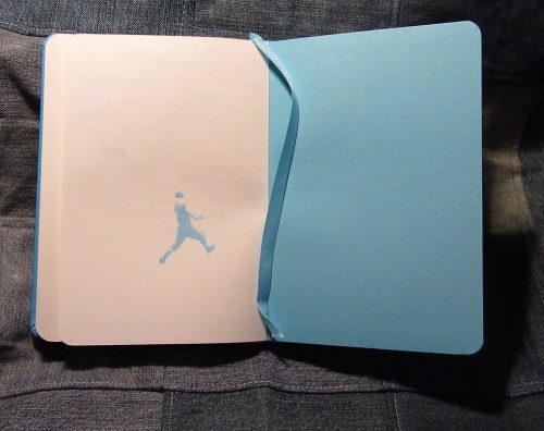 Unfinish sports all the same goodness that all Confidant notebooks have- solid fabric covered hard covers, smythe sewn, quality paper that is FP friendly and nice with pencils, and a too short bookmark.
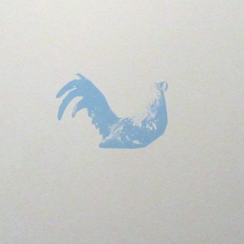
 In short, it is a lovely, if quirky, notebook or journal. It won’t fit the needs of some folks, and will likely incite passionate debate in the stationery forums, but for those who will love it, they will do so with excitement.