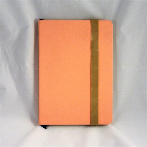
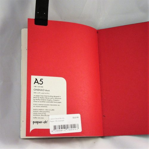
The Yoobi Journal is available in 2 sizes and styles: The vinyl covered 12.7×20.95cm or 5×8.25 inches which retail for $6 and the paper printed 8.5 x 6 inches and retails for $7. This review is for the vinyl covered version, though I’ve used both and the interior is the same.
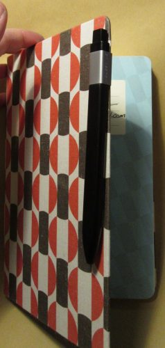
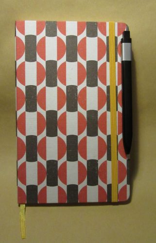
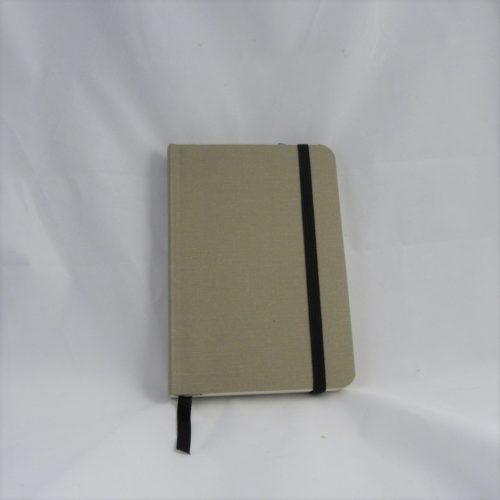
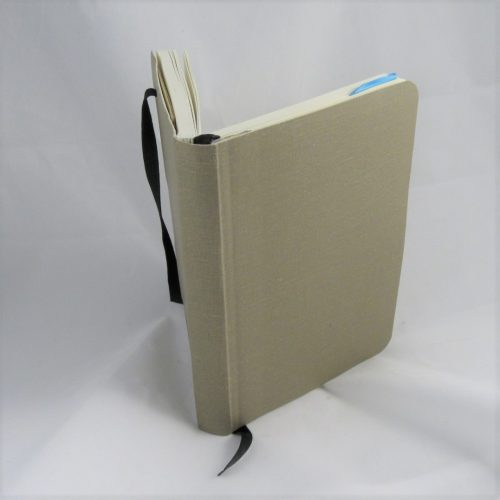
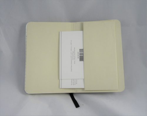
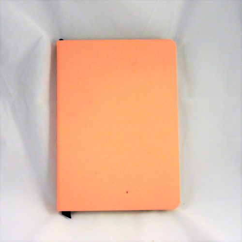
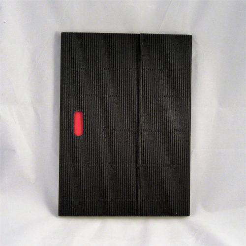
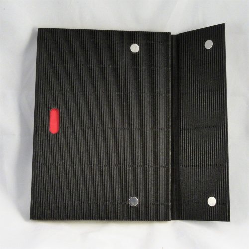
The Yoobi Journal is just another vinyl covered journal/notebook. It breaks no new ground in the category of Moleskine knock offs. It’s got a hard vinyl cover with matching elastic and generously long place marking ribbon. The ribbon is heat sealed to prevent fraying. The corners are rounded. It lacks a pocket, but that is no big loss for a journal meant for writing. There is a 3mm overhang on all edges. They are available in a range of colors and prints- aqua, blue, pink, purple, white, and black. Sadly, they aren’t yet available in the new Yoobi color of coral.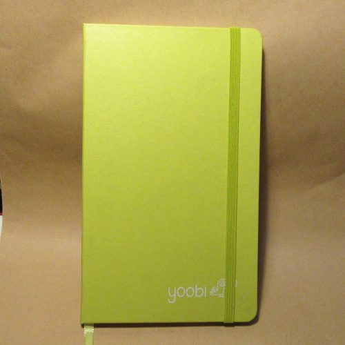
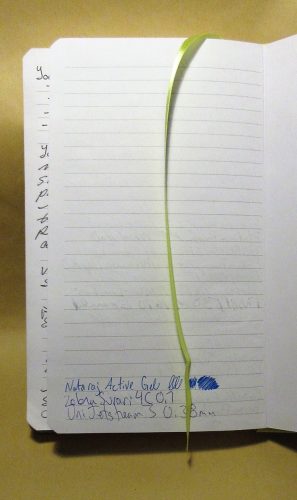
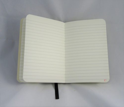
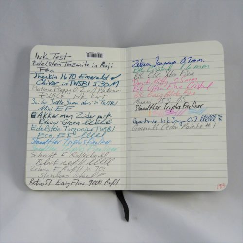
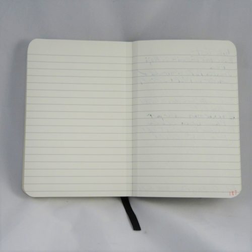
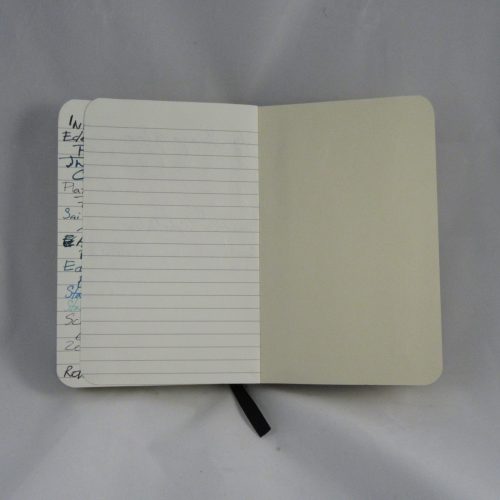
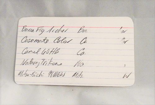
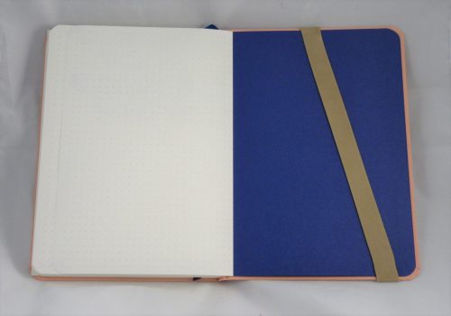
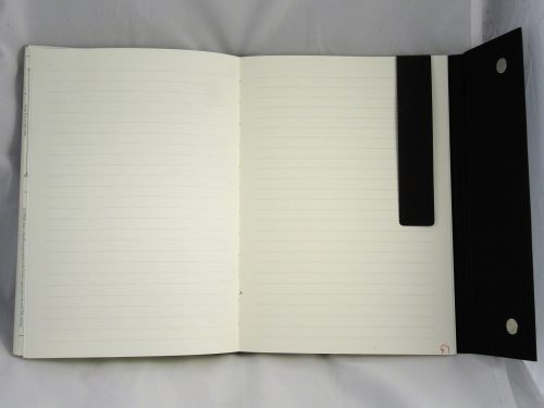
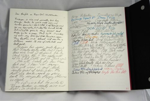
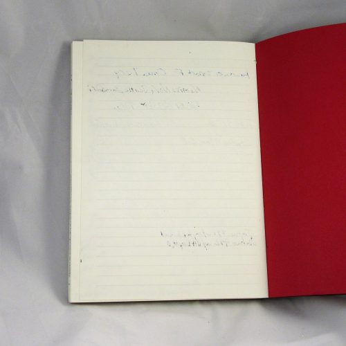
Inside is a book block that is smythe sewn. In some of the signatures there is glue creep along the stitching, but I’ve seen worse. It bears mentioning. There are 160 pages of off white paper. The lines are thin and gray. The ruling is 6.5mm and does not go to the edge of the page. There is a 1cm gap around the page and a generous header..The color is pale enough to disappear behind my writing with most colors. If you’ve been reading this blog for awhile you know that this pleases me greatly. The paper is smooth but has enough tooth to be very nice with pencil. It does okay with extra fine and fine fountain pens, but those gushing mediums and broad nibs are going to soak through. The EF and F did have a tendency to show through but not bad enough to be a deal breaker. These really shine with pencil, rollerball, ballpoint, and gel inks.
The cover is able to be folded over onto itself for writing in hand. The covers are stiff enough that this is comfortable. The notebook does lay flat on a desk even when first opened.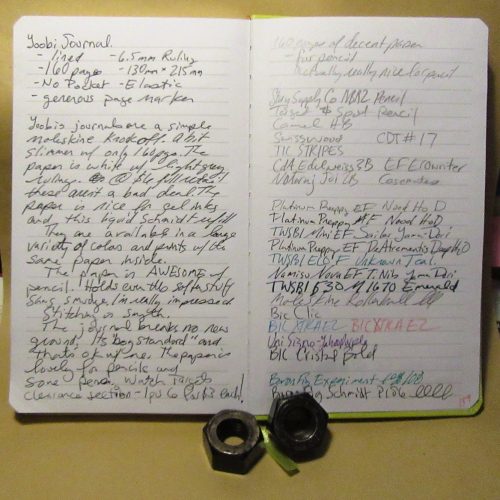
It has the bonus of being inexpensive even at full retail. If you are patient, you will end up finding them on clearance for half price at Target or even the Yoobi website. I have picked up all of my Yoobi Journals for $3 each. This is a great value. This is a budget journal that is serviceable and tough. That vinyl cover stands up to abuse. I’ve been carting one around in my backpack and abusing it for months now and you’d barely notice the wear.