Tag Archives: ink

Drawing-a-Day: Introduction

I’ve been toying with the idea of doing a drawing/ painting-a-day blog for a while now. I’m still debating doing it for a year. Traci Bunkers (click her name for a great blog link) tweeted that I should try it for 30 days. And well, duh! I’ve been reading her blog with her 30 day experiments for awhile now and think that she’s right 30 days is a good start for my commitment phobia to gravitate.

So for the next 30 days you’ll find a post of a drawing done the night before. I think I’ll working my Graf It pad and my Rhodia Dot Pad, both are A5 or 5.75×7.5 inches in size, acid free and archival. I’ll be working in pen and ink, perhaps with spot watercolor. There will be a paypal button so you can purchase the original work, pricing on these will be $25 shipped via USPS to CONUS in a clear archival baggie with a certificate of authenticity. Should it go well I might extend the project.

Drawing-a-day posts will go up on here at noon EST and will feature work from the day before.


Review: Clairefontaine Graf It Pad

One of the other sketchbooks I received from Exaclair was the Clairfontaine Graf It pad. I’d seen these on several occasions at Artist & Craftsman and passed them by due to the cover being… well, kinda lame*. In addition to the plain black grainy text and images, each cover is made with various colors of card stock that folds behind the staple bound pad. The back is supported with sturdy heavy chipboard. Each page is microperfed for easy removal. The perf is sturdy enough that you can turn the page and it won’t tear out, unless you want it removed, it stays. The pad is often sold on American websites as “6×8.” That may be the outer dimensions of the pad but the actual sheet size is 5.75×7.5 inches. There are 80 sheets in each pad.

I did my usual battery of tests on this paper and it withstood them all. I have to say that this paper is amazing. Though it’s only 90g (41lb) it’s super sturdy and accepts a lot of media without issues. It takes some serious effort to get stuff to soak through. When I say stuff I mean ALL the stuff I’ve tossed at it. See the pic below.

Ink mix0044
With watercolor it accepts the color well. The paper cockles as is expected with paper this thin. I find this to be a great paper to experiment with techniques and color. It responds well to puddles of water as well as thin washes. Color stays true and doesn’t get muddy on the page.

While drawing with ink I was able put down multiple layers of ink without cockling and bleed through. Heavy layers that would have bleed through many other heavier papers did not bleed through on this paper. Noodler’s black bonded with the paper well enough that I didn’t worry about it lifting much with my water brush. Colors seem to pop off the page.

I did try gessoing the page but I don’t see the point as the paper is tough enough to survive most stuff without the gesso. I also scrapped acrylic paint over the page to see how it would work, and it worked just fine. This paper is also amazing for pencil. It has just enough texture and tooth that pencil feels really good on it and it hold a lot of graphite, so darks are really dark.

My final verdict on this pad is that it’s great. The paper is awesome. The format it’s served in is where it is lacking. I hate perforations (my own little quirk.) I prefer a pad that allows the pages to stay together. The staple binding is crap for keeping stuff together, I made a little folio out of a USPS priority mailer to keep my drawings together. For art journaling it would be a great pad to do drawings in and then cut out and glue into your regular art journal. The paper is thin enough that if you draw a face and cut it out the edges won’t be all that noticeable.

The pad is pretty cheap. I found it online for $4 to $6 the larger size is pretty reasonably priced too at around $9. These are prime pad for binding into a sketchbook. If this came bound like a moleskine or a Rhodia Webbie I’d buy it. I know that the reason this pad is so inexpensive is that its bound inexpensively, 2 staples straight through to a sturdy backer. I like this paper a lot, in fact the next time I’m at Artist & Craftsman I’ll be picking up another one of these in another size. Perhaps I’ll bind the large size into a nice art journal!

Continue reading

Wordy Wednesday: Cult of Tutu

I followed a link to an art journaling blog where I saw yet another female artist in a tutu. Afterward I tweeted the statement, “To be a mixed media artist do you need to wear a tutu? Or even like them? NO!”

To be blunt, I don’t get tutus. They are made out of plastic scratchy material, the same stuff the exfoliating bath poofs are made of and I can’t imagine they are comfortable.

I’m not saying I’m down on it, I just don’t get it.

Ink mix0043

What I wear doesn’t define me as an artist. My clothing isn’t a statement. I’d rather my art make the statement. I’m a jeans and t-shirt kind woman; I like cotton, wool and other natural materials. I look for comfort while I create. I don’t need something outward to help me find my inner creativity. I know that some people enjoy costumes*and perhaps that is what the tutu is about. Using costume to find that inner well of creativity, capturing lost childhood insight, or perhaps these ladies really enjoy wearing a tutu. It is not my place to yuck your yum, but I can say that I don’t get it

I also have to wonder, other than Salvador Dali, would you see a male artist wearing something like a tutu? In part I’m somewhat uncomfortable with the idea that female artists have to dress up and play a part to sell their art. Peddle their wares like a carnie, “Win your lady a stuffed teddy bear here!” “Strong man competition, ring the bell, win a prize.” “Hooooot sausage and peppers, fried dough, cold lemonade”

Tutus and tiaras, 2 things you’ll never catch me wearing.


Continue reading

Technique Tuesday: Faux Ink Wash

A technique that I’m asked about on  a regular basis is how I get that watercolor effect with my ink drawings. First I start out with a regular ink drawing like the one below. If I know I’m going to use this technique I try and use inks that don’t dry waterproof, eternal or bulletproof.

IMG_2819
The next step is to use a waterbrush to pick up ink and move it around on the page. It takes a little practice to get the “right” amount of water and ink to get the value/tone you want but after you get the feel of it, it’s effective.

IMG_2818

Thursday Review: Pelikan Pelikano Fountain Pen

I like to draw with fountain pens. Now that I’ve discovered the joys of Noodler’s inks (a full post on those coming up soon) I have felt the need to buy a few more pens. I own now a mix of around a dozen pens, of which I keep 6 inked at all times. It’s a bit much. When I’m sketching I find I reach for one pen over and over again. That pen is my Pelikan Pelikano medium point in blue. I keep it inked with a blue or a blue black ink at all times.  There is nothing special about this pen. It’s an inexpensive school pen that lays a nice medium line and a lot of ink. It’s comfortable and easy to clean.  I’m not worried about breaking it or tossing it around because it was pretty cheap.

The important parts about this pen for you to know is that it has a medium point steel nib, it is what is referred to as a “wet” writer, in that when it puts down a line of ink it’s generous in the amount of ink in that line. This means my blacks are truly black and I can blend those lines with a wet brush.  The steel nib is stiff and doesn’t have much line variation but can be abused. I’m not gentle with this pen. I tend to have a heavy hand and it takes that abuse and keeps on writing.

The body of the pen is translucent frosted blue plastic. It’s not gorgeous and it’s not ugly, like most school pens it’s functional. You don’t want to have a pen your classmates will steal, they won’t steal this one. The cap is brushed steel or aluminum with a plastic clip. The pen isn’t going to win any design awards but it works. This pen is a cartridge or converter pen. I hate cartridges and I’m not overly fond of converters, each holding 1ml of ink, sometimes less. That’s not a whole lot of drawing for me. I converted this one to what is called an eyedropper pen by using outdoor grade silicone caulking to plug the 2 vent holes in the end of the body. The body now holds 3ml of ink, which is a whole lot of sketching and drawing.  While not a difficult job it was a tad fiddly to do but has held up for several months of sketching and drawing. Alternately someone could refill the cartridges with a syringe.

I’ll tell you about a couple of other go to pens I use for drawing soon.

Here is a picture I drew using this pen and a few others as well as a brush pen.


Another wine bottle in inks

Review: Noodler’s Flex Pen December 25th Edition

The pen I’m reviewing today is something I bought on a lark used off the Fountain Pen Network’s for sale page. I have to say that the Noodler’s Flexible Nib pens have been well marketed and sought after by many pen enthusiasts. Especially those like me, who are interested in pens on the lower end of the spectrum of price. This pen fits that bill. Its suggested retail price is $14. Noodler’s has come out with several special edition pens; the flex nib that I purchased is the December 25th red and green edition. I purchased mine used for $10, shipping included. It’s a piston filled pen that hold 1ml of bottled ink.

IMG_2741
IMG_2741
IMG_2741
IMG_2741

It’s a nice cheery red color with marbling throughout. The marbling is supposed to be green but I notice little if any green in the marbling. The nib is steel and an unusual design. It does not have a vent hole, instead it’s got a very deep channel cut into the feed that allows a lot of ink to flow. It’s labeled as a flexible but most users report that it’s a semi-flex given the amount of pressure needed to flex the tines. The nib reminds me of a crow quill dip nib. It starts as an extreme hairline point that I’d label as a double extra fine. Flexed fully I’d call it a double broad.  With normal writing or sketching pressure I’d say it writes a fine line.

While I was writing I found that my traditional cursive, learned way back in 3rd and 4th grade adapted itself well to the flexed down stroke with this pen. It made it look old fashioned and could be useful for meditative and mindful journaling. There are a lot of tutorials out there for scripts that use a flexible nib. Writing with this nib is NOT the easiest thing ever. In fact I’d say my forearm got quite a workout. I’ve decided that to better learn how to use this pen I’m going to start filling out all the forms at work with the pen, in script. I figure that using it across the day will make life more interesting, give my forearm a break and exercise throughout the day. I’ll also get a lot of practice in USING the pen.

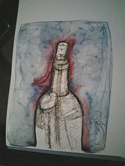
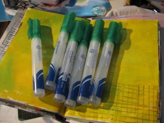
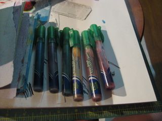
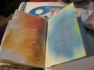
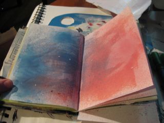
For the artist the place where this pen really starts to sing is in sketching. Flexed it’s not going to keep up with a rapid pace, but the hairline is great for putting down a few delicate lines and then regular pressure gives you a nice fine line. When flexed it gives a nice solid line that is great for shading. I tested it out on a variety of papers. This pen lays down a HEAVY line of ink, especially when flexed frankly you’ll need to find a sketch paper that can handle the flow. Papers that worked well: watercolor paper, better quality drawing paper, Bristol, and heavier sketchbook paper.  Using this nib on gesso’ed paper is going to cause issues. Gesso is gritty and gritty surfaces grind down nibs. Writing on gesso will ruin this nib (and most) fast.

Some images of the various papers:


  • Ink mix0025
  • Ink mix0021
  • Ink mix0022
  • Ink mix0023
Ink mix0023


Here’s my verdict for a $14 pen it’s a lot of fun and worth the money. I have pretty strong forearms and hands and I found using this pen tiring for writing. If you have a light hand this pen will be very difficult for writing use. For drawing this pen really shines in its flexible line width. It does take some practice to use but it’s enjoyable and creates a really dynamic look. It’s comparable to a crow quill dip pen in line variety and it less likely to shatter with heavy handed pressure. It does take a heavy hand for writing to get the full flex out of it. It’s a very adaptable little pen as you can adjust the ink flow pretty easily. (Goulet pens is planning on doing a how to video on this and I’ll link it up when it hit.)

I found the slower pace forced by this pen great for meditative thoughtful writing. It took some practice to get something decent, well that’s something we can argue, but passable.

The major con of this pen is how slim it is. I might try fitting the nib into a pelikan body and see if it’s more comfortable. The flex forces a less relaxed grip and less comfortable writing style that I’m accustomed to, but then again, you aren’t really meant to write for 3 hours with this thing. The second con of this pen is that it holds only 1ml of ink, which is the same amount as a cartridge, and yes I did measure it. I’ve gone through 2 fills of Private Reserve Sonic Blue ink.


Custom Portrait Commissions

By  now you are all well aware that I enjoy creating portraits. I’ve worked really hard to have my own style but retain a sense of realism. I’m excited to now be able to work on commissioned portraits. If you are interested in having me create you a portrait please email me.

More information:
I work in a style that is very me, so be sure you have browsed the gallery of my art  to be sure you like my style. I work in black ink and create sensitive cross hatching to create areas of shadow. The background of the portrait will be painted in one or two colors, which you may leave up to me or specify. If you have me working on a portrait of your daughter and her favorite color is violet I’ll mix a shade of violet and have you okay it.

As the work progresses  I’ll email you progress shots and include you in the process as much as possible. If I’m able to do so I’ll record the process and create a video. When you see the finished piece you won’t be surprised but simply overjoyed.

I like to keep my pricing reasonable. The prices are based on size and materials used.
Pen and ink with single color watercolor background on acid free archival paper, single portrait:

  • Trading Card: $20
  • 3×5: $35
  • 5×7: $55
  • 8×10: $80

All sizes except the trading card size are matted and bagged in a KrystalSeal bag. The trading card size will arrive in a standard trading card sleeve. All pieces will come with a certificate of authenticity.

Email me here.

P7294648
P7294648
P7294648
P7294648
P7294648

I also create unique one of a kind portraits in mixed media. The background is a combination of collage and acrylic paint with sketching and writing within the layers. In the area I would like to create the face I scrape an ultra thin layer of white paint, on which I draw the portrait. The portrait is drawn in a variety of colors. You can request that I work bright and I’ll use a bright color to start the portrait instead of gray. The image is built up of layers of gray, white and black. Around the portrait I’ll layer more stencils and more layers of bright acrylic paint. I may add a variety of other media to the portrait if I feel it needs more texture or particular pops of color. These portraits are 11×14 in size, come with a 16×20 mat and ready to be framed in a standard size frame. Each will also arrive with a certificate of authenticity. These portraits are $75+shipping.

IMAG0176
IMAG0176
IMAG0176

Inspiration and technique: Susan Cornelis: Soul Collage

I really really love Susan Cornelis’s work. She does some images of chickens that I simply adore, but I”m also a fan of her collages and sumi ink drawings/ paintings that she calls Soul Collages. It looks to be something of an automitic drawing process that involves sumi ink poured onto a wet page, manipulated with various tools and then collaged on with color added. It would be a great way to work out ideas, get inspiration and to work yourself out of a rut. This could easily be adapted to working in a spread of a journal- smooshing pages together to manipulate the ink. Reminds me of a rorshack test.

Spray Ink How to

Initially I got this idea from a youtube, I can't remember the name, her video was about alternatives to Tattered Angels spray inks. At $9 for a bottle the inks are expensive. I found some walnut spray ink for a 4 or 5 oz bottle for the same price. That's pretty pricey to me. She used an assortment of alternatives, Kool-Aid, ink etc.. What caught my eye was her use of stamp pad refills.

You'll need the following:

  • 1 bottle isopropyl alcohol, I got 91% but you could go 70% ($1)
  • 6 Hand Sanitizer Pocket Spray bottles. Mine are Walgreens brand but any with a removable top will work ($1.50 each) Each container holds .75 ounces of liquid
  • 1 package Posh Impressions Inkabilities 6 pack refill inks ($15) I got the Earthtones set. Adirondack Sells 3 packs for $10 with larger bottles in a greater range, either brand will work. I liked the selection for the price of the Inkabilities
  • PLEASE keep in mind that isopropyl alcohol is FLAMMABLE. It would not be a good idea to have an open flame while using these as the spray will light up. THIS IS A FIRE HAZARD. I Do not take any responsibility if you do something foolish and burn down your house or apartment.

What to do:
First empty out the hand sanitizer spray bottles. I saved mine in an almost empty bottle. I don't use the stuff, but Christie does. Wash the bottle in warm water. I rinsed until I could no longer smell the stink of the sanitizer.
Then I cleaned the sprayer out. To do this I filled one of the bottle with alcohol, and squirted 3 pumps through the spray head. Then I pulled the spray head out and sprayed until it ran dry. Good enough.
Then I filled each container half full of alcohol.
To this I added about 20 to 30 drops of ink to the alcohol*. twist the cap on tightly. Really tight. Shake.
Spray. Check intensity after the ink dries. Add more ink 5 drops at a time to get the desired intensity.
Now spray to your hearts delight.
My intent is to get some spray paint effects and increase my love of hand cut stencils…Tell me in the comments what you think and link to pages where you use it!

Some pics:

IMG_1443

IMG_1444

IMG_1445

IMG_1446

IMG_1448

You might be wondering why I'd choose to use a hand sanitizer bottle instead of the Ranger little spray bottles. The hand sanitizer bottles are 2 for $3 regular price. I've seen them on sale at CVS for $1. The Ranger spray bottles are 3 for $5. It's a 16 cent difference to the regular Walgreens price, whcih isn't much. But I also know that the hand sanitizer spray bottles are pretty robust, designed to spray a gel in a very fine mist. That fine mist is what I'm looking for. The Stampington spray bottle I've used spatters, I think it's supposed to but I find the effect annoying. I also wanted to find a new use for something a lot of people might already have around. I know a lot of people use these spray bottles. They are designed to be tossed around in a purse so I know they are sturdy and don't leak as long as the cap is on it. Also as something that is designed to hold something that is alcohol based I know it will stand up to the abuse well. Not everything will tolerate the abuse of alcohol. Also these little hand sanitizer bottles only hold .75 ounces of fluid.

IMG_1447

IMG_1450

IMG_1452

Also, thought not pictured I mixed a 50/50 mix of alcohol and india ink in a Stampington spray bottle and holy shite it's awesome. Anyway, everyone should try this. the total cost for me was about $25 for 6 colors not including the india ink.

Somethign else that is great that you could get extra spray bottles and mix colors- 10 drops yellow, 20 drops green for yellow green or 10 drops glue and 20 drops green for blue greens. You could create a completely individualized line of colors for your journal. ALSO you can remix fast and easy. It would take a long time to go through those refill.

*Do this step in a place where your floors are an easy clean up, becuase if you are like me and knock over your RED sprayer before you get the cap on it, it makes  a god awful mess. I can't image what it would do to grout. This stuff stains. However as it is alcohol based alcohol and the saved hand sanitizer does a great job of lifting it off hardwood. Trust me I know, it came off my oak floor very well. I'm really glad I have down a vinyl sign as a safety mat for my slobbery.

Staples Paper Review

I decided that I would do some testing of the new Staples brand paper, which I have from a reliable source is manufactured for them by a major paper brand. (I’ll do a post on that soon.)
So I tested the 3 papers I wrote about in my previous post here.

The first paper I tested was Staples brand 65lb coverstock. It’s thick, stiff and smooth. It’s quite enjoyable to write on, accepts all inks well without noticeable feathering or strikethrough.


Img_4808

The next paper was the Staples brand 5 squares per inch graph paper. As much as I don’t like to sew it up into a book I was surprised at how much I liked writing on it. The paper is very lightweight, very smooth and takes ink well. I noticed a little feathering with the fountain pen and the Staedtler liquid point. There was also a lot of strike through with most pens, however the following pens showed little to no strike through- Uniball Jetstream- all colors and the space pen. The thicker pens with more liquid ink had more strikethrough.


Img_4809

Img_4810

The next paper was the Staples brand 20lb paper in cream. I found little strike through on the paper with the exception of a red liquid ink pen in .7mm. I should check it out with a thicker fountain pen and see what happens. Again I was pleasantly surprised at how nice this paper was to write on. While not the same experience as a Strathmore 100% cotton it as a very nice feeling paper with all the pens. The fountain pen ran smoothly over the surface and the more fluid inks didn’t feather, with the exception of the red ink, which gives even the thickest of papers trouble.

Img_4811

Img_4812

I was pleasantly surprised at the quality and enjoyability of the Staples brand paper. I found the coverstock to be more pleasant than some of the other cardstock I’ve used for hedgehogs. All papers were listed as acid free on the package.