Author Archives: leslie

Review: Nataraj Metallic and Glimo Super Black Pencils

Nataraj pencils are made and distributed by Hindustan pencil company, much like my previously reviewed and adored Casemates (which are distro’d by Walmart). I picked up these two packages of pencils from the ‘zon for $4.99 each with free shipping. Each pack holds 10 pencils, a white plastic block eraser, and a plastic sharpener. For anyone keeping track, that’s about 50 cents per pencil, though factoring in the sharpener and eraser it is about 42 cents per item in the package. The package itself, I should have taken a picture, was well done. The pencils were in a tough plastic envelope, then in styrofoam packaging, and the 2 boxes were wrapped like a gift inside the protective foam package. All in all it was like unwrapping a slightly bizarre gift. Shipping did take about a month. It reminded me of old school mail order. Ahh memories. After unwrapping my gifty to myself I was greeted with Nataraj’s fun pencil packaging. While companies selling in the US seem to have moved toward clear plastic shrink wrap and stickered belly bands, Nataraj uses cardboard boxes. Each package matches the contents well. The Metallics have a metallic box with a pebble finish, while the Glimo has pastel colored diamonds in the colors of the pencils. The Glimo has a diecut window. The packaging is nearly identical except for package date stamps and a line that the metallics meet international quality standards. My pencils were all packaged in 2015, so they aren’t particularly fresh. But then pencils really seem to last forever if stored properly.

Anyway, inside the packages are some nice metallic pencils. The Metallics have gorgeous jewel tones that really shine. The camera cannot pick up the color well at all. It’s seriously glimmery and shiny and reminiscent of dragon flies of nice metallic flake paint on a car. They sport a nicely done and jaunty white and black end dip that looks awesome with the metallic paint. There are blue, purple, green, and red. The Glimo features silver stripes with a coordinating pastel colors of magenta, pink, peach, yellow, and pale teal. The end caps are a nice thick dip of the pastel color. The silver is barely metallic and in some the pastel shade is a touch thin, but overall these are quite well done.

On all of the pencils, either Metallics or Glimo the paint is mostly well done, with the occasional pencil with drips and runs. I had one in each box that had not only visible but runs that could be felt under my fingers. Mostly they were okay. The wood is jelutong and sharpens well in all my sharpeners. The cores are centered in most of the pencils, off in about half, and out of each box one was badly off centered, but still usable.

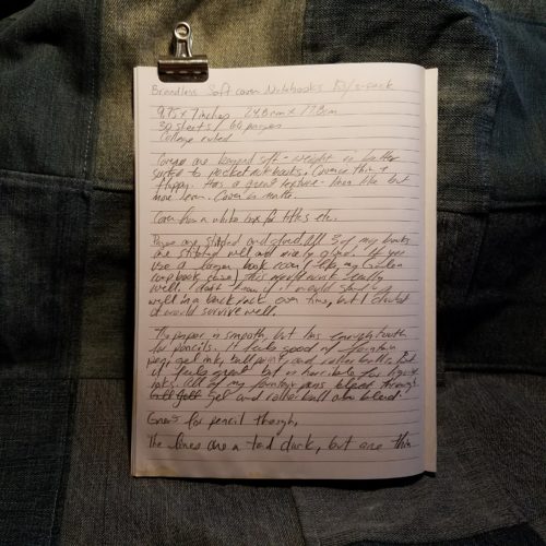
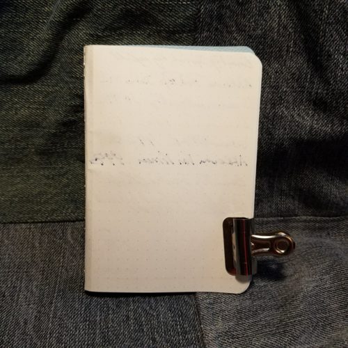
The core in these is the same, Nataraj’s “Super Black.” The super black core is very dark for writing. It is also nicely smooth and glides across most papers that I’ve tested them upon- from Yoobi Comp books, Field Notes, Story Supply Company, Life, Tomoe River, and No Brand Notebooks. (Handwritten review is done on a NBN dot grid traveler’s size.) They glide, which is the best way to put it. Not quite skate, but glide. It’s smooth dark and a nice feel. I believe this is the same core as the Casemates Premium, which is slightly different than the Casemates Neon. It’s darker and smoother. The Neons seem to have more occasional bits of grit and are slightly harder with better point retention/durability.

Speaking of point retention and durability, there is batch variation. I’ve sharpened a few of each, okay one of each color and I’ve found that most of them are almost the same in terms of how many comp book or NBN pages I get, but one, the blue metallic is super soft and even darker than the others. The rest I’d rate around a Staedtler B in terms of point retention and durability the one oddball is closer to a 4B. The majority are closer to a Staedtler 2B in their darkness. That is to say I’m able to get around 4 composition book pages written before I reach for another sharp pencil.

I love how these look and how they write. Sure they are about 50 cents per pencil, roughly 4 and a half times the cost of most of the Walmart Casemate pencils. The trade off is the better paint jobs, consistent cores, no badly afixed ferrules, and  eraser turds. That said, if you don’t want to spend the money, getting the Walmart Casemate Premium pencils is still the best priced option. That said, I immediately sharpened one of each color way and added it to my novel writing pencil cup. The fun colors and metallic sheen make me smile.

My one worry right now is that these have gone the way of the Nataraj/Apsara Pop, which have an awesome coloring scheme, and have been replaced with the less awesome color scheme of the Nataraj Joi.

Continue reading

Review: Casemate Neon Pattern Printed Pencils Hex

The current iteration of Walmart’s Casemate pencils are darn good. Made by Hindustan pencil company they feature a top notch HB core that is dark and smooth. I find the neon and multi-colored packages to be better than the plain yellow pencils. The key to getting good Casemate pencils is to look and make sure the pencils are made in India. I’ve heard other reports that these are often round. The package that I picked up is a hex pencil.

I had hoped to pick up a pack of the plain unprinted neon pencils or a package of the premium tinned pencils. Neither was to be found so I took a chance that the 30 pack of printed neon pencils was as good as the neons.

The packaging for the 30 pack is a pillow box made of stiff clear plastic, with a bit of foam at the base to protect the points, and a thick label wrapped around the belly. In a pinch it could suffice as a decent pencil case. Each tube has 6 pieces of 5 colors- pink, orange, yellow, green, and blue. All are neon except the blue, which in my package is a royal blue color. Each 30-pack is $3.24, which is roughly 11 cents per pencil.

The pencils themselves sport a standard Hindustan HB core. That is to say it’s silky smooth across most papers and is nicely dark. I’ve found very occasional bits of grit in some of my pencils, but this is rare and to the same extent that I find them in much more expensive pencils. The core has excellent point durability/retention. I get a few pages from a sharpening with my Carl A5. The wood is jelutong which sharpens well but has no distinct odor that I can detect*. It is lightweight and I have grown fond of the look of this wood. It ranges from pinkish tan to nearly white to speckled. All of my sharpeners handle it well.

The paint appears to be a layer of white, with neon atop that with an overprinting of a very thin coating of black. The black is nearly see through in some areas and the neon colors definitely pop through the black patterns. The black patterns are a pox upon an otherwise lovely pencil. On my pencils- every single pencil the printing is crooked, the grade designation is not only off center of a side, it’s often printed on a hex point and at an angle. Further the crooked printing is overlapped in some areas and not others. The patterns are also everso slightly stretched on some of the pencils. The images I’ve included in this review do not do justice to how truly abominable the print job is. It’s atrocious. It is laugh worthy. It is, as my Grandmother would say, ugly as sin.
The silver ferrules are affixed well to the pencil and hold a pink eraser. The erasers are typical of Hindustan and Casemate awful. This batch of erasers is stiff and gritty. In use they have a hard time removing graphite from even the smoothest of pages, and yet seem to lift the fibers of the page. Through repeated use I could see these erasers tearing a hole in the paper. They remind me of the old grey ink eraser like the Papermate Union.

In short these are great pencils for a very low investment. The core is wonderful, its’ just the exterior that makes these look awful.

Continue reading

Lined Notebooks and One Off Packs

I finally listed the lined notebooks on my etsy account. You can find them here and here. The first link is to the general lined page with regular 3-packs of black, recycled covers, and a few packs of other colors. The second link is to the lined rainbow Allies packs. Get it, rainbow notebooks with straight lines inside are allies? It made me laugh.

I’m testing out a feature on Facebook that they have recently rolled out- shops. Some people aren’t able to access them yet, but many are. I’ve loaded up a few sets of one off books to Facebook. If they don’t sell by the end of next week I’ll go about putting them on etsy but for now, I really want to test out the facebook shop feature. (They don’t take a cut or percentage or even listing fee like Etsy does, so it might be a good way to sell things in the future.) You can find my Facebook shop here. The one offs are made of paper that I bought years ago for art journaling purposes and never used, now I am. Many of the covers feature some subtle glitter. All the loose glitter has infected my printer, shear, corner rounder, and life.

Writing Process Examined

After NaNoWriMo I decided to start my next novel and continue writing by hand. Thus far I’ve written 66,600 words across 4 Yoobi composition books and used only graphite. The Yoobi books are significantly smoother in texture than the Norcom and Roaring Springs Comp books I used for NaNo. The tactile feel is substantially different, and I’m really enjoying the feel. I began writing on February 26th (this writing is initially being done on 3/31) so I’ve done a substantial amount of writing in the last 30 days. In fact I reached 50,000 words after only 20 days.

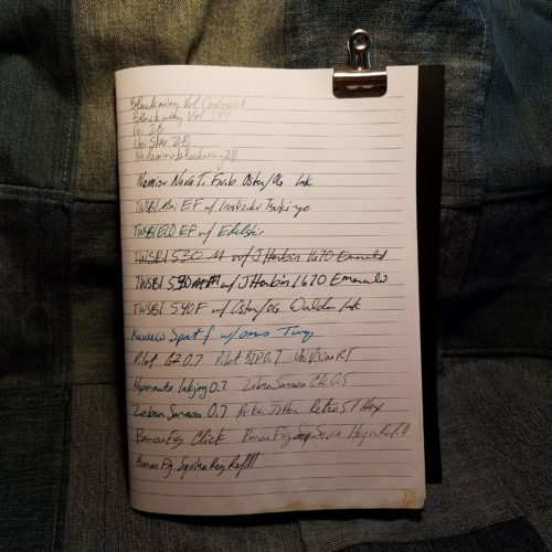
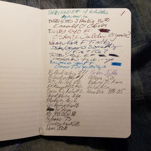
Pencils used in writing.

My work schedule has settled down to my working most days after 2pm until about 7pm with longer days here and there. I’ve had to revamp when I write. In the past I had a strict no media- reading, TV, movies, art, or writing before work. I’m prone to getting into the flow and not knowing what time it is, and have been late to work in the past. Now that I’m working afternoons and evenings, that just doesn’t work. If I’m up at 10am I need to be able to work before work otherwise I waste most of my day, because I’m often fried after work.

I’ve set alarms on my phone to alert me to about a half hour before I need to leave, and then again when I need to get out of the house so I won’t be late. The 30 minutes allows me to jot down my thoughts for the scene and where I’m thinking it will go on  a sticky note as well as wrap up the thought. It also gives me enough time to pack my bag and grab a snack. I listen to podcasts on my way to work that help me to disengage from the creative process and get into the right mode for work. (Erasables, Myth and Legend, I Should be Writing, Art Supply Posse, etc)

After work I often find I need some down time to unwind. While writing is helpful in helping me to unwind I find that reading something can be more helpful in shifting from work mind to creative mind. I often read and listen to music for an hour or so after work. Occasionally I watch TV, but I find that many of the TV shows that I’ve been watching tend to aggravate me more than relax me.* I tend to save up 3 or 4 episodes of any one show and then watch them all in one day.

Often after reading for a few hours I’ll hit up the novel again and get a few more pages down. Sometimes I don’t get to it. I’ve learned not to beat myself up if I can’t write after work or skip a day. After all, I won NaNo once, and I’m currently crushing the number of words I did in NaNo 2016. I can do it even if I take days off. So a day or two off here and there is no big deal, hell, I am now looking at it as a needed rest for my brain. The other side of that is that just because I’m not writing doesn’t mean that I’m not thinking about the novel. I’m a fan of the idea that sometimes the brain needs downtime to noodle through thoughts and figure out the sticky bits. Sometimes the downtime is needed reflective time.

So while yes the adage of “apply ass to chair” is a good one, sometimes the brain needs time to reflect without the pressure of the pencil/pen/keyboard. So long as you get the ass back into the chair after a day or two- even if it is to work on a different project, and you aren’t using the downtime to avoid the writing, the I think it’s all good.

Continue reading

Home Brew Pocket Notebooks

I intended for this post to come out BEFORE I introduced No Brand Notebooks, but alas I left it in draft form and forgot about it. That said, I’m a huge fan of open sourcing information and  I’ve offered up patterns for a bunch of my products to others for free in the past. I’ve done tutorials on many of the books I’ve sold in the past, and frankly, I think being open about the process of binding brings more people into the hobby than being closed about info. Sharing is caring and all that fun stuff. I’m a maker not a great salesperson.

Also, before anyone asks, no I will not make diagrams or take photos of the process. The images  provided should give you a good idea of where staples should be placed. Experiment and you’ll figure it out.

Any of you who have read this blog for any period of time know that my obsession with stationery started young, but was really pushed to new heights as I attempted to find a sketchbook that worked for me. As a young artist I tried sketchbook after sketchbook, flirted with altered books, used loose paper bound by rivets or contained within handmade binders. In short I used every paper I could get my hands on, destroying bindings, scrapping books with bad paper, until finally I said, “Screw it!” and started to make my own sketchbooks. Simple single signature notebooks made of junk paper from work were bound one after another after another. I acquired book after book after book on binding books. I graduated from simple single signature books with limp covers to complex hardcover tomes sewn onto cords, and intricate coptic stitches. Leather was soon added to my arsenal, and I made thousands of books filled with paper for writing, art journaling, sketching and all kinds of art making. Those were the days.

The thing is, binding books is as much an obsession as any other hobby and I miss it dearly. I miss the gathering of sheets, folding of signatures, punching of stations, the smell of beeswax as I pass linen thread through the block of wax. The feel of the stiff waxed thread as it passes through paper and card. These days I don’t get to feed the sensory bit of binding, but I have started to make my own pocket notebooks and Traveler’s notebook refills. It’s dead simple, and you can do it too. Since I’m a fan of open source, feel free to share this info or just use it yourself.

Materials:

First, start off by loading 12 sheets of your favorite paper into your printer. Head to gridzzly.com and play around with the settings. I like lines and dot grids for my notebooks. I like dot grid at 5mm and lines at 7mm. Why? Dunno, those settings work for me. I also move the slider to about ¾ of the way to the right for darkness. The lines will not come out as a true black but more of shades of gray. Test out the site and see what you like. Start with mine and go from there. For my notebooks I work the printer setting to print without margins on any side. The printer can’t flood print, so I get a .25mm border with no printing no matter what I do. I deal with it. Print the lines/grids you like on both sides of the 12 sheet of paper.

Stack your 12 sheets of paper and add a piece of cardstock as a cover. Use paperclips or binder clips to hold everything in place. If you are making pocket notebooks set the guide on your long arm stapler to 4.25 inches or 11cm. Starting from the center of the paper, place a staple at 4.25 inches, another at 6, another at 8, another at 9.75, now return to the other side and place a staple at 2.5, and one at .5 inches. You will  have a total of 6 staples.

Cut the stack in half at the 5.5 inch mark, now fold the half along the staples, letting them guide your fold. Use a bone folder or butter knife to tighten this fold. Using a straight edge, trim the fore edge of the book at 3.5 inches. I have successfully used a rotary cutter as well as a craft knife so long as I’m slow and careful. Round corners if you so desire. Placing the books under weight for a night or two will help keep the spines creased. Several large textbooks serve the purpose well, while a board with a brick or two will also work.

If you are making a Traveler’s notebook, you will place 3 staples, one in the center of the book and one at each end, .5 inch away from the edge. Fold the notebook along the staples, letting them guide your fold. Use a bone folder or butter knife to tighten this fold. Trim the fore edge at 4.5 inches. Round corners if you’d like, then place under weight for a night. I do not trim the excess off the height of my TN, the proper height is 8.25 inches.

It is ridiculously easy to make your own notebooks with a minimum of investment. A long reach stapler is now only $11 on Amazon, while years ago they cost well over $30. If you keep an eye on thrift stores you can find them for less. Often offices toss them out when the person who did the office booklets quits or retires. I kick myself for turning down an old school cast off of a booklet stapler. Oh how I regret that choice. The investment for making notebooks is minor, but the reward is well worth the effort.

If you make some notebooks I’d love to see them. Hit me up on instagram with pics.


Review: Camel HB Pencils

I have resisted the allure of the Camel HB pencils for quite some time. I told myself, “they won’t be great, they are pretty but they aren’t great.” Finally in  my last CWPE order I broke down and order 4 of them. At $1.50 each they aren’t cheap but they aren’t Caran d’Ache Stinkwood prices either.I resisted them because I’m in complete and utter lust with their minimalist design. The sleek lacquered finish, with a clean white imprint, and a ferrule-free eraser is simple pencil perfection. They are available in 2 color combinations (plus some pastel shades)- cedar with clear lacquer and a grey eraser cap and cedar with a warm honey stain and lacquer, with a off white eraser cap. Stunning. I really love how these look.

I sharpened one of each of the colorways and told myself they were going to suck, this despite the glowing reviews they’ve received just about everywhere. I’ve used them for page after page in my most recent novel in a Yoobi Composition notebook (more on those at a later date.) I’m getting 3 to 4 pages per sharpening in the Carl A5 and the same with the KUM masterpiece. Other than point retention/durability the feel of the core is smooth on all the papers I’ve tested it on. It performs well on Yoobi comp, Tomoe River, Moleskine, and various Field Notes. I like these pencils a lot. I’m bummed I only bought 4 of them. I should have bought 10, or a dozen, but more than the mere 4 I have in my grubby paws.
The eraser works admirably well, though I am loath to use it lest I grubby up the clean lines of these pencils. I purposefully pulled one off to see how it worked and the pencil itself is whittled down to fit inside the eraser just like a regular pencil cap. A dab of superglue reacquainted the two pieces and now even when I try I cannot remove the eraser.

The bottom line on these pencils, is that they have a beautiful clean design, crisp printing, a thick coating of clear lacquer, and that ferrule free eraser cap is a stunner. Overall the minimalist design of these pencils makes me super happy. The fact that they perform well means I can keep using them over and over again.

Enter No Brand Notebooks

For those of you who have been here since the start, you own’t be surprised when I tell you that I’m making books again, specifically pocket notebooks. This was, after all, my bread and butter for a good long time. Hell, it’s why I started the blog- to discuss my nerdy interest in all things bookbinding. Well, age and labor caught up with me and I have carpal tunnel as arthritis runs in the family. There are times when I can’t pull a needle though a signature of paper. The act of making stations in my signatures can be excruciating. The last time I made a serious number of books, well my wrist was in pain for days and I realized that I cannot make books in the same manner that I once did, so I put away my awl, sign vinyl, and stopped hoarding reams of paper. 

Anyway. I picked up a long reach stapler off the clearance rack at staples a few years ago. I let it gather dust until recently I wanted dot grid in a notebook and none of my hoarded Field Notes, Word Notebooks, or Story Supply Company had dot grid. I had some 24lb HP laser Jet from my experiment making my own planner books (still do this, still need to write a post about it) so I printed off some dot grid and pulled out that stapler and started making books.

For the most part this is not bothering my wrists. Which makes me so happy.

that said. I’m happy to begin offering my notebooks again. You can find them on etsy here.

Continue reading

Review: Curnow Back Pocket Journal with Tomoe River Paper

I’ve been using a Curnow Back Pocket Journal with cream Tomoe River paper for a few weeks now. In fact the one I started with is nearly filled.

Mine has a plain butcher orange card cover. Which has survived and is quite sturdy. It is the standard pocket journal size of 3.5X5.5 inches, with 48 pages of paper. Because it’s filled with Tomoe River paper it’s ultra slim and roughly half the thickness of a Field Notes or Word notebook. There isn’t anything groundbreaking happening with this notebook. The one change from other pocket notebooks is that this is stitched in a traditional pamphlet stitch with 3 holes using waxed linen thread. It’s very sturdy and has stood up to my abuse this month quite well.

The great thing about the Tomoe River paper is being able to use any and all of my fountain pens in it without fear of bleed through. I did have to worry about smudging and dry time. But to be able to use a wet medium nib was really kind of nice. I stuck to mostly using my fine and ef pens as that is what I use while I’m out and about and allows for faster dry times.

I really enjoyed harder pencils on this paper. I’m not sure why they performed so well, perhaps there is some toothiness there that isn’t perceptible with fountain pen. No matter- the Caran d’Ache Swiss Wood (aka Stinkwood) and the Les Crayon De La Maison Cd’A (aka Fancy Plywood Pencils FPP) were really amazing on this paper. I actually grew to link the Stinkwood and ignore it’s foul odor of burnt soy sauce on it’s pages. Pretty shocking. Curnow offers some of their notebooks with limited edition covers, some mined from Creative Commons Imagery* and some from artists working with them. They also offer a variety of papers. The prices vary according to the paper inside with the Tomoe River as the most expensive option and it’s the same price as a pack of Field Notes with non-fountain pen friendly paper.

These are a great little notebook and worth the cost if you want to use fountain pens. They are well made and wear well. I have another with the other paper that they use and can’t wait to crack into it.

Oddly the only way to buy these little notebooks is through facebook or email. Honestly, I hate that, but head over to their facebook page, look at their offerings and send them a message and they will send you a paypal invoice.

Continue reading

Review: Baron Fig Archer

So I’m a few days late and a few bucks short when it comes to this review. I’ve been sitting on it hoping my opinion would change. For the TL;DR crowd- it is pretty, if you like pretty, go ahead and buy them. If you want performance, go elsewhere.

I picked up a few of these from a friend for a few bucks. I didn’t want to spring for a 12-pack of pencils where the whispered undertone to all the reviews read, “scratchy.” I sharpened one up and used it extensively in a cheap Staples comp notebook during NaNoWriMo. I’ve forced myself to use it on slick as teflon Tomoe River paper and silky smooth Maruman and Life notebook pages. I’ve even jotted a shopping list on the nondescript paper in Field Notes.

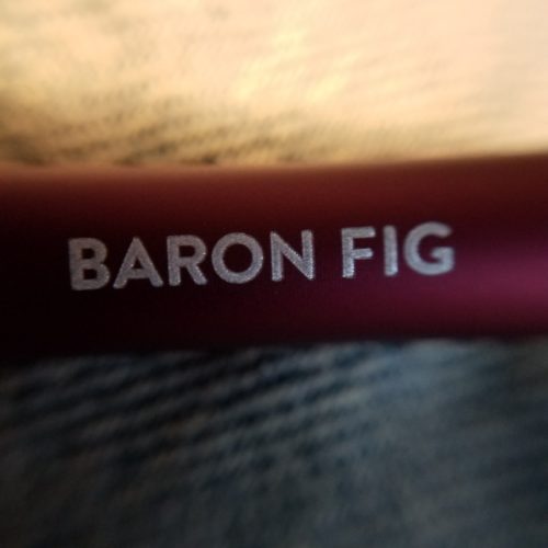
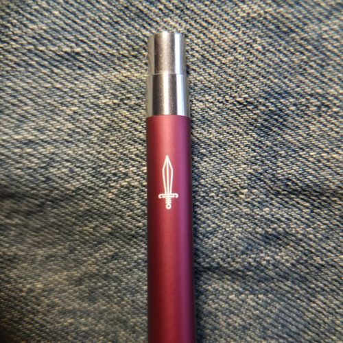
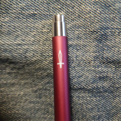
Ignoring the feeling of the point on paper, the looks of these pencils is gorgeous. The matte finished cool gray paint with a perfectly end dipped darker charcoal gray end is just pretty. It is simplistic and pretty. It works. The imprint is also minimalist- a simple Baron Fig on one flat, with a stylized arrow on the opposite- both in crisp perfectly imprinted white. The pencil is perfectly minimalistic in design. They are gorgeous to look at.

I sharpened mine in, gasp, the Carl Angel-5 with it’s dangerously chewy teeth, which chomped into the soft linden wood body.  I suggest linden over bass based off scent. Linden smells like bay leaves to me and these pencils when freshly sharpened have that dusty odor of impending kitchen magic. Linden is ridiculously light weight. These pencils feel lighter than most pencils. I have not weighed them to be sure. the absence of a ferrule and eraser make them lighter but even compared to other pencils without ferrule and eraser they feel significantly lighter. I should weigh them and and take the subjective out of this review, but I’ll leave this here to let you know they FEEL lighter than other pencils. I prefer a little bit of heft to my pencils

This brings me to the core of these pencils. Scratchy is an apt description of these pretty pretty pencils. I’d lean more toward gritty. They are the antithesis of smooth.  If you are a fan of pencil points gliding over your page like butter on a hot griddle, look elsewhere, these aren’t the fix you are seeking.  They have a durable point that lasts for a good long time. I found myself getting pages in the comp book with the Archer. But it was an effort to write with- I had to force the graphite off the pencil. Compared to *gasp* my penny-per-pencil Casemates, these were a disappointment in use. Going back to kitchen based comparison- writing with these on most papers, even the glassy smooth Tomoe River, is like spreading chilled butter on cold toast- a gritty mess that is simply unpleasant.

Continue reading

Sunday Study: The Perfection of the Paper Clip

All my stationery nerd friends said, “Read this book, you’ll love it.” Well, I have and I don’t.

When I spot a factual error in a book it makes me question all other information held as facts in the book. The first factual error I found was on page 26 where Ward states that reed pens are “filled by pouring ink into the top of the pen.” Apparently Ward has never used a reed pen because this is  hilariously wrong. Reed pens are dip pens. You soak some reed pens (bamboo) in water before use to activate the capillaries in the bamboo, but even still they are still dip pens. They function similarly to quill and steel dip nibs.. You dip them in ink. After this point I was left wondering what else was wrong.

In the section about Moleskines he writes that the “first” time a moleskine was labeled as “Made in China” was only after the company had been purchased by SGCapital in 2013. I suspect this may be a typo and he meant 2003, which was certainly before Modo e Modo was purchased. Further I remember the online uproar the “Made in China” label created. I remember my first “Made in China” Moleskine. I got that Moleskine long before 2013. In fact 2013 is long after I’d given up using Moleskines due to quality control issues. It is true that the Moley had always been made in China, and had previously been labeled, “Designed in Italy.” Further I have some issues with his “historical” facts of small-m moleskines. Yes there was one Parisian supplier that sold those made by someone Chatwin loved, but moleskines are a style of small pocketable notebooks- not just the one sold in that one shop. Rather, moleskine was used to describe all manner of small pocketable notebooks covered in oil cloth and were available all over Europe.

After this point I began to hate read the book. The section on pencils is quite good, though I’m reticent to take anything he’s written as factual given the previous factual errors. The section on King’s The Dark Half may not be totally accurate.

Ward’s humor is not funny to me. He tries really hard to be pithy and funny but often his jokes fall flat. Where Rees has deadpan down pat Ward’s attempt at humor fall flat and scratching my head, wondering how did he think that was funny? I got what he was trying to say, I just never found the humor in what he had written. Frankly, Ward’s writing style bores me. I’ve read many of the books on his reference list, and while those are boring they are far more informative than Ward’s book and because the writing was solid, well researched and informative with out wannabe pithy commentary, they were good.

I’m sorry, but The Perfection of the Paper Clip is anything but perfect, and I can’t even say it’s good. I’m not including an Amazon link for this one. just because I tortured myself doesn’t mean you should too.