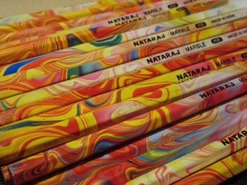
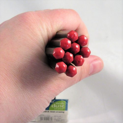
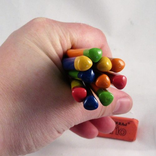
This is marbling done right. I really adore the look of these pencils. They range from cool shades of pink to hot red and yellow with a bit of blue interspersed. The swirls are lovely and again range from big swooshes of color to tiny thin whorls and peaks. There are occasional bubbles that mar the surface of the lacquer but for the most part mine are smooth and well done. There is no seam to overlap because these pencils are actually marbled.*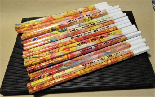
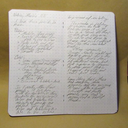
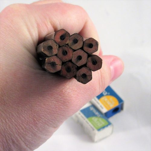
In my 50 pencils, or half a tub of them, I had a few that were warped, but mostly mine are straight and well done. Cores are about as centered as I’d expect for any pencil made by Hindustan- that is to say, a handful of my 50 are off center with a few of those really off center, but are totally usable. The white end dip is pretty well done, though they do occasionally crack, but I’ve yet to see that in this batch.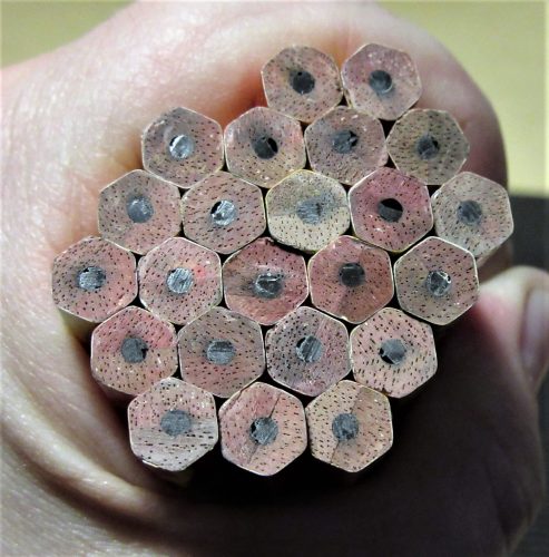
When you order a bucket of these, depending on the vendor, you may get graphite dust all over the pencils. It’s ugly but pretty easily cleaned using either a wet wipe or hand sanitizer or electronics cleaning spray on a microfiber cloth. The graphite wipes right off. The graphite won’t harm you and it never seems to get on my hands from the pencils I haven’t bothered to clean.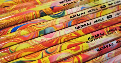
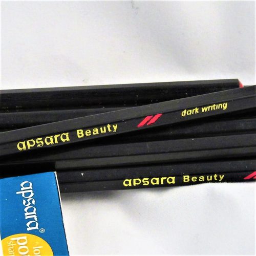
The graphite in these is a nice smooth HB that reminds me of the Apsara Beauty “Dark Writing” core, and I suspect it is one and the same. Thus far in this batch, the handful of pencils I’ve sharpened are consistent. I’ve bought a few in the past that seemed harder and lighter. That said, these have a really nice core.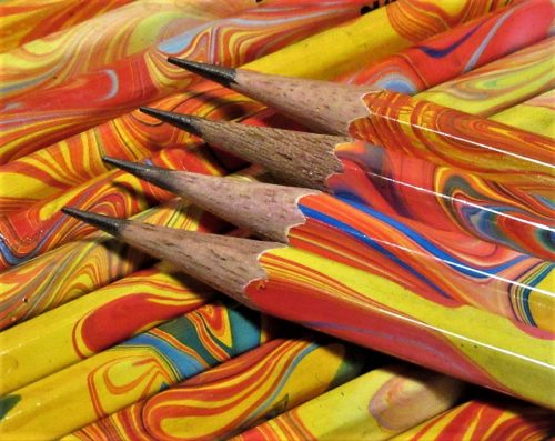
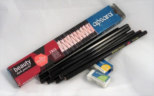
End point? These are nice pencils that are cheap as dirt when you order them via Amazon. You get 100 for about $25. You can order a handful on CWPE or hit up The Curious on Facebook to get fewer. If you order the bucket of 100 expect a few to be warped, a handful of cores to be off center, and maybe some cracked end caps.