Tag Archives: review

Observation: Looking Back into Old Journals

I was looking through one of my older moleskine sketchbooks specifically the one I started writing in then I first moved to Massachusetts. One of the thigns that I wrote about a lot was simplicity. I had lived in a small 3-ish room apartment in the woods of Maine. My apartment was essentially 1 large L-shaped room, a half wall divided the kitchen from the living “room” and a wall with a doorway divided the kitchen from the bedroom. There was no door on the bedroom. The only room that had a door was the bathroom, which housed a shower stall, toilet, sink and a bunch of shelves. Total square feet of the apartment was maybe 600sq ft. If the walls had not been vaulted it would have been awesome.

When I moved to Mass the apartment I moved into wasn’t much larger. Over the years we moved from about 600sq ft to about 700 sq ft and now we are in a 1200 sq ft house, we’ve got about 300 to 500 sq ft we don’t use all that often. Sometimes I feel like it’s too much space and other times I feel like it’s not enough. I am really thankful we’ve got a garage and a basement, both of which feel decadent after years of living without a space to work on bikes, engines and greasy things that don’t belong on kitchen or coffee tables.

I feel like I need to revisit this simplicity concept . It’s not like we live extravagantly, simplicity is something I strive for, but sometimes I get caught up in ridiculousness and making things more complex than they need to be. I need to cut that out.

I tend to think of simplicity as going hand-in-hand with organization. As I look around my office I think perhaps I should start here and work my way out.

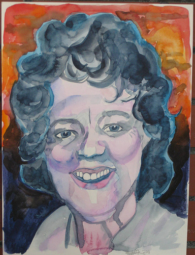
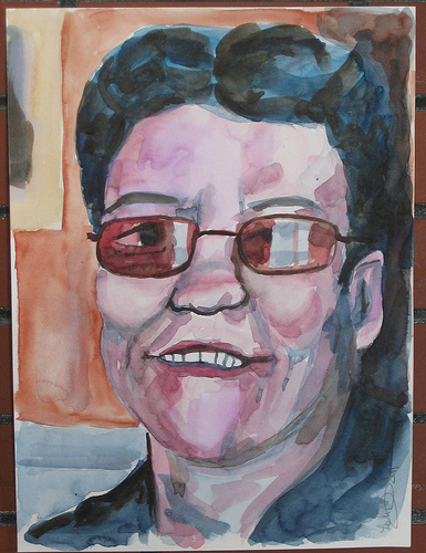
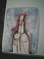
On a side note anytime I think of simplicity I have to think of my art and what materials I would work in if I could only chose a few supplies to keep with me. I have to say I’d probably go with pen and ink with watercolor. It gives me color and the ability to draw.

If you could only pick 3 art materials to use for the next 6 months what would you use?

Review: Lamy Safari and Joy

I had resisted my urge to buy a Lamy pen for quite some time. I didn’t want to just buy another pen that everyone said was great. The selling point for me is it’s ability to swamp out nibs even when fully loaded with ink and start writing almost immediately.

The Lamy uses a proprietary cartridge system. This annoys me. So I searched for ways to turn it into an eye dropper style pen. I found a simple solution- buy a fountain pen and roller ball set and swap the bodies. Then fill the end of the roller ball body with silicone caulking and let it dry. The body of the pen will hold 3 ml of ink.  Otherwise you need to buy the cartridges or refill used ones with a syringe.

I bought a glossy black set and it’s been great. A friend gifted me with the Lamy Joy with a black body and a red wire cap with a 1.5mm tip. To swap the tips you can grab the tip with a rag, piece of rubber or tape and gently pull the nib off. I find the nibs swap out pretty effortlessly but the first time was a little tougher. The new nib simply slides onto the section and in a few seconds is ready to write.

Depending on where you buy your nib they cost around $10 each. But considering that they can be used on any of the Safari, Al-Star, Studio, Accent, or Joy series pen bodies, it’s a pretty sweet deal. I’ve got a medium, broad and 1.5mm tip. The broad nib flips over and easily writes a fine line. With some smoothing it would be fine for writing. With this assortment of nibs I can easily do a variety of sketching. The medium is my usual nib of choice for regular sketches and writing. It’s thick enough that my lines look deliberate and not wimpy. I can also use it fill in a decent area of color without too much work. If I’m looking for something a little more bold I can switch to the broad nib and really lay down some bold lines. The 1.5mm nib allows me to get calligraphic lines and fill in a lot of area fast.


  • IMG_2969
  • IMG_2970
  • IMG_2972
  • IMG_2974
IMG_2974


I keep this pen filled with Noodler’s Black. It’s the only pen I’ve got that I match the ink color to the color of the pen. It makes sense for me to keep this pen filled with black in as it’s my go to pen for quick on the go sketches. The body of the pen is made of ABS plastic and tough as nails. This is one of the few pens I’ve got that I’m not that careful with. I’m not that worried about breaking it or causing harm to it. It’s tough. I’ve dropped it, on hard cement flooring and into dirt.

This is considered a beginner’s pen in terms of fountain pens. It will set you back about $30 no matter where you purchase it. Unless you chose to buy one used, in which case I suggest you check out the Fountain Pen Network’s for sale section. You can occasionally find one for sale for around $20. These pens are all over eBay as well. Gouletpens and Jetpens both carry the pens themselves as well as the nibs.

The downside of the Safari, Al-Star, and Joy pens is that they have a triangular grip which forces you to hold them tripod style and can be somewhat uncomfortable if you are like me and hold your pens in a variety of styles. This can be solved by purchasing one of the other pens that the nibs fit but those are significantly more expensive. But if you can tolerate the triangular grip of the Safari et al it’s a winning pen for sketching that will survive even very tough conditions. The Joy has an elongated body shape that is similar to a desk pen. Normally pens like this do not post but the Joy does post, which is good if you like that but I don't tend to draw with my pens posted.

Anyway, check out some of the drawings I’ve done with this pen.


  • Ink mix0064
  • Ink mix0063
  • Ink mix0062
  • IMG_2829
IMG_2829


Review: things that make me go Meh

 When I started doing reviews on here I debated the smarts of posting negative reviews. I have to tell you, there are things I don’t like. There are tools that I hate and will never use again nor recommend to my friends but they are few and far between. I decided to do a round-up of stuff that made me go, meh. These aren’t bad things they just aren’t stuff I’m raving to my friends about. You may have different feelings.

Noodler’s Nib Creeper Fountain Pen

The nib is fine to extra fine with no other option other than flex. You have many color options including clear. The colors all have that vegetal resin smell that to me, frankly it smells like fecal matter. I have read several reviews that this offensive odor is not offensive to all people, I happen to be of the group of people, like those that think cilantro tastes like soap, that think this stuff smells awful.

The pens themselves are nothing special, a rebranded Indian (Dollar)made pen that sells for less without the Noodler’s branding. They are light weight and feel pretty cheap. They hold 1ml of ink, almost exactly, and lay a wet even line. There is a tendency that if you are writing fast for the nib to dry out and will require a dangerous shake to get ink to flow.

Noodler’s Luxury Blue Ink

This is a blue that is nothing to write home about. It’s blue, like a ball point pen and it flows. It’s not special. It does dry mostly waterproof. I found that in EVERY pen I used it in there was a tendency for nib creep. Which is just messy.

Don’t get me wrong, it’s a nice enough blue but for a 1oz bottle at the regular 3oz prize I’d rather get another blue that I like.

Moleskine 3x5in Graph Notepad

I bought this. Yeah, I have a drawer full of moleskins I was given for doing a giveaway on my blog years ago and I bought this because it had GRAPH paper in it. I love the look of the moleskine; the lovely black covers, the great bindings, the pocket and the place marker. I love everything BUT the paper. This paper sucks. Even my EF pens filled with well behaved inks soak through its paper, everything feathers on it and well, MEH!

Strathmore Visual Journal Bristol 3×5 size

Sturdy spiral binding and very sturdy covers filled with nice paper should make this a winning journal. I just can’t seem to bond with it. It’s nice, just not for me.

Sanford Peel-off Magic Rub 1960 Eraser Stick

I used to buy these in college for detail erasing. They were the only stick erasers available then and did its job well enough. I saw one at Artist& Craftsman and picked it up. It’s just like a Magic Rub but in stick form. It’s soft and is prone to smudging stuff. Magic Rub Erasers are not a favorite of mine for this reason. It will also lift some ink and smudge that too. Meh.

Mio Paper 146×87 mm Campus blue label

This is one of the most expensive notebooks I’ve ever bought. I picked it up on jetpens because I’d heard the MIO paper was amazing for fountain pens. Guess what? It’s is, smooth, perfect for writing and nothing soaks through it but the wettest pens and there isn’t even a hint of feathering at all. Ink DOES take forever to dry on it and smudges even when the ink looks dry. The cover is cool with subtle texture and coloring. It’s small enough to slip into a back pocket, purse, or where ever. This is another one of those notebooks I should love but I haven’t bonded with and thus it sits in a drawer mocking me for the money spent on it.

Sharpie Pens

I don’t like ‘em. I bought a couple of packs of them when they first came out and liked them for quick notes but they seem to dry out fast and I break the tips and they are too fine for me. It’s okay, everyone else loves them.

So that's my round up of stuff that makes me go meh.


Review Redux: Rhodia Webbie

I never managed to get the images up for my Webbie review. So I'm putting them up here (and probably in the actual review.)

You can see here how the page takes watercolors and then ink over the watercolor.

Ink mix0045
And here you can see where I scraped the acrylic and painted on some gesso and then layered ink and watercolor crayons over the top.

Ink mix0046

I wasn't kidding around when I said I was having a hard time putting this journal down. I have 2 more I need to review and I really don't want to stop using this beautiful thing. I guess I'll have to fill it!

Review: Quo Vadis Bookmark

This week’s review is a little different. I’m reviewing, drum roll please, a bookmark. Wait, don’t go away. I promise, it’s a special book mark, so special in fact that it’s simplicity made me over look it when I opened my box of goodies from Exaclair.

IMG_2810

The Quo Vadis bookmark is a 5x 1.75 inch piece of cardstock coated in plastic with a brown and tan elastic loop attached. Non-descript and utilitarian in appearance as some of the best ideas are. The brown and tan is not pretty, a nice black elastic loop should be something they consider on their next run.

Simply you hold your place with the bookmark and loop the elastic around your journal to hold it shut. Ridiculously easy and remarkably efficient.


  • IMG_2811
  • IMG_2812
  • IMG_2813
IMG_2813


You know how I said my miquelrius notebook was going to fall apart before I was finished with it? Way back here? Well it is, and I’m not even half finished. This bookmark holds it together, with ease. It also holds all the stuff that I’ve stuffed it within it. Nothing falls out. The elastic is remarkably secure, adapts to a variety of journal sizes and is cheap. You can get one here on GouletPens.com* for $1.50. I’ll be ordering a bunch with my next order. Brian even did a little video on them here.

Seriously, if you are ordering ink or paper, add one of these little wonders to your cart, you’ll thank me later.

Read another review of them here.

Continue reading

Review Redux: Canson XL Watercolor Pad

I reviewed the Canson XL Watercolor pad a few weeks back, mostly with inks and scraping of acrylic paint. I determined through that use that it would be #1 a great paper for binding into a journal #2 great for watercolor crayon and acrylic. I didn’t put it through its paces with watercolors.

I did this weekend.

I use a variety of watercolors from Holbein to Academy. This paper holds the colors true. For a cold pressed paper the paint absorbed just enough to dry quickly but allowed for easy lifting of color when needed. Some “student grade” watercolor paper sucks. Its cockles, it’s as absorbent as a paper towel, which is not the case with this paper. It’s good stuff.

Check out some of the images below, all are done on the XL watercolor paper. Vibrant saturated colors throughout.

Zura Beth facebook face experiment

@JournalChic facebook face experiment

I can without reservation recommend this paper for watercolors. It’s cheap enough for throwaway sketches and nice enough for finished work.

Thursday Review: Pelikan Pelikano Fountain Pen

I like to draw with fountain pens. Now that I’ve discovered the joys of Noodler’s inks (a full post on those coming up soon) I have felt the need to buy a few more pens. I own now a mix of around a dozen pens, of which I keep 6 inked at all times. It’s a bit much. When I’m sketching I find I reach for one pen over and over again. That pen is my Pelikan Pelikano medium point in blue. I keep it inked with a blue or a blue black ink at all times.  There is nothing special about this pen. It’s an inexpensive school pen that lays a nice medium line and a lot of ink. It’s comfortable and easy to clean.  I’m not worried about breaking it or tossing it around because it was pretty cheap.

The important parts about this pen for you to know is that it has a medium point steel nib, it is what is referred to as a “wet” writer, in that when it puts down a line of ink it’s generous in the amount of ink in that line. This means my blacks are truly black and I can blend those lines with a wet brush.  The steel nib is stiff and doesn’t have much line variation but can be abused. I’m not gentle with this pen. I tend to have a heavy hand and it takes that abuse and keeps on writing.

The body of the pen is translucent frosted blue plastic. It’s not gorgeous and it’s not ugly, like most school pens it’s functional. You don’t want to have a pen your classmates will steal, they won’t steal this one. The cap is brushed steel or aluminum with a plastic clip. The pen isn’t going to win any design awards but it works. This pen is a cartridge or converter pen. I hate cartridges and I’m not overly fond of converters, each holding 1ml of ink, sometimes less. That’s not a whole lot of drawing for me. I converted this one to what is called an eyedropper pen by using outdoor grade silicone caulking to plug the 2 vent holes in the end of the body. The body now holds 3ml of ink, which is a whole lot of sketching and drawing.  While not a difficult job it was a tad fiddly to do but has held up for several months of sketching and drawing. Alternately someone could refill the cartridges with a syringe.

I’ll tell you about a couple of other go to pens I use for drawing soon.

Here is a picture I drew using this pen and a few others as well as a brush pen.


Another wine bottle in inks

Review: Noodler’s Flex Pen December 25th Edition

The pen I’m reviewing today is something I bought on a lark used off the Fountain Pen Network’s for sale page. I have to say that the Noodler’s Flexible Nib pens have been well marketed and sought after by many pen enthusiasts. Especially those like me, who are interested in pens on the lower end of the spectrum of price. This pen fits that bill. Its suggested retail price is $14. Noodler’s has come out with several special edition pens; the flex nib that I purchased is the December 25th red and green edition. I purchased mine used for $10, shipping included. It’s a piston filled pen that hold 1ml of bottled ink.

IMG_2741
IMG_2741
IMG_2741
IMG_2741

It’s a nice cheery red color with marbling throughout. The marbling is supposed to be green but I notice little if any green in the marbling. The nib is steel and an unusual design. It does not have a vent hole, instead it’s got a very deep channel cut into the feed that allows a lot of ink to flow. It’s labeled as a flexible but most users report that it’s a semi-flex given the amount of pressure needed to flex the tines. The nib reminds me of a crow quill dip nib. It starts as an extreme hairline point that I’d label as a double extra fine. Flexed fully I’d call it a double broad.  With normal writing or sketching pressure I’d say it writes a fine line.

While I was writing I found that my traditional cursive, learned way back in 3rd and 4th grade adapted itself well to the flexed down stroke with this pen. It made it look old fashioned and could be useful for meditative and mindful journaling. There are a lot of tutorials out there for scripts that use a flexible nib. Writing with this nib is NOT the easiest thing ever. In fact I’d say my forearm got quite a workout. I’ve decided that to better learn how to use this pen I’m going to start filling out all the forms at work with the pen, in script. I figure that using it across the day will make life more interesting, give my forearm a break and exercise throughout the day. I’ll also get a lot of practice in USING the pen.

For the artist the place where this pen really starts to sing is in sketching. Flexed it’s not going to keep up with a rapid pace, but the hairline is great for putting down a few delicate lines and then regular pressure gives you a nice fine line. When flexed it gives a nice solid line that is great for shading. I tested it out on a variety of papers. This pen lays down a HEAVY line of ink, especially when flexed frankly you’ll need to find a sketch paper that can handle the flow. Papers that worked well: watercolor paper, better quality drawing paper, Bristol, and heavier sketchbook paper.  Using this nib on gesso’ed paper is going to cause issues. Gesso is gritty and gritty surfaces grind down nibs. Writing on gesso will ruin this nib (and most) fast.

Some images of the various papers:


  • Ink mix0025
  • Ink mix0021
  • Ink mix0022
  • Ink mix0023
Ink mix0023


Here’s my verdict for a $14 pen it’s a lot of fun and worth the money. I have pretty strong forearms and hands and I found using this pen tiring for writing. If you have a light hand this pen will be very difficult for writing use. For drawing this pen really shines in its flexible line width. It does take some practice to use but it’s enjoyable and creates a really dynamic look. It’s comparable to a crow quill dip pen in line variety and it less likely to shatter with heavy handed pressure. It does take a heavy hand for writing to get the full flex out of it. It’s a very adaptable little pen as you can adjust the ink flow pretty easily. (Goulet pens is planning on doing a how to video on this and I’ll link it up when it hit.)

I found the slower pace forced by this pen great for meditative thoughtful writing. It took some practice to get something decent, well that’s something we can argue, but passable.

The major con of this pen is how slim it is. I might try fitting the nib into a pelikan body and see if it’s more comfortable. The flex forces a less relaxed grip and less comfortable writing style that I’m accustomed to, but then again, you aren’t really meant to write for 3 hours with this thing. The second con of this pen is that it holds only 1ml of ink, which is the same amount as a cartridge, and yes I did measure it. I’ve gone through 2 fills of Private Reserve Sonic Blue ink.


Review: Moleskine 6×9 Sketchbook

This sketchbook contains 80 roughly 110lb plain cream colored pages. They are contained within plastic covered hard black covers. The plastic is imprinted to look like leather. This sketchbook is very often suggested for people started out in art journaling.

The paper is stiff and smooth. It’s good for writing and drawing. I find that the paper has a coating that repels wet media like watercolors, which it absorbs but gives a blotchy appearance. It does the same with some inks. It can be quite a pain in the rear. I’ve found that if I got through my sketchbook and spritz the pages with a little water so they are evenly damp and then allow them to dry before working in watercolor or ink the blotchiness is minimized.

The paper responds favorably to pitt and zig pens. They remain perfectly black and don’t show any blotchiness. The paper is also heavy enough to support many layers of collage and acrylic paint. When working with wet media it’s best to be aware that the paper will cockle and remain wavy even after it dries. I like the wavy paper but most don’t.

The heavy weight paper does not show strike nor bleed through except when using sharpies and copic markers. Fountain pens do just fine on this paper. Some fountain pen inks get blotchy.

The sketchbook has a great form factor with its smooth hard black covers, pocket in the back and elastic closure. I can’t say that the paper would be a reason to recommend it. The pages can take abuse but if you erase too much or scrub the pages with a brush you’ll end up will pilling of the top of the paper. I’ve read reports of the spine breaking on these sketchbooks but I’ve abused the heck out of mine and never had a broken or damaged spine, and I’m not gentle with my sketchbooks and journals. The price however is quite prohibitive at $18 for 80 pages.

If you are looking for a sketchbook that handles a variety of media relatively well, with a nice hard cover, at a ridiculously high price this is a good sketchbook. There are others similarly shaped and sized that will work as well at a lower price.

 INterested in purchasing a moleskine sketchbook? Follow this link, it was the best price I could find on them:


Thursday Review: MiquelRius Grid Notebook

MiquelRuis 300page Grid Notebook with Red vinyl cover

I bought this notebook 4 or 5 years ago while searching for a Ciak brand notebook. As a notebook snob and a bookbinder I find this book to be just MEH.

First it’s perfect bound- glue with no stitching. Eventually with hard use pages will fall out. It’s just a matter of when not if. Perfect binding is simply not sturdy enough for the kind of abuse I put my notebooks and journals through. I will say that I’ve been carting this notebook around for 2 or 3 months and it’s held up pretty well so far. Also due to the binding and thickness of the book, it will not open completely flat while writing, which is a nuisance.

The pages are 15 to 18 pound in weight and very thin. Almost every pen I own strike through (is visible on the reverse side) and 90% bleed through. This means I can only use one side of each sheet of paper. So that drops the 300 pages of the book down to 150 usable surfaces. So even if I wanted to brave the non-flat writing surfaces of the left side of the notebook, I could barely read what I wrote. Additionally some of the inks I own feather like mad on this paper. I’m talking about relatively well behaved inks like Diamine Chocolate Brown.

The paper is very smooth and has the best light pale blue grid I’ve ever seen. It’s what drew me to the brand in the first place. After looking at a dozen or so gridded notebooks, I fell in love with the pale blue of this grid. It’s pale enough to blend into the background and not interfere with the writing when you are referring back to your writing. The pen glides over it. It’s not as smooth as Rhodia or Claifontaine paper but its way better than Moleksine paper. Ink is better behaved on the right side of the MiquelRuis paper than moleskine paper. The paper definitely has a right and wrong side for fountain pen use. One side is smooth and the other has a little more tooth to it and grabs the tip of the pen ever so slightly.

The format of the book I purchased is great- at 6×8 inches I’m finding the page size perfect for writing and recording thoughts and sketches. The size is good for slipping into a book bag.The 300 pages is a tad on the heavy size for every day toting about but if it were the only notebook you were to carry it wouldn’t be bad. They come in 100 and 200 page counts as well.

Would I buy another one of these notebooks? Probably not. The bright vinyl cover is nice but doesn’t speak to me the way a leather cover does. The paper’s lovely pale blue grid is about the only thing I really like about this notebook. Using both sides of the page is important to me, using just one side seems very wasteful to me. I prefer a stitched notebook for durability. I have to mention that pale blue grid again; it’s why I keep reaching for this notebook. This would be a good gift idea for the vegan writter on your shopping list. They also offer a host of recycled vinyl options that I'd like to see.

I purchased mine about 5 years ago at Barnes and Noble. I notice that the brand is no longer listed on their website. When I purchased this particular note book it was the last one on the shelf. It cost $10. You can buy these notebooks at the miquelrius website here.

Pros:

  • 300 Pages
  • Sturdy Vinyl Covers
  • Cheap $10
  • Great pale blue grid
  • Mostly fountain pen friendly o n the right hand pages
  • Smooth paper is nice for writing

Cons:

  • 300 pages are heavy
  • Almost all my pens and inks exhibit strike through and bleed through
  • Not good for a wet nib
  • Can only write in it- sketching would result in horrible bleed
  • Forced to write lightly
  • Perfect bound- not very sturdy
  • Won’t lay flat when writing.

Some inks that did well on the paper:

Noodler’s Bulletproof Black, Eel Blue, Walnut, Beaver, Eternal Brown and anything BUT Herbin Bleu Nuit in an EF nib.