This post is written by Paula Binsol, the med student behind the Insta account @outofpost and the blog Out of Post. She gives us a fresh take on SABLE.
In the past few months or so, SABLE or Stash Acquired Beyond Life Expectancy, has been a term thrown around in pen and pencil collector communities. I have always been more of a user than a collector, with even the rarest among my collection being sharpened up and put to good use, but in terms of SABLE, my stash is small and practical because SABLE for me means Student Acquisitions Budgeted for Length of Education.
Just a little background: for the past two and a half years, I have been studying in the Philippines. Here, my daily allowance is equivalent to about $10 a day, depending on the exchange rate of the US Dollar that morning. It may not seem like much but there are some people in this country who don’t make that as their salary, let alone as a daily allowance and while it is more than enough to live on here while I’m studying, it is not enough to acquire a collection of rare or vintage items, which is why I tend to use everything that is in my stash. As a stationery lover for years, mostly of pens and paper, I started my whole pencil journey in January 2017 and was shocked and surprised when many of the veteran members of my pencil-loving Facebook family offered to send me packages of pencils and notebooks to try. Their gifts make up the bulk of my collection and while it was not feasible to transport everything back to school with me, I have almost one of everything and they are being put to great use each day.
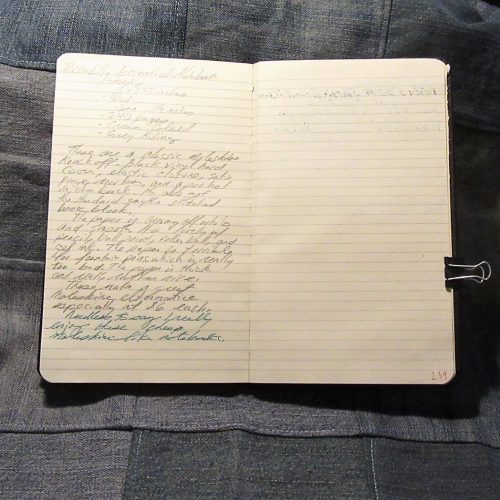
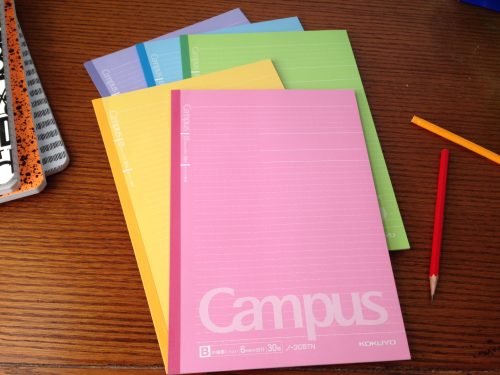
Now, being on a student’s budget does not mean that I cannot collect or acquire pencils! It just means that I must be more creative in the way that I acquire them. To do this in the smartest and most cost-effective way possible, I begin with making a list of all the pencils that I wish to acquire, basically, a pencil wish list. Then, in another notebook (for me, a Field Notes Lunacy), I keep an inventory of all the pencils currently in my possession, which gives me a bird’s-eye-view of my collection, at-a-glance. To make sure that I have the opportunity I try everything, I use a system taught to me by a friend – I have three plastic boxes, two of which house pencils that are newly sharpened and the last that houses ones I have tried. If I love the pencil, it goes into my daily line-up on a pencil cup in my desk, but most of them go into the green “have tried” box. 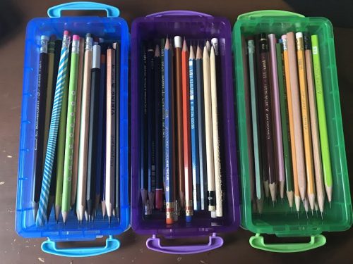 Practically speaking, I try to get the most out of what I do have by using it, using it and using it some more! There are a few things that I carry around with me on a regular basis that get a lot of use. First, is my little Klimt tin, which houses my most-used erasers and a traveling sharpener.
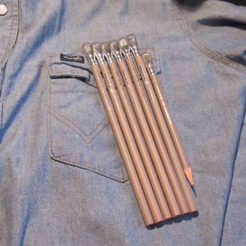
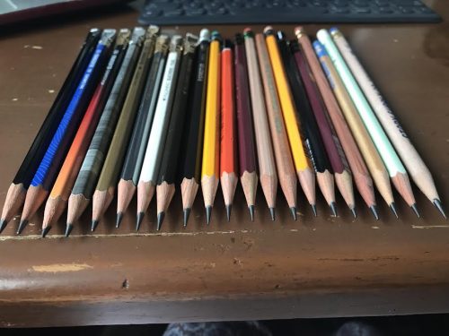
 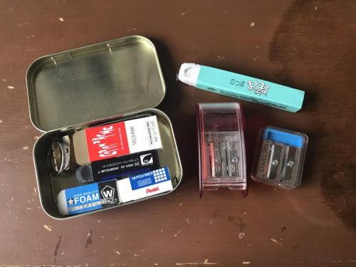 Then, my most used pencils remain on my desk in a pencil cup. I use three each day in my daily journaling and rotate through them so that I can get a feel for what I like and don’t like; it helps me pare down my collection to the bare necessities. I don’t let myself buy anything for my collection, which limits my acquisitions to just what comes to me in trades, which allows me to cut costs substantially, but does allow me to explore the pencil and stationery world in a budget-friendly way!
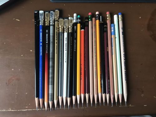
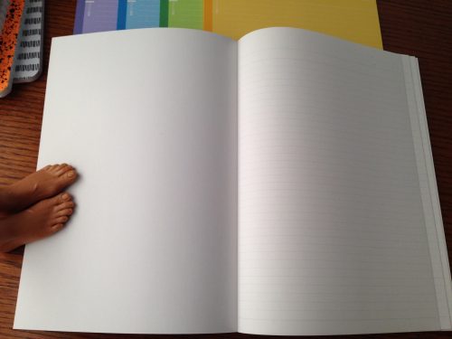
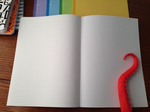
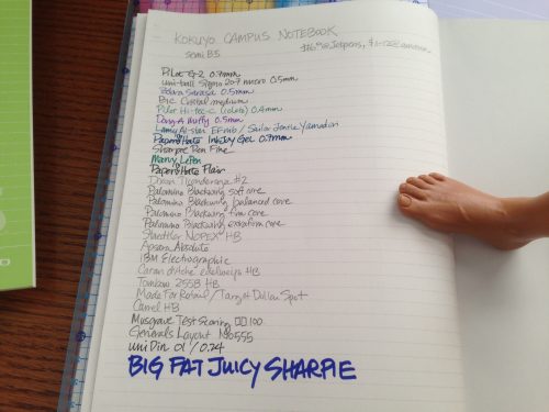
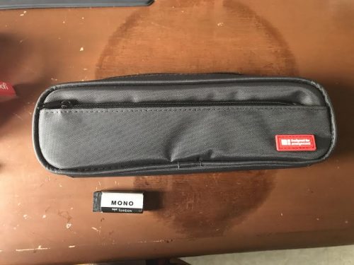
 And as a student on-the-go, I have a pencil case that is ready and waiting for me at all times. My pencil case of choice for this academic year is a Yoobi case that I bought at Target. I love it because it opens up into a tray, which makes grabbing what I need when I’m studying so much easier. Because I very rarely have time hand-sharpen when I’m at school or during exams, I bring mostly mechanical pencils with me – my current favorites are the P200 series and I have one of each, a P205, a P207 and a P209, mostly for taking written exams (because on our exams if you alter your answers after writing in pen, it’s considered wrong—the perfect excuse to start out with pencil). You can also see my all-time favorite pencil for writing and journaling, Apsara Absolute with its Ippo Pencil Cap. My two trust erasers, the Sakura Foam and Tombow Mono were chosen because of how well they erase both on paper and on Scantrons; they don’t leave a trace and that’s just the way I like it.
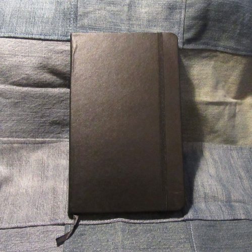
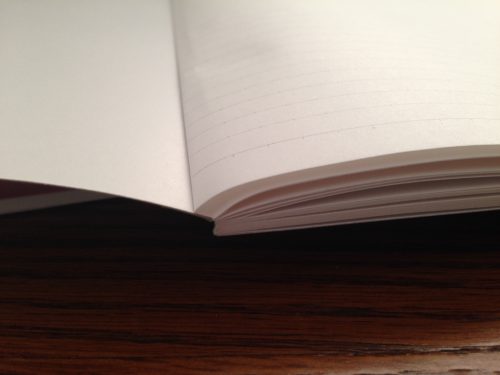
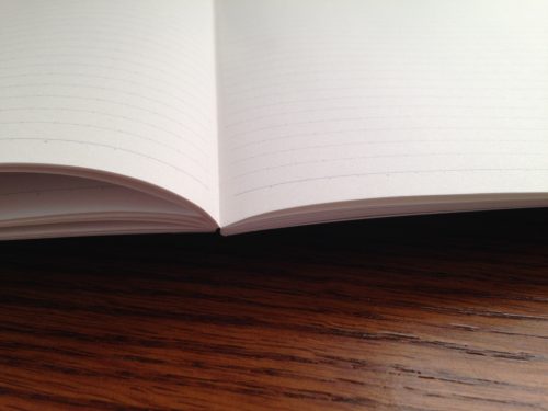
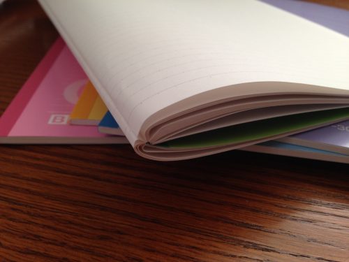
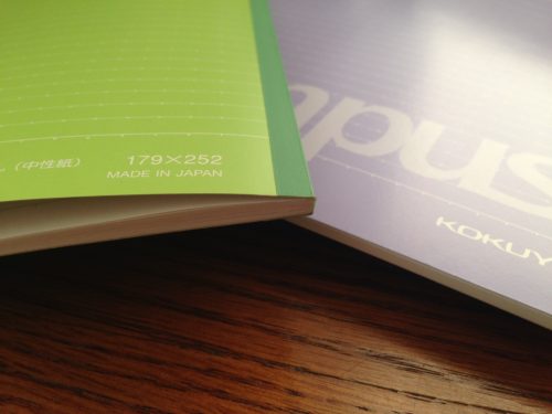
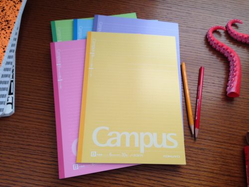
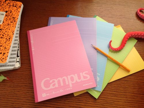
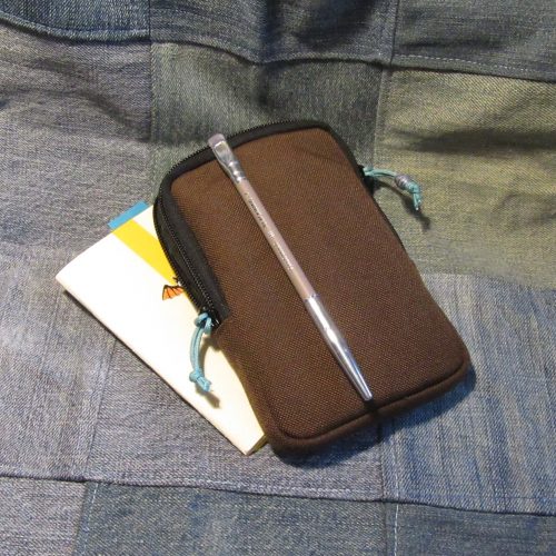
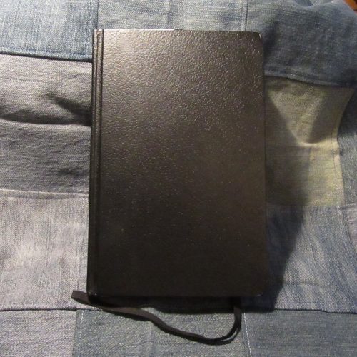
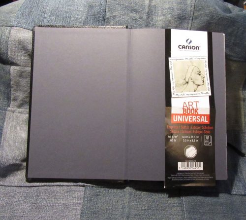
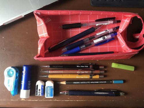 While as a medical student, we aren’t able to use pencil very often (we are required to use pen or submit typewritten work for the most part), my favorite use of pencil lies in my quiet daily life, in journaling, making grocery lists or my bullet journal. I have a special pencil case that I use when I travel along with my notebooks that can fit even an unsharpened Blackwing and has extra pockets where I can keep a Ziploc and a sharpener, for long point sharpening while traveling! My favorite notebooks are my A5 bullet journal (no brand traveler’s notebook), the Olive Edition by the Traveler’s Company used for journaling and my September Leather Field Notes size bought off Amazon for my notebooks that carry lists, brain dumps and speaker’s notes for the debate team that I train.
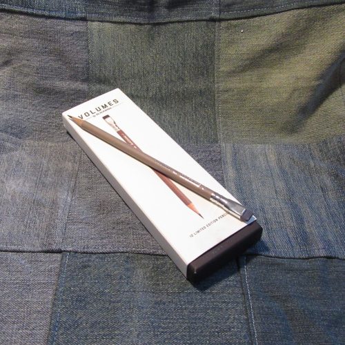
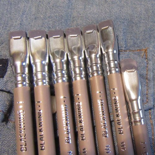
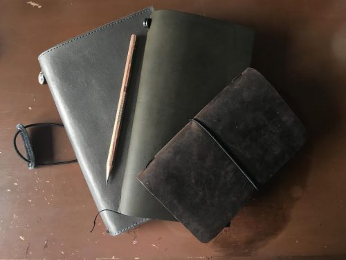
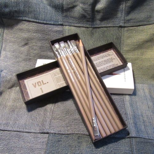
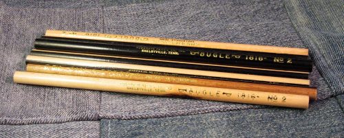
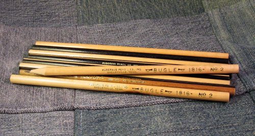
 All in all, when asked to describe my process and collection and myself, as a lover of stationery, I label myself as an appreciator—both a user and a collector. I find my collection to be large for someone who didn’t have to spend too much and I love, love, love trades because they not only allow me to get to know others within the pencil and stationery community, but they expose me to pencils and other paraphernalia that I would otherwise not have known without the kindness and knowledge of others. So maybe I can’t yet afford the renowned Pollux or snag a vintage Eberhard Faber Blackwing, but with my kind of SABLE, I find that I get to go on an adventure every single day.
- Instagram/Twitter: @outofpost
- Blog: https://outofpost.wordpress.com
Biography: Born and raised on bagels and lox and challah French toast, Paula considers herself a Jersey girl through and through. She is a lover of stationery, the musty smell of a good, well-loved book and runs on hot tea and plain croissants. Currently pursuing her medical degree in the Philippines and in her third year, she is a self-proclaimed nerd and believes that quality tools bring quality work.
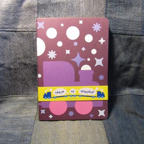
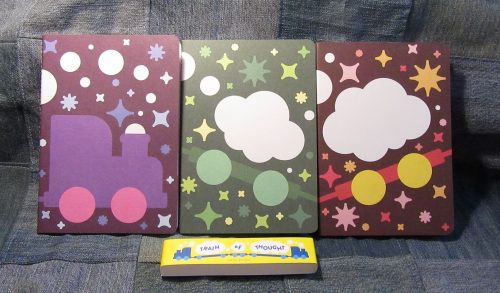
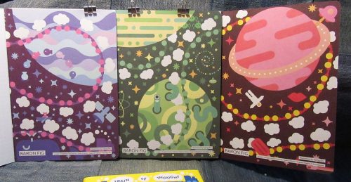
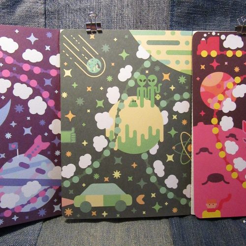
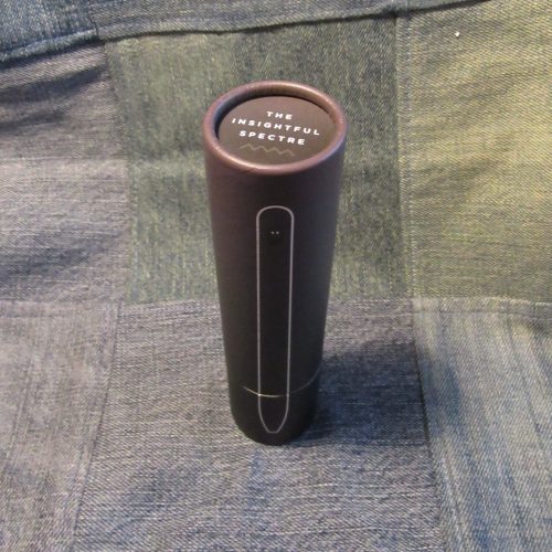
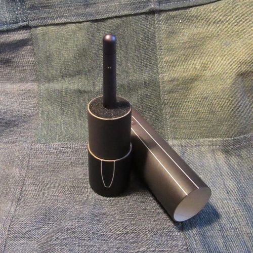
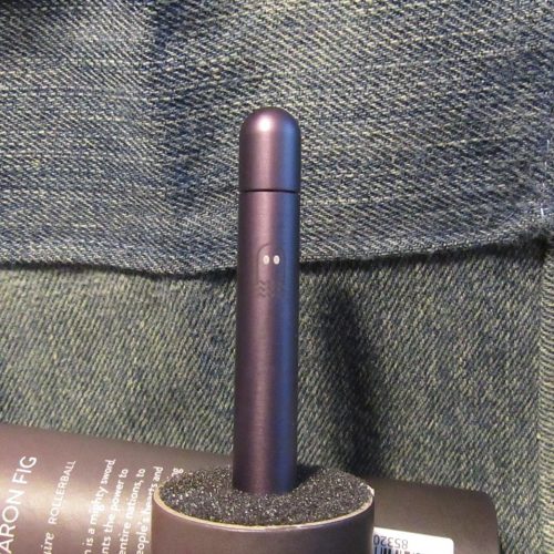
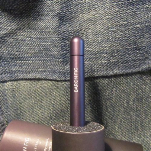
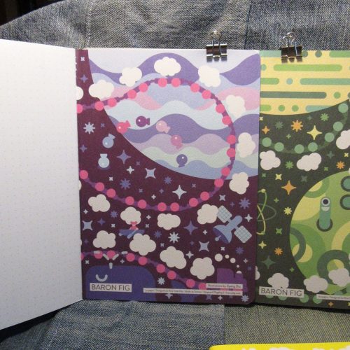 Here is where i”m going to go tangential on you. There is something really fresh and fun with all the things BF has been doing lately. Train of Thought is just one example where BF is shaking up the bring monotony of the stationery world. There are a hundred places where you can get a black grey, or white pocket notebook; hell even BF offers their notebooks in standard colors of black and grey. No I can’t take these into a stodgy board meeting but is that the target audience of these notebooks, or even the New School set? I don’t think so. I think Baron Fig is going after their core audience of younger professionals who might not be so concerned with what is considered “professional” in the traditional sense. I suspect a lot of people are going to loathe this set while many more are going to enjoy Lisa Frank on acid. I am in the camp who loves the idea of these despite working in an environment where my boss might tell me I can’t use them.