Tag Archives: journal

Drawing-a-Day: Weekly recap

I decided that after week 2's disasterous results of, well, not getting a lot done along with allergy attack I needed to regroup and rethink the drawing-a-day thing. (Traci was right when she said the upload was the longest part of it.) My initial decision to NOT tweet process pictures really threw me for a loop. Tweeting, facebooking and flickring process shots really makes my drawing time more interesting. Drawing is interesting with out the progress shots but… I like progress shots. So I'll be putting those back into my "process." I'm also taking the size requirement out.

Initially I focused on making the drawings in my Graf  it pad, which was all well and good, but for the fact that sometimes I want to draw on my lunch break and I don't take the graf it pad with me. Maybe I should just suck it up and BRING it with me. Instead I chose to change my "rules" to conform to how I actually work, and that is that the drawing-a-day can be in any format, ie in my webbie if I chose, or the graf it pad, or anything else.

So, there's that, and here are some of my drawings from this past week:


  • Ink mix0069
  • Ink mix0070
  • Ink mix0071
  • Ink mix0072
  • Ink mix0073
  • Ink mix0074
Ink mix0074


Review: Clairefontaine Graf It Pad

One of the other sketchbooks I received from Exaclair was the Clairfontaine Graf It pad. I’d seen these on several occasions at Artist & Craftsman and passed them by due to the cover being… well, kinda lame*. In addition to the plain black grainy text and images, each cover is made with various colors of card stock that folds behind the staple bound pad. The back is supported with sturdy heavy chipboard. Each page is microperfed for easy removal. The perf is sturdy enough that you can turn the page and it won’t tear out, unless you want it removed, it stays. The pad is often sold on American websites as “6×8.” That may be the outer dimensions of the pad but the actual sheet size is 5.75×7.5 inches. There are 80 sheets in each pad.

I did my usual battery of tests on this paper and it withstood them all. I have to say that this paper is amazing. Though it’s only 90g (41lb) it’s super sturdy and accepts a lot of media without issues. It takes some serious effort to get stuff to soak through. When I say stuff I mean ALL the stuff I’ve tossed at it. See the pic below.

Ink mix0044
With watercolor it accepts the color well. The paper cockles as is expected with paper this thin. I find this to be a great paper to experiment with techniques and color. It responds well to puddles of water as well as thin washes. Color stays true and doesn’t get muddy on the page.

While drawing with ink I was able put down multiple layers of ink without cockling and bleed through. Heavy layers that would have bleed through many other heavier papers did not bleed through on this paper. Noodler’s black bonded with the paper well enough that I didn’t worry about it lifting much with my water brush. Colors seem to pop off the page.

I did try gessoing the page but I don’t see the point as the paper is tough enough to survive most stuff without the gesso. I also scrapped acrylic paint over the page to see how it would work, and it worked just fine. This paper is also amazing for pencil. It has just enough texture and tooth that pencil feels really good on it and it hold a lot of graphite, so darks are really dark.

My final verdict on this pad is that it’s great. The paper is awesome. The format it’s served in is where it is lacking. I hate perforations (my own little quirk.) I prefer a pad that allows the pages to stay together. The staple binding is crap for keeping stuff together, I made a little folio out of a USPS priority mailer to keep my drawings together. For art journaling it would be a great pad to do drawings in and then cut out and glue into your regular art journal. The paper is thin enough that if you draw a face and cut it out the edges won’t be all that noticeable.

The pad is pretty cheap. I found it online for $4 to $6 the larger size is pretty reasonably priced too at around $9. These are prime pad for binding into a sketchbook. If this came bound like a moleskine or a Rhodia Webbie I’d buy it. I know that the reason this pad is so inexpensive is that its bound inexpensively, 2 staples straight through to a sturdy backer. I like this paper a lot, in fact the next time I’m at Artist & Craftsman I’ll be picking up another one of these in another size. Perhaps I’ll bind the large size into a nice art journal!

Continue reading

Review: Some Thoughts on Watercolors

I’ve bought a bunch of different watercolors from Grumbacher Academy to Winsor & Newton. My favorite travel watercolor set is a Cotman 12 pan set. The colors wet easily and lay down nice saturated colors. It was a  great value to get 12 half pans of color for around $20.

IMG_2824
I’ve since focused on purchasing tubes of color to replenish emptied tubes and adding a few extras. I’ve tried to buy a few different brands. If you’ve got an AC Moore or Michael’s near you, getting a tube of Winsor & Newton Artist watercolors with a 40% off coupon is a pretty good deal.*

My usual rant with any art material is that you get more out of artist’s grade than student. Why? They tend to have more pure pigment and less filler and that means you get more color out of a 5ml artist grade tube versus a 15ml student grade tube.

I’ve purchased a few tubes of Holbein watercolors at Artist & Craftsman as they’ve been having a sale. The 15ml tubes are a little pricier than the usual 5ml tubes of Winsor & Newton colors that I buy but it’s also 3 times the amount. The colors are intense.

The first time I sprung for a tube of W&N artist grade watercolor I was shocked at how much more intense the color was than Cotman and Academy colors. I was also surprised at how easily my damp brush picked up a lot more color than with Cotman. The “rewetting” ability of W&N over their own Cotman student grade colors was surprising and delightful. Creating an intensely colored wash was much easier than with my cheaper colors.

Now that I’ve discovered Holbein I’m feeling the same way about them as I did about my W&N artist grade colors. I feel like I’m getting more bang for my buck out of these slightly more expensive tubes of really intense color. So far I’ve bought a tube of indigo, turquoise blue, and sepia. All 3 colors perform flawlessly and wonderfully on everything I’ve tried them on so far. The Holbein turquoise blue is a very different shade than the Cotman turquoise. Since I rather like the color of the Cotman turquoise I may end up buying a new tube of it, but I have to say that I’ve been quite spoiled with the Holbein paints.

That being said I also tried out a tube of Van Gogh watercolor. These are larger sized tubes of color that are considered student grade. The VG colors had something going for them- they rewet on a palette like nobody’s business. A swipe across a dried out blob of red oxide brought up a fully loaded brush of intense color. These tubes are moderately priced around $4 a tube and come in sets. I’ve not tried their pan colors but the tube color is very well behaved and an excellent value.

Ink mix0042

Continue reading

Wordy Wednesday: Cult of Tutu

I followed a link to an art journaling blog where I saw yet another female artist in a tutu. Afterward I tweeted the statement, “To be a mixed media artist do you need to wear a tutu? Or even like them? NO!”

To be blunt, I don’t get tutus. They are made out of plastic scratchy material, the same stuff the exfoliating bath poofs are made of and I can’t imagine they are comfortable.

I’m not saying I’m down on it, I just don’t get it.

Ink mix0043

What I wear doesn’t define me as an artist. My clothing isn’t a statement. I’d rather my art make the statement. I’m a jeans and t-shirt kind woman; I like cotton, wool and other natural materials. I look for comfort while I create. I don’t need something outward to help me find my inner creativity. I know that some people enjoy costumes*and perhaps that is what the tutu is about. Using costume to find that inner well of creativity, capturing lost childhood insight, or perhaps these ladies really enjoy wearing a tutu. It is not my place to yuck your yum, but I can say that I don’t get it

I also have to wonder, other than Salvador Dali, would you see a male artist wearing something like a tutu? In part I’m somewhat uncomfortable with the idea that female artists have to dress up and play a part to sell their art. Peddle their wares like a carnie, “Win your lady a stuffed teddy bear here!” “Strong man competition, ring the bell, win a prize.” “Hooooot sausage and peppers, fried dough, cold lemonade”

Tutus and tiaras, 2 things you’ll never catch me wearing.


Continue reading

Review: Rhodia Webnotebook aka Webbie

Stephanie of RhodiaDrive hooked me up with Karen of Exaclair, the American importer of several very fine French made stationary products so I could do some reviews. I received a box in the mail and I felt like a kid at Christmas. There is nothing quite like opening up a box of sketchbooks to get my heart racing, well pen products would be a close second. Anyway, one of the products contained in that wonderful box was a Rhodia Webnotebook. It’s the larger size, 5.5×8.25 inches (I14x21cm) with blank cream colored pages. There are 96 sheets or 192 pages.

When I first opened the covers the color reminded me of oak tag; creamy, warm and lovely. The paper is 90g (roughly 24lb) which seems kind of thin when you’ve been working on 140lb watercolor paper for the last few months. When I ran my hand over it felt glassy smooth. Clairfontaine paper is known for this feature and is sought after by people who use fountain pens.

The cover is black with the Rhodia logo inset into the center of the front cover. Like all notebooks of this style there is an elastic to hold the whole thing shut. The plastic/vinyl of the cover is soft, like fine leather. I have a journal made of deer hide and the feel of this pleather rivals its softness and feel. I handed the journal to someone to check out and she actually said “Ooohhh, that feels nice that feels really nice, what is it?” Like, leather the cover does show greasy fingerprints, unlike leather those greasy fingerprints wipe off with a damp rag. Yes, I tested this by eating French fries at my desk and picking up the journal and having to wipe it clean.

Continue reading

Review: Quo Vadis Bookmark

This week’s review is a little different. I’m reviewing, drum roll please, a bookmark. Wait, don’t go away. I promise, it’s a special book mark, so special in fact that it’s simplicity made me over look it when I opened my box of goodies from Exaclair.

IMG_2810

The Quo Vadis bookmark is a 5x 1.75 inch piece of cardstock coated in plastic with a brown and tan elastic loop attached. Non-descript and utilitarian in appearance as some of the best ideas are. The brown and tan is not pretty, a nice black elastic loop should be something they consider on their next run.

Simply you hold your place with the bookmark and loop the elastic around your journal to hold it shut. Ridiculously easy and remarkably efficient.


  • IMG_2811
  • IMG_2812
  • IMG_2813
IMG_2813


You know how I said my miquelrius notebook was going to fall apart before I was finished with it? Way back here? Well it is, and I’m not even half finished. This bookmark holds it together, with ease. It also holds all the stuff that I’ve stuffed it within it. Nothing falls out. The elastic is remarkably secure, adapts to a variety of journal sizes and is cheap. You can get one here on GouletPens.com* for $1.50. I’ll be ordering a bunch with my next order. Brian even did a little video on them here.

Seriously, if you are ordering ink or paper, add one of these little wonders to your cart, you’ll thank me later.

Read another review of them here.

Continue reading

Review Redux: Canson XL Watercolor Pad

I reviewed the Canson XL Watercolor pad a few weeks back, mostly with inks and scraping of acrylic paint. I determined through that use that it would be #1 a great paper for binding into a journal #2 great for watercolor crayon and acrylic. I didn’t put it through its paces with watercolors.

I did this weekend.

I use a variety of watercolors from Holbein to Academy. This paper holds the colors true. For a cold pressed paper the paint absorbed just enough to dry quickly but allowed for easy lifting of color when needed. Some “student grade” watercolor paper sucks. Its cockles, it’s as absorbent as a paper towel, which is not the case with this paper. It’s good stuff.

Check out some of the images below, all are done on the XL watercolor paper. Vibrant saturated colors throughout.

Zura Beth facebook face experiment

@JournalChic facebook face experiment

I can without reservation recommend this paper for watercolors. It’s cheap enough for throwaway sketches and nice enough for finished work.

Wordy Weekender: Loving Kindness Week

The troll attack on the blog (and on others) and the eloquent rebutals spawned loving kindness week. A few kind souls got the ball rolling on a UStream-a-thon, art journal pages, and blog posts. The love was felt through out the Art Journaling world and something really special came of this week. As the week comes to an end and I've gotten more loving kind emails than I've gotten in a long time I'm amazed at the power of being loving and kind to our fellow human beings. I'm a little overwhelmed. A couple of people are sending me artwork, and I can tell you right now it will be framed and hung over my desk, a place of honor as I sit here daily.

Here are some links to those people who participated in Loving Kindness Week.

JellyBeansDesign

IKerriLove

Magic Bartender

Tammy Ozuna

DeDe of Inkwell Studio

Beth_Snyder

DarcyW

 Deina

 Art Journey

Eveline

Thursday Review: MiquelRius Grid Notebook

MiquelRuis 300page Grid Notebook with Red vinyl cover

I bought this notebook 4 or 5 years ago while searching for a Ciak brand notebook. As a notebook snob and a bookbinder I find this book to be just MEH.

First it’s perfect bound- glue with no stitching. Eventually with hard use pages will fall out. It’s just a matter of when not if. Perfect binding is simply not sturdy enough for the kind of abuse I put my notebooks and journals through. I will say that I’ve been carting this notebook around for 2 or 3 months and it’s held up pretty well so far. Also due to the binding and thickness of the book, it will not open completely flat while writing, which is a nuisance.

The pages are 15 to 18 pound in weight and very thin. Almost every pen I own strike through (is visible on the reverse side) and 90% bleed through. This means I can only use one side of each sheet of paper. So that drops the 300 pages of the book down to 150 usable surfaces. So even if I wanted to brave the non-flat writing surfaces of the left side of the notebook, I could barely read what I wrote. Additionally some of the inks I own feather like mad on this paper. I’m talking about relatively well behaved inks like Diamine Chocolate Brown.

The paper is very smooth and has the best light pale blue grid I’ve ever seen. It’s what drew me to the brand in the first place. After looking at a dozen or so gridded notebooks, I fell in love with the pale blue of this grid. It’s pale enough to blend into the background and not interfere with the writing when you are referring back to your writing. The pen glides over it. It’s not as smooth as Rhodia or Claifontaine paper but its way better than Moleksine paper. Ink is better behaved on the right side of the MiquelRuis paper than moleskine paper. The paper definitely has a right and wrong side for fountain pen use. One side is smooth and the other has a little more tooth to it and grabs the tip of the pen ever so slightly.

The format of the book I purchased is great- at 6×8 inches I’m finding the page size perfect for writing and recording thoughts and sketches. The size is good for slipping into a book bag.The 300 pages is a tad on the heavy size for every day toting about but if it were the only notebook you were to carry it wouldn’t be bad. They come in 100 and 200 page counts as well.

Would I buy another one of these notebooks? Probably not. The bright vinyl cover is nice but doesn’t speak to me the way a leather cover does. The paper’s lovely pale blue grid is about the only thing I really like about this notebook. Using both sides of the page is important to me, using just one side seems very wasteful to me. I prefer a stitched notebook for durability. I have to mention that pale blue grid again; it’s why I keep reaching for this notebook. This would be a good gift idea for the vegan writter on your shopping list. They also offer a host of recycled vinyl options that I'd like to see.

I purchased mine about 5 years ago at Barnes and Noble. I notice that the brand is no longer listed on their website. When I purchased this particular note book it was the last one on the shelf. It cost $10. You can buy these notebooks at the miquelrius website here.

Pros:

  • 300 Pages
  • Sturdy Vinyl Covers
  • Cheap $10
  • Great pale blue grid
  • Mostly fountain pen friendly o n the right hand pages
  • Smooth paper is nice for writing

Cons:

  • 300 pages are heavy
  • Almost all my pens and inks exhibit strike through and bleed through
  • Not good for a wet nib
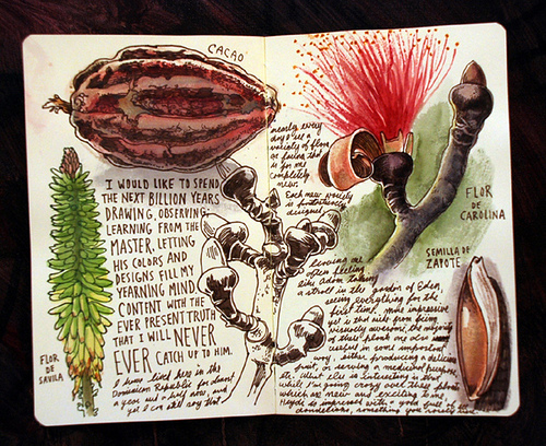
  • Can only write in it- sketching would result in horrible bleed
  • Forced to write lightly
  • Perfect bound- not very sturdy
  • Won’t lay flat when writing.

Some inks that did well on the paper:

Noodler’s Bulletproof Black, Eel Blue, Walnut, Beaver, Eternal Brown and anything BUT Herbin Bleu Nuit in an EF nib.