Author Archives: leslie

Open Letter to the AJ Ning Community

Hi Everyone,

Change is inevitable but we are a fortunate group. Ning, the company we use to host Art Journaling has raised it’s prices but we are paid for the next year so we are good on Ning until June 2017.  another group I am a member of cannot afford the price hike and is shuttering at the end of October.

This is the second major price hike, where the group went from free to a reasonable price, to expensive (and why we run a yearly fundraiser) to now absolutely outrageous. The price went from $239/year to $588/year, more than doubling for next year. My frustration with this price hike has much to do with the fact that Ning has made little to no improvements in the years since the last price hike, so we are getting double the cost with zero improvements. Ning made plenty of promises after the last price hike, and lost many groups, particularly those like AJ Ning, but we persevered.
While we have a year to decide the fate of Art Journaling, right now I feel that the best choice is to move the site to a new host and using a new software. I’m leaning toward WordPress social media site but I’m open to other ideas, so long as it is less expensive than $588/year. I do not want to make a HUGE change like this without your input, as always because this is a community site, movement matters little if it is not done without YOUR thoughts, ideas, and feelings taken into account.

Please head to the site and join the group “Movement and Change” to discuss the option and feelings around this potential change.  http://artjournaling.ning.com/group/movement-and-change

I have a  little heart ache over the idea of moving from Ning, but I also feel like together we can make AJ Ning continue to be amazing and a resource for all the new and old art journalers alike. Again, even if you decide not to head over to AJ Ning (I really hope you do) I appreciate all the input, ideas, and art we’ve shared over the years. Please join in on the discussion and share your thoughts.

MUCH LOVE,

Leslie aka ComfortableShoes

SSS: Privilege, Power, and Difference

Last week we saw the brouhaha over the University of Chicago’s anti-trigger warning letter, the Tattooed Professor’s response, and generally a great deal of posting that miss the point about trigger warnings.

The big problem that I had with UC’s letter was that it was based on a fallacious understanding of what trigger warnings are, and follows that bad understanding to a rather silly conclusion that amounts to the dean stomping his big toddler foot and shouting, “We don’t support trigger warnings, you big babies!’

The Tattooed Professor explains what trigger warnings are in perhaps the most understandable analogy possible- they are the academic version of movie ratings. To which no one seems to argue anymore, though I must admit that I remember a time when ratings were argued against.

Here’s the thing, what is so wrong or even bad about putting content information into a syllabus? The professors should know the content of the readings (and other materials) they are assigning students to read, so adding a blurb at the start of the assignment for the day that states, “This reading contains the following: graphic descriptions of domestic violence/suicide/homicide/rape/assault/etc. PLease see the professor, privately, if this is a problem.” Or some such explanation. In some cases simply having the warning is enough for someone to prepare themselves to be reading about their particular trauma and be able to complete the assignment.

This links really well into the SSS reading I chose last week. Johnson writes specifically about dominant groups (in this case professors) being able to dictate what is considered normal in their sphere of influence and power (Ivory Tower BS/College Campus) and that when this power dynamic is shaken, the dominating group will fight back (UC Dean). Watching this play out on facebook has been interesting. I have friends who are professors and friends who could care less about college, and some of both groups have been calling the recent groups of college students “cry babies” and “wimps” due to the desire for trigger warnings and safe places.  Interestingly, most of those who respond in such a way seem to think that the desire for trigger warnings is a way for students to get out of work, but in the cases where I’ve seen trigger warnings offered there was always an alternative text or option for reading. Kids aren’t getting out of work by requesting trigger warnings, in some cases they are making more work for themselves. All that is beside the point. The point is that trigger warnings are a cultural shake up in an area that has seen a lot of destabilization in recent years (adjunct unionization, fewer faculty positions, and lower pay all around weeee) so those who are in power want to keep their precious power.

I see this as a good thing for students and universities. Anyone else miss the 90s, when politically correctness meant being kind to your fellow humans, and not the BS that has been assigned to it today?

Sunday Study

Many of the stationery groups I belong to end up with a great deal of religiously based Sunday Study posts. Most of the time these posts are less evangelising and more about the stationery used in the study. I realized that I’d spent the last 3 years of my life engaging in secular study every day of the week. Now that I’ve graduated I’m missing that aspect of school, I know that is a tad bit nerdy but, frankly I enjoy studying. I began to institute a Sunday Study of my own which I named “Secular Sunday Study.”(SSS)

Each week I pick a book off my shelf, one I’ve read before, and chose a passage to deeply read, chew on, and write about in my journal. I typically pick one paragraph or page to really wrap my mind around. If you think this resembles something out of the church, you’d be right. Many churches/pastors chose a section of the bible and a few passages of the week for the congregation to study. Often this forms the basis for the following week’s service. In my case, I’m using these passages to explore myself, without the direction of a minister or pastor.

Thus far I’ve engaged with the following texts: “Poetry is not a Luxury” Audre Lorde, “How to be an Explorer of the World,” Kerri Smith, and “The Portable Atheist,” Christopher HItchens, and “Everyday Matters” by Danny Gregory. This week I’m engaging in “Privilege, Power and Difference,” by Alan Johnson. I realized in each of these texts that I’m exploring the same overarching topic- a way of looking at the world that is slooowed way down. The Lorde, Smith, and Gregory texts are all about being creative even when the world doesn’t want you to be. They are all about looking at the world, slowly and creatively, and changing your perspective on life. The Lorde, Johnson, and Hitchens texts are academic while the Smith and Gregory books are in the realm of self help.


Anyway, I hope to ease back into this blog thing with some monthly posts about SSS. Feel free to join in by posting a pic of a book you’ve enjoyed and are reviewing on a sunday with the hashtag #SecularSundayStudy or #sundayStudy. If you follow any of the linked pictures over to instagram you can follow the project there by following me. You will also get images about my garden, Pokemon Go, and stationery images.

All links in this are Amazon Affiliate links. I get a small amount of change if you purchase through the links and it doesn’t affect your price at all. If you don’t mind making the purchase via my links, I appreciate it very much and it helps to keep the site running.

Just a Pencil

Some of the heat that has been received over these posts has amounted to a minimizing and invalidating shout of, “It’s just a pencil!” Now I detailed my issues with the BWV and BW marketing over here so I’m not going to get into that. Instead i’m going to write about the statement, “It’s just a pencil.”

A Dixon HB #2 is just a pencil, as is the Casemate’s yellow HB #2, as is the Casemate’s Premium HB #2. These  three pencils and so many others are “just” pencils. There is nothing special about them, they don’t even have any remarkable marketing. They are just pencils. Graphite, wood, glue, paint, aluminum, and an eraser. They’ve been given no life beyond their aesthetic appeal, simply pencils.

Just pencils.

A photo posted by LC Harper (@originallcharper) on

The Blackwing Volumes  in complete opposition are not just pencils. Each has a story attributing it’s finish to someone. They are given a story. These are commemorative pencils, a tribute to the particular person they are designed around. These pencils are all about the story, not the pencil. The pencil is secondary to the story. The story is what sells the pencil. The pencil is just a pencil without the story. With out the story the 725 is the sunburst, the 211 is unfinished, the 1138 is gray scale, 24 is blackout, and 56 is pinstriped. Without the story these are pretty boring, yet expensive, pencils.

Pencils with stories attached. i.e. NOT just pencils.

A photo posted by LC Harper (@originallcharper) on


See now you can come back at me and tell me that Field Notes are just notebooks, because, let’s face it Draplin divorced the story from specific people and made them about things and the process of making the notebooks- night sky, beer, winter, etc. concepts and process not people or even specific things. That makes the FN just notebooks, whereas it’s much harder to tell me that the BWV are “just” pencils. They aren’t because BW decided to make them about the story.* Because for them, the story is what sells the pencil, never mind some of us have to actively divorce the story from the otherwise cool pencil to enjoy it. 

The other end of the battle cry of, “It’s just a pencil,” is that we’ve pissed in the sandbox because we focused our thinking around women and people of color. We’ve now been told that we’ve “ruined something that was once great.” Apparently suggesting that the party include women and POC ruins everything and holy shit, we brought women and POC to the party, well it’s completely ruined now. Might as well set fire to its corpse.

This “What do you think the next BWV will be? You know what would be cool?” literally occurs before EVERY single release, but for some reason this time it pissed people off. The only reason I can find for this anger, and this is supported by the comments section on Andy, Dee, and Johnny’s blogs is that we wrote about women and POC.

Maybe what we need to set fire to is the fragile little egos of those who complain at the suggestion that maybe some of us would like to see women and POC memorialized, perhaps because we are women or people of color, or maybe our loved ones are women or POC, maybe our families are made up of POC? Maybe I look to heroes that aren’t like yours?
Continue reading

Tribute Pencils: Buffy Edition

I’m a huge Buffy the Vampire Slayer fan. I remember when the movie came out but didn’t watch the show until it was no longer on the air. I’ve made up for lost time by watching the entire season when I can’t figure out what I want to watch. Needless to say, with all this talk of commemorative pencils I started to thinking, “What would a BtVS tribute pencil look like?”

Would it be a #2 Faber Castell American, like what she used to slay the vamp while studying? Or would it look like a stake?

For this pencil modification I chose the stake route.

Materials were as follows:

  1. General’s Cedar Pointe #1
  2. L.A. Looks Endless red fingernail polish

I removed the erasers from the pencils and brushed on a generous coating of the polish. At the end I put a large dollop of polish on one facet and allowed it to run down the side of the pencil. Then I stuck it into a box so it stood up and could dry overnight.IMG_0143

I searched for a nail polish called “Harlot” but could not find one, however I think Endlessfits the bill and is the right blood red color.IMG_0144

Why the blood red? “Cause it’s always got to be blood….  blood is life.” IMG_0146

Anyway, this is my BtVS tribute pencil.

Memory Sparks

It seems that bright colors and stripes are all the rage in pencil fashion these days. I’ve waxed philosophical about the neons in both Wopex and Ticonderoga in the past. This year Dixon has introduced striped Ticonderoga pencils in 5 colorways. Green, blue, yellow, orange, and magenta. Each pencil sports 2 shades of the color- one bright the other pastel. Each has an eraser to match the brighter color and that traditional green and yellow Ticonderoga ferrule. All that bright cheery goodness is wrapped around good old American cedar. These are all made in their pencil manufacturing facility in China, so don’t be fooled that these are American made. That is the only thing that could make these better. The core inside is their soft HB which reminds me more  of a B than anything else.IMG_0138

I dig these bright colorways so much. I am most taken by the green. It reminds me of school bus seats in buses dating back to the 60s, like the one I rode back in 1980 when I first went to school. They remind me of the old supplies in green cardboard boxes my teachers had in their pale tan cabinets. The dark green color is also nearly the same shade as the enameled tin boxes that tools would be in before molded plastic became popular and cheaper. The outside of the tin would be a mottled green color and inside the tool would be set into a thin plastic molded shelf. I used one of those metal tool boxes as my pencil and pen case in high school. It also served to protect my fancy graphing calculator from harm.*

The green striped pencils evoke memories of early childhood and school for me. The yellow reminds me of the school bus- the dark shade is just right for the rickety school bus I first rode.

The  final three colors, the magenta, blue and orange remind me of summers as a child. That blue perfectly encompasses the color of the sky reflected off the oceans and lakes I swam in. The orange is the sand and sun beating down on us. The magenta is the color our skin turned after a few days in the sun. IMG_0141

These bright cheerful pencils are awesome and nostalgic.


This post was inspired by Brandon’s over here. Continue reading

Pencils for Heros

Yesterday’s post, and the responses to it across the other 2 blogs and the Erasable community got me thinking. I wondered, “What currently produced pencils would I assign to each of these people or things that I feel embodies them?” If I think about my pencil collection and each of these people/things, which pencils match up? This list is my imagination and doesn’t take into account what the person would have or does actually use. I base this list off my readings of the person listed and out of my imagination.

With the old in with the new. #pencil #penaddict #stationery

A photo posted by LC Harper (@originallcharper) on

Lois Lane. I think Lane would use a tough, serviceable pencil like the USA Gold. Not the natural but the old fashioned yellow, made in the USA, USA Gold. It’s a smooth, tough core that lasts and lasts. I think she’d need that for writing in her reporter notebooks.

Hannah Hoch. This was an easy one. Hoch is the Staedtler Norcia, black with a white eraser. A hint of goth but it’s too cool for that. It’s got a hint of controversy too. Perfect pencil for this brilliant artist.

Sojourner Truth. Ticonderoga Renew. It’s got that renewable thing going for it, raw wood, smooth core with the occasional scratchiness. It’s remade into something awesome, and if there is one person on this list that is awesome, It’s Truth.

Audre Lorde. General’s Cedar Pointe #1, Raw, tough, serviceable, signs of use are easily visible as the sweat of one’s labor stains the barrel.

Softball. Eberhard Faber EcoWriter. A pencil that took years of work and research to create, but wasn’t around long enough  and is now gone, gone, gone.

Ellen. Nataraj Pop or Ticonderoga Stripes. Both pencils embody her bright, cheerful and positive attitude. The Pops sold out here in the States and the Tic Stripes on well on their way to being a best seller.

If you were to honor someone you admire with a pencil that is already on the market, who would it be, and what pencil would represent them?

Diversity? Schmercity

I haven’t subscribed to the Blackwing Volumes. There are so many reasons why, but after I let my Field Notes sub lapse I thought a lot about what it means to me to subscribe to something. I forced myself very carefully to examine my want vs need internal meter and each time I am faced with that WANT feeling, I carefully examine it.

IMAG2187-1

For the most part, the Volumes don’t hit home for me. I like Dylan but uh, it’s a little before my time. The 211 was nice and hit all the buttons for me- except for the core. I don’t like the 602. Then we had the 1138 which I just don’t care about. The 24 is really nice but I have to actively divorce the Steinbeck association away from the pencil.* Finally we have the 56, the Dimaggio edition over a 602 core. Meh. Of the 5 editions only 1 really spoke to me.

Part of my disdain of the majority of the BWV is the heavy handed marketing by BW, the corporate atmosphere surrounding the editions, that they won’t release numbers produced** but also, the majority of the stuff memorialized is before my time. I’m not their target demographic- which is apparently older white dudes.

Mellissa in the Erasables group put up an interesting post pointing out that all of the editions have memorialized dead white guys and a music festival. Not one woman. Not one person of color. We could probably explore the myriad of reason for this, but I’ll leave it alone.

There’s been plenty of research in sociology and psychology that people tend to see people like themselves as their heroes. So when it comes to portraying heroes we usually see white dudes as those heroes. So I started to think about if I were to do a tribute pencil what would it look like and who would it be?

The Lois Lane Edition, 1938 She first appeared in the comics in 1938,m sure she was the love interest for Superman, but she was also a “tough broad” who held her own- a difficult thing in the newsroom back in ‘38. It’s be black, because Lois has black hair (most of the time) and a blue eraser, to match her eyes. The core? The extra-firm of the 24.

The Hannah Hoch Edition, Dada No numbers for this one, the Dada movement would insist. Hoch is often overlooked in favor of the male Dadaists, but she was no joke. Some of her art is astounding and stand up to this day. Call her the godmother of creepy teenage collages with oversized eyeballs. The pencil would be paperwhite, with a silver ferrule, and a black eraser because most of her work was done in black and white.
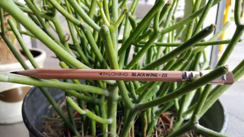
The Sojourner Truth Edition, 1851. She ran to freedom with her infant daughter in 1826 Changed her name in 1843. And gave her famous “Ain’t I a Woman” speech in 1851. The pencil would be dark blue for the Union Army’s Uniform, silver ferrule for lead shot, with a red eraser for blood lost.

The Audre Lorde Edition. 1984, For the year she published, “The Master’s Tools Will Never Dismantle the Master’s House” an amazing read that every person should read. The pencil would be the grey of a well used tool handle, the ferrule rust colored, and the eraser, white to denote it’s the master’s tool.

The Softball Edition, 2012, Softball was removed from the list of olympic sports in 2012. But it’s played all over the world by millions of girls and women. Go figure. The pencil would be red for the stitches on a baseball, it’s have a gold ferrule for the gold medals that’ll never be won, and a brown eraser for the color of the infield. The core would be an MMX, because no one buys those.
The Ellen Edition, 1997. Ellen DeGeneres was the first openly gay woman on TV and had the first character to come out. The importance of this cannot be minimized. For years lesbians had to pretend that other female characters were “like” them and suddenly, there she was on the screen. It’d be a god damn rainbow.

Interested in reading more posts like this? Check out Johnny’s post and Andy’s post.

Please be aware there are no accusations leveled here, simply ideas for things I think would hit my demographic just about right.

Continue reading

Review: Bob Slate Quad

Comrade Johnny recently informed me in the Erasable Facebook group, about Bob Slate’s Quad ruled 5×7.75 spiral bound notebooks. I had to buy a few.

The Quad is $2.95 at Bob Slate Stationers in cambridge, MA. It is not available anywhere else.*  The covers are the Standard BSS hard kraft imprinted with a red brown ink. The decoration is simple, their logo, notebooks info, and a little grid on the lower right corner. These covers are hard with minimal flexibility. Folded over on itself you can write in hand. The spiral is bright silver and doubled. Though I’ve shoved this notebook into my bag and let it get beaten up. The spiral looks as good as the day I bought it while the cover has developed a nice patina of graphite, fingerprints, and coffee rings.QUAD

Inside the paper is white with blue ruling. There are 4 lines per inch. It is narrow but not as narrow as many graphs or grid that are out there. The printed grid is quite a dark blue, and though they are dark, they are VERY fine, very narrow, so though dark, they still disappear behind darker shades of ink.QUAD

So let’s talk about ink. With ballpoint, rollerball, and gel inks this paper is great. It’s got a nice tooth and feels good. With porous points, fiber tips, fountain pens, and other liquid ink pens it’s not as nice. Fountain pens bleed through and even my smoothest fine points feel rough. Larger nibs feel better, but they bleed like I’m writing on TP. Even fiber tips and fineliners soak through this paper. This was a huge surprise to me, because BSS paper is usually so good with fountain pens and liquid inks. That said, if you are a pencil fan, these are amazing. The toothiness of the paper is great with every single pencil I’ve used within its covers.Stick to pencils or ballpoint and this is a great notebook.QUAD QUAD QUAD QUAD

Continue reading

Review: Staedtler Triplus Fineliner

triplusI decided to pick up a trio of these pens a few months ago for sketching. I picked them up at Blick for around $2 a pen. They are now available at Artist and Craftsman for a little less. You can get multipacks on Amazon for decent prices. I’ve only seen singles at Blick and A&C. Blick has a great range of colors, while A&C had only 24 shades.

The Triplus sports a very fine fiber point that is sheathed in metal. The ink flow is smooth, generous, and even. The feel of the tip is smooth on every paper I’ve used. It will soak through on some thinner and more absorbent papers. It performed well in Field Notes, though the black does soak through if I linger upon a word in my meandered thinking.triplus

While drawing I found that they performed well. The teal shade was a tad too light, while black and blue were dark. What is important that you can leave them uncapped for ages and they won’t dry out, hence the “dry safe” designation on the pens.

I found the size and shape of the pen comfortable but not for long periods of time. Like most narrow, triangular writing instruments I find the shape and size annoying. Why? I’m not sure. I tend to death grip narrow pens but add triangular to the mix, I’m attempting strangulation. The tip itself is nearly a full inch long and if you are a “near the point” type gripper, you are going to feel the transition from body to point, and likely find it uncomfortable.IMG_0064

These have been marketed with adult coloring books. Have I yet mentioned that the tips are incredibly fine? They are smaller than 0.5, likely in the 0.38 category. It would take FOREVER to do a coloring page. I colored in 3 ¼ inch squares in a Mt Tom and 2 hours later I finish. Yes, hyperbole. That being said, if you would like to use a fiber tip pen the Paperhate Flair, which is cheaper, has a wider tip, might be a more enjoyable choice.
triplusOn the other hand, I tend to be heavy handed with fiber tipped pens and crush them. These survived and still work really well. I could see drawing with these or using brighter colors for highlighting. Mostly I’ve been using them for doodles and occasional quick notes in my Field Notes.